Summary Outline –
When it comes to home decor, the walls of your home serve as a blank canvas waiting for your creative touch. Whether you’re a seasoned interior design lover or a DIY enthusiast, transforming your interior walls with paint color and style can dramatically alter the ambiance of your living space.
This analysis is tailored to guide you through the essential steps for revolutionizing your interior walls, making them a testament to your unique taste and style.
Summary of Site Content
1st Painting Tip: [view tip]
… we begin this analysis by understanding the essentials of interior wall painting. Specifically, we will examine room layout, selecting a focal wall, connecting spaces, the interplay of light and dark colors, and more.
2nd Painting Tip: [view tip]
… the second section becomes the fun part: selecting the perfect paint color for your interior design concept. Explore the best paint color ideas categorized by room, interior style, and various color schemes.
3rd Painting Tip: [view tip]
… moving forward, this section gets into the specifics of paint finishes, hues, color schemes, and various styles that can be used to give your room a customized look.
4th Painting Tip: [view tip]
… the fourth painting section emphasized the critical importance of preparing your interior walls and ceiling before painting. Discover detailed preparation steps and the essential tools required to ensure a successful painting project.
5th Painting Tip: [view tip]
… the fifth section is how-to guide on painting techniques. It details optimal practices, common pitfalls to avoid, drying times, the necessity of second coats, and considerations for hiring a professional painter if needed.
6th Painting Tip: [view tip]
… the sixth and final step is to sit back, admire the newly applied color, and decide on the wall art and decor for the finishing touches of your interior makeover.
We’ll explore diverse techniques for selecting the ideal paint color, finishes, hues, and styles that align with your interior aesthetic. Additionally, we’ll highlight the crucial steps for preparing your walls before painting and provide a detailed guide on the best practices for applying paint, including drying times before adding a second coat.
With our comprehensive guide, you’ll be equipped with the knowledge and inspiration to turn your walls into stunning works of art that reflect your personality and elevate your home’s interior design.
- post content
- Painting Tip 1: Understanding the Analysis of Wall Painting
- Painting Tip 2: Choosing the Best Paint Color for Every Room and Interior design
- Painting Tip 3: Understanding Paint Finishes, Hues, and Styles
- Painting Tip 4: Guide to Prepping Walls for Painting
- Painting Tip 5: Starting the Painting Process
- Painting Tip 6: Decorating the Wall Once the Paint Job is Completed

-
Quick scroll to first topic about decorating interior walls with paint color …

first “decorating interior walls with paint color” idea


copyright image by 123rf.com
Painting Tip 1: Understanding the Analysis of Wall Painting
Notes:
-
Before diving into the actual process of wall painting, it is crucial to undertake an in-depth analysis. Understanding the analysis of wall painting involves examining a few key factors that will ultimately influence your design choices and the outcome of your project.
For example, natural and artificial light can significantly affect how paint colors appear throughout the day. Test paint samples under different lighting conditions to ensure the color you choose maintains its desired appearance.
Likewise, choosing the right walls to paint can dramatically transform the look and feel of your home. Whether you’re looking to create a cozy atmosphere in your living room or a vibrant, energetic space in your kitchen, understanding which walls to focus on is crucial.
Also take into account color psychology and how different hues can impact emotions and behaviors. Understanding these principles can help you select a palette that not only reflects your style but also enhances the functionality and feel of the space.
By thoroughly analyzing these factors, you set the foundation for a successful and visually appealing wall painting project.
-
Quick scroll to “analyzing wall painting” side notes …
-
-
1st: Understanding the Room Layout
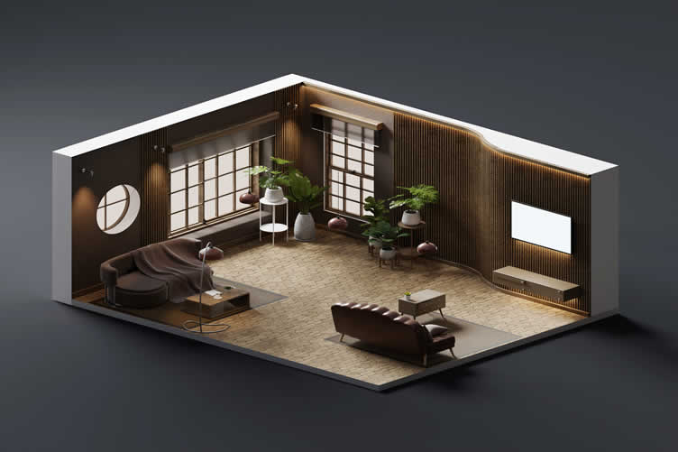
Before deciding on which interior walls with paint color and style to use, it’s essential to consider the layout and purpose of the room. Take note of the room’s architectural features, such as windows, doors, and any built-in elements, as these can influence how different paint colors appear and interact.
Think about the function of the room and how you want to feel within the space. For instance, an accent wall in a living room might draw attention to a cozy seating area, while a painted wall in the bedroom could create a calming focal point behind the headboard.
-
Highlighting Key Features to Enhance Visual Appeal
Identify key features in the room that you want to highlight or downplay. A fireplace, large windows with a scenic view, or unique architectural details can be accentuated with a well-chosen paint color.
On the other hand, if there are elements you wish to deemphasize, consider painting them in a more muted shade that blends seamlessly with the rest of the room.
-
Balancing Natural and Artificial Lighting
Lighting plays a crucial role in how paint colors are perceived. Observe how natural light moves through the room at different times of the day, as well as how artificial lighting affects the mood and appearance of the space.
Ensure that your paint choices work harmoniously with the lighting conditions to create a balanced, pleasing environment. Darker hues tend to absorb light, creating a cozier, more intimate atmosphere in a room, whereas lighter shades reflect light, giving the illusion of a larger, more open space.
By thoughtfully understanding the room layout and considering factors like functionality, key features, and lighting, you can make informed decisions that enhance the overall aesthetic and ambiance of your space.
-
Tips for Analyzing Room Layout:
- Identify Natural Breaks:
Look for natural breaks in the room, such as corners, doorways, or architectural features like built-in shelves or fireplaces. These breaks often indicate where a change in color would be most effective. - Consider Furniture Placement:
Think about where your furniture is situated. Painting a wall that’s mostly covered by a large piece of furniture won’t have as much visual impact. - Traffic Flow:
Observe how people move through the space. High-traffic areas might benefit from a more durable paint finish or a color that hides dirt and scuffs.
- Identify Natural Breaks:
copyright image by 123rf.com
[ diagram: interior room layout design ]
[ youtube: layouts for a harmonious home ]

-
-
2nd: Choosing The Focal Point Wall
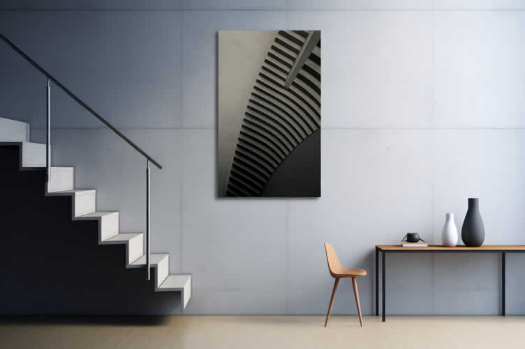
When choosing which wall to paint, identifying the focal point wall is a crucial step. The focal point wall is typically the area where the eye naturally gravitates upon entering the room.
There are several factors to consider when determining which wall should serve as the focal point. Often, the focal point can be a wall with an existing feature such as a fireplace, a large piece of artwork, or a built-in bookshelf.
If such features are absent, the wall directly opposite the entryway can serve as a natural focal point, instantly drawing attention as one steps into the room.
- Fireplace Wall:
If your room has a fireplace, the wall containing it is a natural choice for a focal point. - TV Wall:
In living rooms, the focal point wall may be behind the main seating area or around the television setup. - Headboard Wall:
In bedrooms, the wall behind the headboard typically serves this purpose, as it anchors the primary piece of furniture in the space. - Dining Area:
In dining rooms, the wall facing the dining table can make a perfect focal point.
Once identified, this wall can be painted with a color or pattern that enhances its prominence, turning it into an eye-catching element that enhances the overall aesthetics of the room.
copyright image by 123rf.com
- Fireplace Wall:
-
3rd: Using an Accent Wall
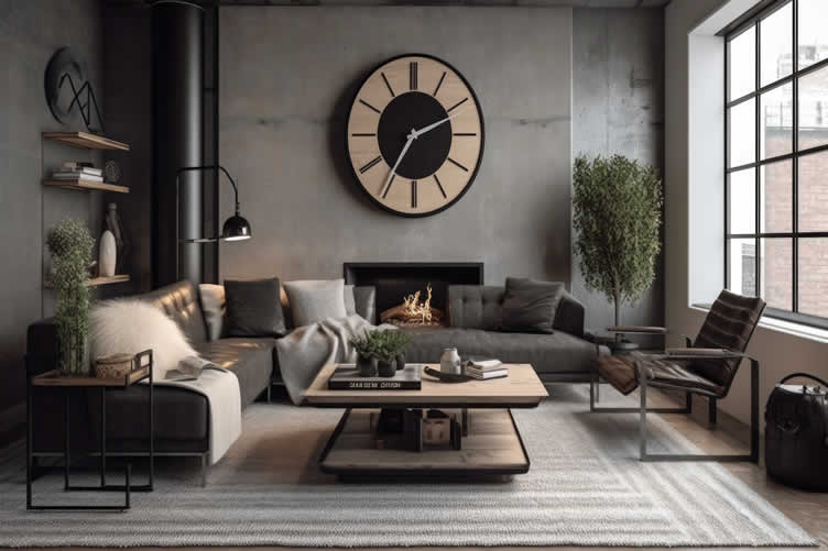
Incorporating an accent wall into your room is an excellent way to add depth, interest, and personality to your space without overwhelming it. An accent wall serves as a design focal point, often featuring a bold color or distinctive pattern that contrasts with the other walls in the room.
When choosing which wall to designate as your accent wall, consider the room’s existing layout, features, and furniture placement.
The accent wall should ideally be the room’s natural focal point, as discussed previously. However, it can also be a wall that frames a significant piece of furniture or architectural element you wish to highlight.
For instance, in a living room, you might choose the wall behind the sofa as the accent wall, whereas in a bedroom, the wall behind the bed can serve this purpose.
To successfully pull off an accent wall, the choice of color or pattern is crucial. Dark or vivid colors can make a striking statement, while lighter shades or subtle textures can add sophistication and depth.
Additionally, the use of patterns such as stripes, geometric designs, or wallpaper can introduce a unique visual appeal. The key is to select a treatment that complements the rest of the room’s decor while standing out enough to draw attention.
-
Choosing Walls for Accenting:
- Balance:
Select a wall that balances the room. Avoid walls that are broken up by large windows or doors. - Color Selection:
Choose a color that complements the room’s existing palette. Bold colors can make a statement, while subtle hues add a touch of elegance. - Positioning:
Typically, the longest unbroken wall is a good candidate for an accent wall. However, don’t be afraid to break the rules if another wall feels right.
- Balance:
copyright image by 123rf.com
[ view images: painted accent wall ideas ]
[ pinterest: painted accent wall ]
-
-
4th: Connecting Spaces with Paint
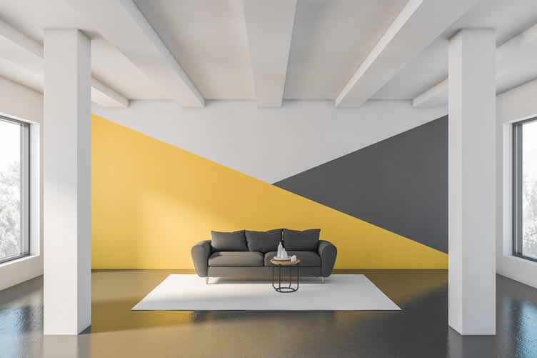
Connecting different spaces within your home using paint is a subtle yet impactful way to create a cohesive and harmonious environment. When selecting which wall to paint, consider how the colors and shades will interact between adjoining rooms.
A unified color palette can seamlessly transition from one space to another, fostering a sense of continuity and flow. To achieve this, choose a base color that can be used in varying intensities or shades across different rooms.
For example, a soft beige might serve as the primary color in the living room, while a deeper taupe could be used for an accent wall in the dining area. This gradient approach links the spaces visually while allowing each room to maintain its unique character.
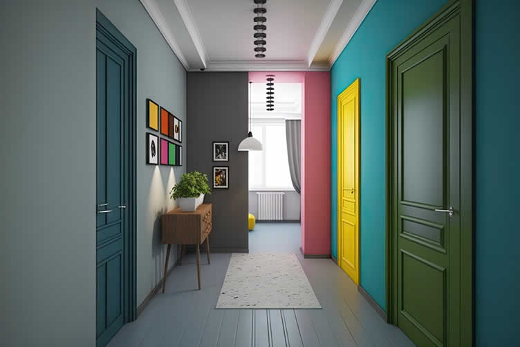
Another effective technique is to use complementary colors or analogous color schemes. If you have a bold, vibrant color in one room, you might choose a softer, complementary hue for the adjoining space. This not only connects the areas but also adds a visually pleasing contrast that enhances the overall aesthetic.
Furthermore, consider architectural elements such as doorways, trim, and molding as opportunities to tie spaces together with paint. Using a consistent trim color throughout your home can help different rooms feel part of a cohesive whole, even if the wall colors vary.
This approach is particularly useful in open-plan layouts, where defining distinct areas while maintaining a unified look can be challenging.
-
Tips for Connecting Spaces:
- Color Flow:
Use a consistent color palette throughout adjacent rooms to create a seamless transition. This doesn’t mean every room should be the same color, but the colors should complement each other. - Feature Continuity:
Extend a feature from one room into another. For example, if one room has a painted accent wall, consider using the same color for a smaller feature in the adjoining space. - Visual Boundaries:
Use paint to define areas within an open floor plan. For instance, a different color can delineate the dining area from the living space.
- Color Flow:
copyright image by 123rf.com
[ images: connect space with paint ideas ]
[ youtube: connect rooms with color ]
-
-
5th: Light and Dark: The Effect on Room Perception
The interplay of light and dark colors plays a crucial role in shaping the perception of a room’s size, mood, and overall ambiance when choosing which wall to paint.
Light colors, such as whites, pastels, and soft neutrals, tend to reflect more light and create an expansive, airy feel. These shades are ideal for smaller rooms or areas with limited natural light, as they can make spaces appear larger and more open.
Light colors also evoke a sense of calm and tranquility, making them suitable for bedrooms and living rooms where relaxation is key.
Conversely, dark colors, including deep blues, charcoal grays, and rich greens, absorb light and can make a room feel more intimate and cozy. While darker shades can sometimes make a space feel smaller, they are perfect for creating a dramatic, sophisticated atmosphere in larger rooms or open spaces.
Using a dark color on an accent wall can also add depth and dimension without overwhelming the entire room. This technique can highlight architectural features or create a focal point, adding visual interest and character.
Balancing light and dark colors within a single room can be achieved by considering the source and direction of natural light. For instance, in a room with ample sunlight, a darker wall can anchor the space and provide contrast, while light-colored walls enhance the brightness and reflectivity.
Additionally, integrating dark furniture or accents within a predominantly light-colored room can create a harmonious balance and prevent the space from feeling too clinical or stark.
-
How Wall Color and Light Influence Perception:
- Light Colors:
Light colors make a room feel larger and more open. They’re excellent for small spaces or rooms with limited natural light. - Dark Colors:
Dark colors create a sense of intimacy and coziness. They work well in larger rooms or spaces where you want to evoke a more dramatic feel. - Natural Light:
Rooms with ample natural light can handle darker colors without feeling closed in, while rooms with limited light benefit from lighter shades to keep them bright and airy.
- Light Colors:
copyright image by 123rf.com
[ youtube: best dark and moody neutral colors ]
[ youtube: how color changes your room size perception ]
-
-
6th: Painting the Ceiling to Match or Blend
When it comes to painting the ceiling, the choice to match or blend it with the painted walls can significantly influence the overall ambiance of a room.
Painting the ceiling the same color as the walls creates a seamless, cohesive look, which can make the room feel more integrated and harmonious. This is particularly effective in rooms with lower ceilings, as it visually extends the walls and can make the space feel less confined.
Alternatively, a slightly lighter shade on the ceiling compared to the walls can add subtle depth and dimension, giving the illusion of a higher ceiling. This technique works well in rooms where you want to maintain a flow but still define the boundaries subtly.
On the other hand, a darker ceiling can create a dramatic, intimate atmosphere, drawing the eyes upwards and making the space feel cozier. This works particularly well in large rooms or spaces with high ceilings, where a darker color can bring the ceiling down visually, making the area feel more inviting and warm.
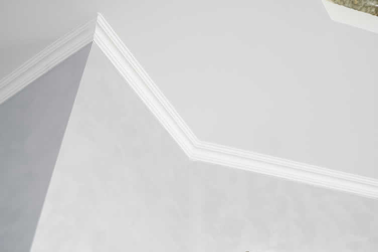
Moreover, incorporating architectural details such as crown molding can further enhance the effect of your chosen ceiling color.
For example, a white or light-colored molding can provide a striking contrast against darker ceilings and walls, while continuing the same color through the molding can maintain a seamless look.
Whether you opt for matching or blending, thoughtful coordination between wall and ceiling colors can significantly enhance the room’s overall design and mood.
copyright image by 123rf.com
[ pinterest: wall and ceiling paint colors ]
[ youtube: ultimate guide to ceiling paint colors ]
-
-
ideas to view and compare from the information discussed above
Scroll up to directory … or scroll to next section about decorating interior walls with paint color …



for every room and interior style


second “photo remodeling” idea
copyright image by 123rf.com
Painting Tip 2: Choosing the Best Paint Color for Every Room and Style
Notes:
-
Selecting the perfect paint color can dramatically transform your home, infusing it with personality and mood. The right hue can make a room feel inviting, calming, or energizing, while also complementing your interior décor.
However, with endless color options available, deciding the best paint color for each room and style can be overwhelming. This guide aims to simplify the decision-making process by offering expert advice on the best colors for different rooms and interior styles.
-
Quick scroll to “bring nature inside” side notes …
-
-
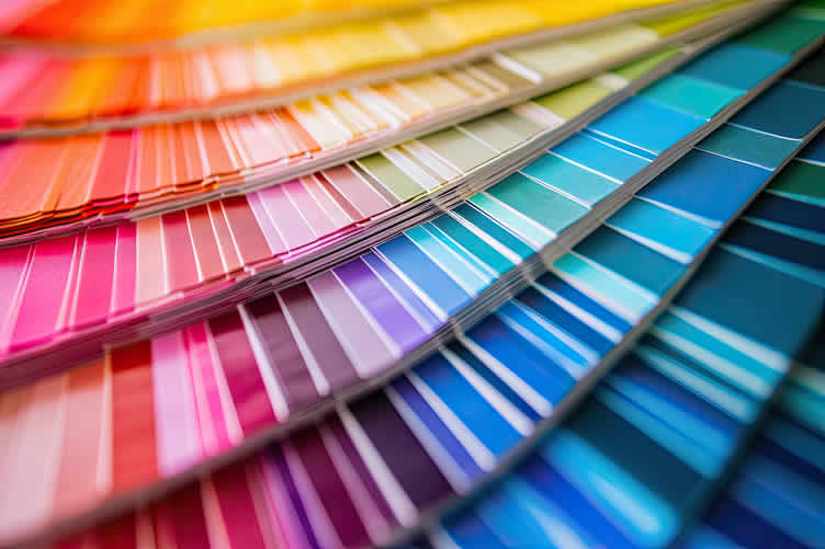
1st: Understanding the Psychology of Color
The psychology of color plays a pivotal role in interior design, significantly impacting our mood, emotions, and behaviors. Selecting the right paint color for your walls goes beyond aesthetic appeal; it’s about creating an atmosphere that aligns with the desired emotional tone of each room.
Below, we explore how different colors influence our psyche and how to harness this knowledge in choosing paint colors.
-
Warm Colors
Warm colors, such as red, orange, and yellow, are known to evoke feelings of warmth and comfort, but can also stimulate conversation and excitement. However, these tones can also increase feelings of anger or hostility in some people.
For rooms meant to be lively and inviting, like the kitchen or living room, consider softer shades of these colors to balance stimulation with comfort.
-
Cool Colors
Cool colors, including blue, green, and purple, tend to have a calming effect, making them ideal for bedrooms and bathrooms. These hues are believed to reduce stress and aid in relaxation.
For instance, light blues can evoke feelings of tranquility, making them perfect for creating a serene bedroom oasis. However, overuse of cooler shades might lead to a space feeling cold or impersonal.
-
Neutral Colors
Neutral colors like white, beige, gray, and black can be incredibly versatile, serving as a backdrop for more vibrant colors or as standalone schemes for a minimalist look.
These shades are often associated with elegance and sophistication but should be chosen carefully to avoid creating a bland or stark atmosphere.
-
Emotional Impact of Specific Colors
- Red:
Often associated with energy and passion, red can be too intense for walls, except as an accent color. - Green:
Known for its restorative and soothing qualities, green is excellent for creating a peaceful refuge. - Blue:
Blue is the most calming of all colors, ideal for bedrooms but should be balanced with warmer hues to prevent a too-cold feel.
- Red:
Understanding the psychological impact of color can profoundly affect the ambiance of your space. When selecting paint colors, consider the mood and behavior you wish to encourage in each room.
Combining personal preference with the basic principles of color psychology can help you create spaces that are both beautiful and beneficial to your well-being.
copyright image by 123rf.com
[ view images: color psychology illustrations ]
[ pinterest: the role of color in interior design ]
-
-
2nd: Choosing the Best Paint Color by Room
When it comes to selecting paint colors for each room of your house, the process is as much an art as it is a science. Each room serves a different purpose and, as such, should evoke specific emotions and functionality.
The color choice for a bedroom may differ vastly from that of a kitchen or living room, reflecting the unique character and requirements of each space.
Understanding the psychological effects of colors and considering the room’s lighting, size, and existing decor can guide you in choosing a paint color that enhances the room’s appeal and aligns with your personal style.
This section will explore essential considerations and expert recommendations for selecting the optimal paint color for each room in your home, ensuring your spaces are not only beautiful but also beneficial to your overall well-being.
Quick scroll to rooms …
Living Room Color Choices
The living room, often considered the heart of the home, is where families gather to relax, entertain, and enjoy each other’s company. Given its significance, choosing the right color for the living room can set the tone for the entire home.
The best living room color should create a welcoming atmosphere, fostering comfort and sociability. Whether you lean towards warm, inviting hues like soft beiges and rich terracottas, or prefer cool, calming shades such as dusky blues and gentle greens, the key is to select a color that reflects your personality while enhancing the room’s natural light and size.
This section will provide insights into selecting the ideal paint color that promises to transform your living room into a harmonious retreat.
-
Creating a Welcoming, Cozy Atmosphere
- Warm Neutrals:
Beige, taupe, and warm grays create a welcoming and cozy ambiance. These shades are versatile and can easily match various furniture styles. - Soft Blues and Greens:
These calming colors can make your living room feel serene and inviting, ideal for relaxation and family gatherings.
- Warm Neutrals:
-
For a Vibrant, Social Space
- Bold Colors:
Rich shades like navy blue, emerald green, or even a striking red can add energy and make your living room a focal point for social interactions. - Accent Walls:
Consider painting one wall in a bold color to create a statement without overwhelming the space.
- Bold Colors:
Living Room Paint Colors
google imagesReds view ideas Oranges view ideas Yellows view ideas Greens view ideas Blues view ideas Purples view ideas Browns view ideas Grays view ideas Tans view ideas Whites view ideas 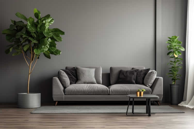
copyright image by 123rf.com
[ pinterest: best paint colors for living room ]
[ youtube: living room paint color ideas ]
Scroll back up to room directory …
Bedroom Color Choices
Choosing the right color for your bedroom is crucial for creating a personal haven that reflects your tastes and promotes restful sleep. The bedroom is your private sanctuary, a place to unwind, reflect, and recharge after a busy day.
The best bedroom colors are those that invoke a sense of peace, relaxation, and comfort, contributing to a conducive sleeping environment. From soothing pastels to deep, comforting tones, selecting a color that suits your style and enhances the room’s ambiance can transform your bedroom into a tranquil retreat.
This section explores the various hues that can elevate your bedroom’s aesthetic and atmosphere, ensuring a harmonious balance between style and serenity.
-
Calming Colors for Restful Sleep
- Soft Neutrals:
Whites, creams, and light grays can create a tranquil environment that promotes restful sleep. - Pale Blues and Greens:
These colors are known for their soothing qualities and can help you unwind after a long day.
- Soft Neutrals:
-
Incorporating Personal Style
- Moody Hues:
Deep blues, charcoal grays, or even black can create a dramatic and intimate space that reflects your personal style. - Pastel Shades:
Soft pinks, lavenders, and mint greens can add a touch of personality while maintaining a calming vibe.
- Moody Hues:
Bedroom Paint Colors
google imagesReds view ideas Oranges view ideas Yellows view ideas Greens view ideas Blues view ideas Purples view ideas Browns view ideas Grays view ideas Tans view ideas Whites view ideas 
copyright image by 123rf.com
[ pinterest: best paint colors for bedroom ]
[ youtube: bedroom paint color ideas ]
Scroll back up to room directory …
Kitchen Color Schemes
Selecting the perfect color scheme for your kitchen is more than just a matter of aesthetic appeal; it’s about creating a space that reflects your home’s heart and soul.
The kitchen, often referred to as the hub of the home, is where meals are prepared, families gather, and memories are made. Therefore, the colors you choose should not only inspire culinary creativity but also promote a warm and inviting atmosphere.
This section will guide you through some of the best kitchen colors that can enhance functionality, mood, and overall design, ensuring your kitchen is as welcoming as it is beautiful.
-
Making the Kitchen Feel Brighter and Spacious
- White and Off-Whites:
These colors reflect light and can make your kitchen appear larger and more open. - Light Grays and Blues:
These hues add a bit of color while keeping the space feeling airy and bright.
- White and Off-Whites:
-
Creating an Inviting Space
- Warm Yellows and Oranges:
These colors can make your kitchen feel cozy and inviting, perfect for family meals and gatherings. - Earthy Tones:
Sage green, terracotta, and other earthy colors can add warmth and complement natural materials like wood and stone.
- Warm Yellows and Oranges:
Kitchen Paint Colors
google imagesReds view ideas Oranges view ideas Yellows view ideas Greens view ideas Blues view ideas Purples view ideas Browns view ideas Grays view ideas Tans view ideas Whites view ideas 
copyright image by 123rf.com
[ pinterest: best paint colors for kitchen ]
[ youtube: kitchen paint color ideas ]
Scroll back up to room directory …
Bathroom Color Schemes
Choosing the right color scheme for your bathroom can transform it from a purely functional space to a personal sanctuary. The best bathroom colors do more than just appeal to the eye; they also play a crucial role in how we perceive the comfort and cleanliness of the space.
Whether you’re looking to create a serene retreat or a refreshing and vibrant area, the selection of colors can significantly impact the bathroom’s mood and feel.
This section will explore some of the top color choices that can make your bathroom not just a room, but an experience, ensuring that every moment spent there is in an environment that truly resonates with your personal style and comfort needs.
-
Complementing Fixtures and Creating a Relaxing Space
- Soft Blues and Greens:
These colors evoke a sense of cleanliness and calm, making them ideal for bathrooms. - Classic Whites and Grays:
These timeless shades can make a bathroom feel fresh and bright.
- Soft Blues and Greens:
-
Adding a Touch of Luxury
- Rich Shades:
Deep teal, navy, or even a sophisticated charcoal can add a touch of luxury and elegance to your bathroom. - Metallic Accents:
Consider incorporating metallic paints or finishes to create a luxurious and spa-like atmosphere.
- Rich Shades:
Bathroom Paint Colors
google imagesReds view ideas Oranges view ideas Yellows view ideas Greens view ideas Blues view ideas Purples view ideas Browns view ideas Grays view ideas Tans view ideas Whites view ideas 
copyright image by 123rf.com
[ pinterest: best paint colors for bathroom ]
[ youtube: bathroom paint color ideas ]
Scroll back up to room directory …
Home Office Color Schemes
Choosing the right color scheme for your home office is essential for creating an environment that fosters productivity and focus. The colors you select can influence your mood, motivation, and even your efficiency.
This section highlights some color schemes that can transform your home office into an inspiring and effective workspace.
-
Help You Stay Motivated at Work
- Bright Yellows and Oranges:
These vibrant colors can boost energy levels and stimulate creative thinking, making them perfect for spaces where brainstorming or innovative work takes place. - Crisp Whites and Pastels:
Light and airy colors can refresh the mind, giving the space a clean and open look that can be quite invigorating during intense work periods.
- Bright Yellows and Oranges:
-
Perhaps You Share the Space with a Library
- Soft Blues and Grays:
Muted and cool colors like these can create a serene atmosphere, helping to reduce stress and maintain focus during long work sessions. - Deep Blues and Greens:
Rich, dark colors not only add a touch of sophistication but also create a professional setting conducive to serious work and concentration.
- Soft Blues and Grays:
Home Office Colors
google imagesReds view ideas Oranges view ideas Yellows view ideas Greens view ideas Blues view ideas Purples view ideas Browns view ideas Grays view ideas Tans view ideas Whites view ideas 
copyright image by 123rf.com
[ pinterest: best paint colors for home office ]
[ youtube: home office paint color ideas ]
Scroll back up to room directory …
Entry and Hallway Color Schemes
The entryway and hallway are often the first spaces guests see when they visit your home. Therefore, choosing the right color schemes for these areas can set the tone for the entire house, making a lasting first impression. This section suggests color schemes that can enhance these transitional spaces and create a welcoming atmosphere.
-
Warm and Welcoming
- Earthy Tones:
Colors like warm beige, soft terracotta, or rich amber can make your entryway and hallway feel inviting and cozy, immediately making guests feel at home. - Monochromatic Schemes:
A palette of varying shades of a single color, such as different tones of gray or beige, can create a sophisticated and timeless look that flows seamlessly through your entryway and hallway.
- Earthy Tones:
-
Bright and Airy With a Classic Look
- Light Neutrals:
Pale shades such as whites, light grays, and soft creams can make these often-narrow spaces feel larger and more open, creating a sense of airiness and lightness. - Jewel Tones:
Deep hues like emerald green, sapphire blue, or ruby red can add a dramatic flair to your entryway and hallway, turning these transitional spaces into bold style statements.
- Light Neutrals:
Home Entry/Hallway Colors
google imagesReds view ideas Oranges view ideas Yellows view ideas Greens view ideas Blues view ideas Purples view ideas Browns view ideas Grays view ideas Tans view ideas Whites view ideas 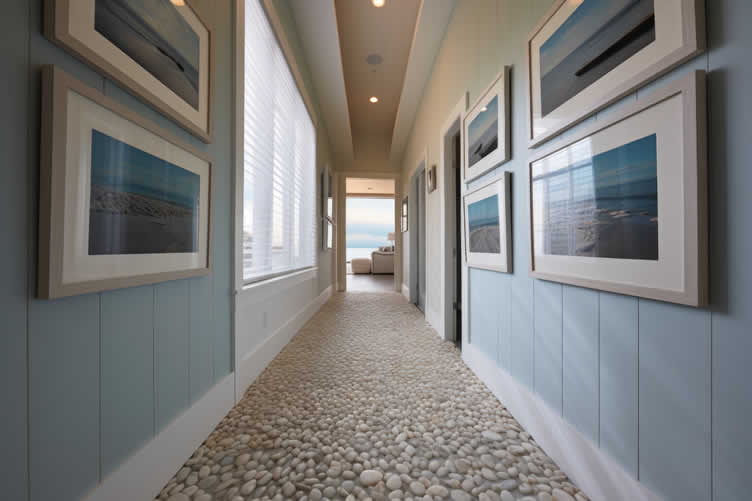
copyright image by 123rf.com
[ pinterest: best paint colors for home entry hallway ]
[ youtube: hallway paint color ideas ]
Scroll back up to room directory …
Color Schemes for Other Areas of the Home
Choosing the right color scheme is a crucial aspect of interior design that significantly affects the mood and functionality of different spaces within a home. Beyond the main areas of the home — from the living room to the kitchen, bedrooms, and bathrooms— , these other requires thoughtful consideration of color to create a harmonious and cohesive environment.
This section will explore various color scheme options for different rooms, helping you to tailor each space to its specific use and desired ambiance.
-
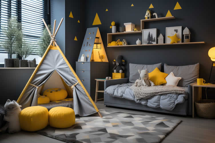
Child’s Room
When it comes to creating a nurturing and imaginative space for a child, choosing the right colors can make all the difference. The room should not only foster creativity but also offer comfort.
- Bright and Playful Colors:
Vibrant hues such as sky blue, soft pink, or sunny yellow can stimulate creativity and make the space inviting. - Neutral Tones:
Soft grays and beiges can provide a calm and flexible backdrop that grows with your child.
- Bright and Playful Colors:
-
Recreation Room
The recreation room should be a place of relaxation and fun, a space where family and friends gather to unwind and enjoy.
- Warm Hues:
Colors like burnt orange, deep red, or chocolate brown can create a cozy and welcoming atmosphere. - Energetic Colors:
Bright and bold colors like royal blue, lime green, or bright purple can add a dynamic and energetic vibe, perfect for entertainment and activities.
- Warm Hues:
-
Laundry Room
Though often overlooked, the laundry room deserves thoughtful consideration when it comes to its color scheme. A well-chosen palette can make laundry tasks more pleasant.
- Light and Airy Colors:
Soft pastels or crisp white can help make the space feel clean and organized. - Cheerful Accents:
Adding splashes of color through accessories or an accent wall in sunny yellow or sky blue can bring a sense of cheer to the routine of laundry tasks.
- Light and Airy Colors:
copyright image by 123rf.com
[ pinterest: best paint colors for recreation room ]
[ youtube: child bedroom paint color ideas ]
Scroll back up to room directory …
-
-
3rd: Selecting Paint Color Based on Interior Style
The selection of paint colors for your home’s interior is more than just a matter of aesthetic appeal; it’s about creating a space that reflects your personal style, enhances the functionality of each room, and influences the mood and atmosphere.
Recognizing the intrinsic link between paint colors and interior design styles is essential in crafting cohesive and harmonious environments.
Whether you’re drawn to the minimalist elegance of Scandinavian design, the warm and inviting tones of a rustic aesthetic, or the sleek, bold accents of modern decor, understanding how to choose paint colors that complement your interior style can transform your living spaces.
In this section, we’ll explore how various color palettes can be used to accentuate different interior design styles, providing you with the knowledge to make informed decisions that align with your vision and personal taste.
Quick scroll to styles …
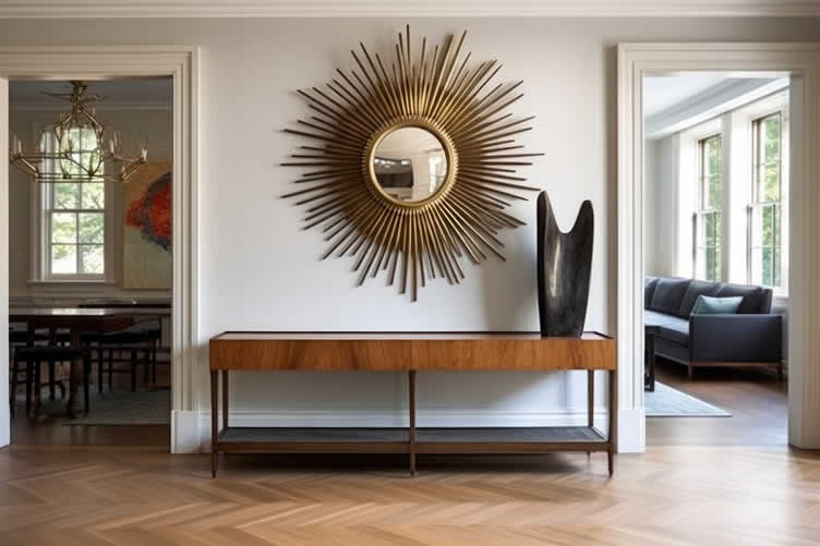
Traditional
When it comes to traditional interior design, the choice of colors plays a pivotal role in creating a space that feels both timeless and inviting. Colors in a traditional palette often draw inspiration from nature, featuring deep, rich hues that evoke a sense of comfort and elegance.
Think of warm wood tones, soft neutrals, and muted shades of red, blue, and green. These colors serve as a beautiful backdrop for classic furnishings, detailed moldings, and rich fabrics, contributing to a cohesive and refined aesthetic that pays homage to the past while remaining welcoming and warm.
Selecting the best colors for a traditional style involves balancing these understated, yet sophisticated hues to capture the essence of classic elegance.
-
Timeless Elegance
- Classic Whites and Creams:
These colors complement traditional design elements like wainscoting and crown molding. - Rich Reds and Greens:
These deep, saturated colors can add a sense of history and richness to traditional interiors.
- Classic Whites and Creams:
copyright image by 123rf.com
[ view images: paint colors for traditional interior ]
[ pinterest: traditional interior paint colors ]
Scroll back up to style directory …
Modern
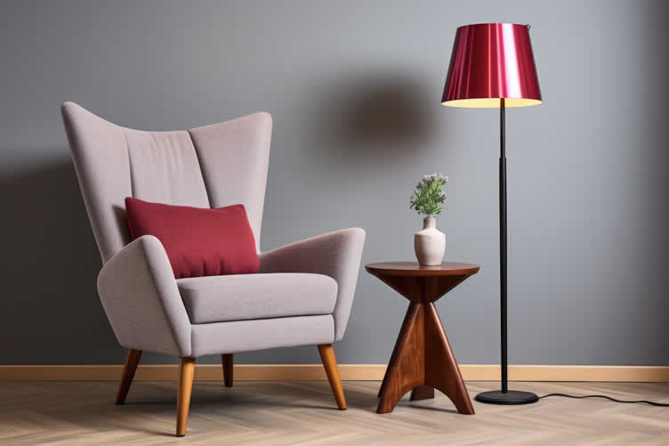
In the realm of modern interior design, the ideal color palette embraces simplicity and minimalism, creating spaces that feel open, airy, and unmistakably contemporary. Opting for shades that reflect and amplify natural light plays a crucial role in achieving the clean, uncluttered aesthetic that modern design is known for.
Monochromatic or neutral color schemes, punctuated with bold accent colors, form the basis of many modern interiors. Stark whites, soft grays, and blacks are often used to create a stark contrast that highlights the sleek lines and innovative materials typical of modern design.
The best colors for a modern style are those that foster a sense of harmony and balance, providing a perfect backdrop for the avant-garde furniture, futuristic elements, and statement pieces that define modernity in interior design.
-
Bold, Minimalistic Choices
- Monochromatic Schemes:
Shades of gray, white, and black create a sleek, modern look. - Bold Accents:
Bright colors like mustard yellow, cobalt blue, or even a vibrant red can act as striking accents in a modern space.
- Monochromatic Schemes:
copyright image by 123rf.com
[ view images: paint colors for modern interior ]
[ pinterest: modern interior paint colors ]
Scroll back up to style directory …
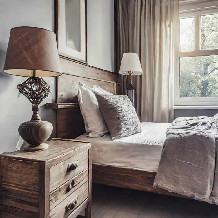
Rustic
Choosing the ideal color palette for a rustic style interior is about echoing the natural world outside and bringing the warmth and authenticity of rural life indoors.
This design philosophy gravitates towards earthy, natural tones that elicit a sense of tranquility and groundedness.
The best colors for rustic style are those that harmonize with elements like exposed wood beams, stone fireplaces, and handcrafted metal work, creating a seamless blend of beauty and comfort.
-
Cozy, Earthy Tones
- Natural Greens and Browns:
These colors work well with natural materials like wood and stone, creating a cozy, rustic feel. - Warm Oranges and Reds:
These tones can add warmth and enhance the inviting nature of a rustic space.
- Natural Greens and Browns:
copyright image by 123rf.com
[ view images: paint colors for rustic interior ]
[ pinterest: rustic interior paint colors ]
Scroll back up to style directory …
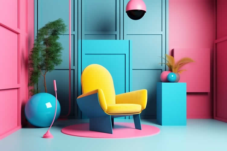
Eclectic
Choosing the best colors for an eclectic style involves embracing a diverse mix of hues, patterns, and textures that reflect a broad spectrum of influences and personal tastes. This style thrives on the unconventional, pairing bold and unexpected colors to create a unique and personalized space.
An eclectic color palette can combine vintage rusts with contemporary neons, or soft pastels with deep, rich jewel tones, making each space a true reflection of individuality.
The key is in finding a cohesive element that ties the diverse colors together, ensuring the space feels harmonious despite its variety.
-
Vibrant, Contrasting Colors
- Mix-and-Match:
Don’t be afraid to experiment with bold, contrasting colors that reflect your unique style. - Vibrant Hues:
Bright pinks, purples, and greens can create a lively and dynamic space.
- Mix-and-Match:
copyright image by 123rf.com
[ view images: paint colors for eclectic interior ]
[ pinterest: eclectic interior paint colors ]
Scroll back up to style directory …
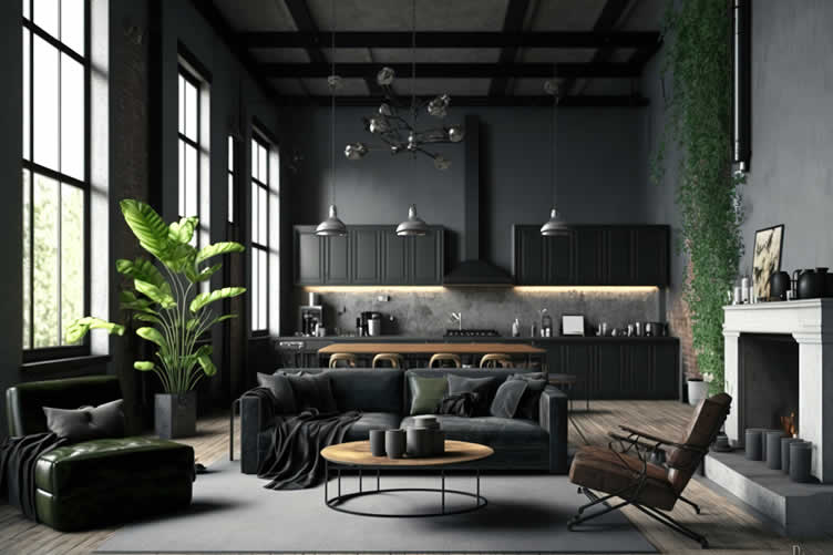
Industrial
The industrial style draws inspiration from warehouses and urban lofts, where the raw and unfinished elements are not just tolerated but celebrated. It’s a design that prefers the unrefined and utilitarian, where structural elements become part of the visual appeal.
The ideal color scheme for an industrial-style interior emphasizes the beauty of the building materials in their most natural state, creating a striking contrast between the old and the new by incorporating modern furnishings within a historical framework.
-
Rugged, Raw Materials
- Neutral Palette with Grays and Browns:
These colors mirror the industrial materials like exposed brick, metal, and unfinished wood. - Accent with Metal Hues:
Silver, copper, and gold tones can add a sophisticated touch to the industrial aesthetic.
- Neutral Palette with Grays and Browns:
copyright image by 123rf.com
[ view images: paint colors for industrial interior ]
[ pinterest: industrial interior paint colors ]
Scroll back up to style directory …
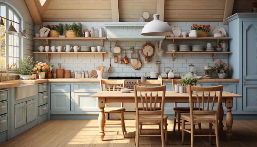
Farmhouse
The farmhouse style is characterized by its cozy, relaxed atmosphere, embodying a blend of modern and rustic aesthetics. It’s about creating a space filled with warmth, simplicity, and practicality, where every piece has a purpose and history.
The color palette and decor aim to evoke a sense of comfort and homeliness, making it the perfect retreat from the fast-paced outside world.
-
Warm, Welcoming Comfort
- Soft, Neutral Palette:
Opt for gentle hues of white, cream, and beige to create a warm and inviting space. - Natural Wood Elements:
Incorporate reclaimed wood furniture and exposed beams to add texture and a sense of history. - Vintage Accessories:
Enhance the charm with antique finds and vintage decorations that tell a story.
- Soft, Neutral Palette:
copyright image by 123rf.com
[ view images: paint colors for farmhouse interior ]
[ pinterest: farmhouse interior paint colors ]
Scroll back up to style directory …
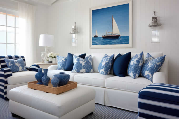
Coastal
The coastal style brings the calm and serenity of beach living into the home, creating a relaxed and rejuvenating atmosphere. It draws inspiration from the natural beauty of the sea and shoreline, focusing on creating a light, bright, and breezy space.
This style emphasizes comfort without sacrificing elegance, offering a retreat that feels both sophisticated and casual.
-
Serene, Breezy Elegance
- Light, Airy Palette:
Incorporate shades of blue, green, and sandy neutrals to mirror the colors of the beach and ocean. - Natural Light and Airy Fabrics:
Maximize natural light with large windows and use lightweight, breathable fabrics to enhance the airy feel. - Sea-Inspired Accents:
Decorate with seashells, driftwood, and sea glass to bring the tranquility of the coast indoors.
- Light, Airy Palette:
copyright image by 123rf.com
[ view images: paint colors for coastal interior ]
[ pinterest: coastal interior paint colors ]
Scroll back up to style directory …
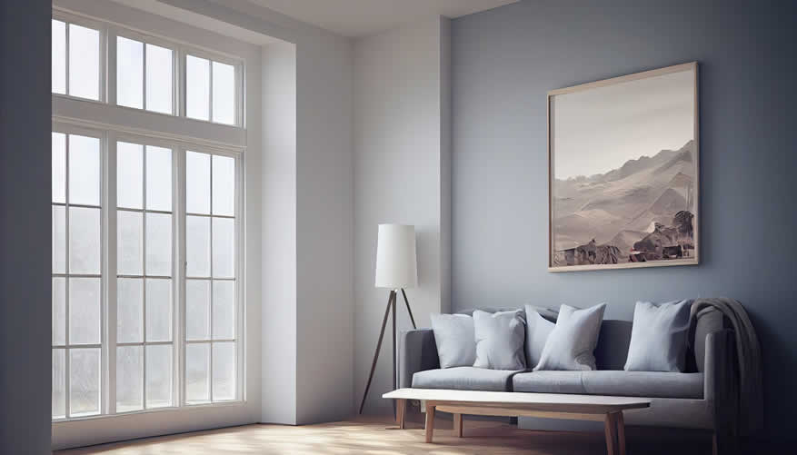
Minimalist
Minimalism is all about simplicity and clean lines, emphasizing a serene and orderly environment. This philosophy extends to paint colors that create a calm and uncluttered aesthetic, often featuring neutral tones like whites, beiges, and soft grays.
Such colors not only enhance the sense of space but also contribute to a peaceful and harmonious atmosphere.
-
Minimalist Paint Palette:
- White:
Opt for crisp, clean whites to enhance the feeling of space and purity. - Soft Grays:
Add depth and sophistication with various shades of gray - Muted Neutrals:
Incorporate beige, taupe, and other neutral tones for a warm, inviting atmosphere. - Black Accents:
Use black sparingly to create contrast and emphasize architectural features.
- White:
copyright image by 123rf.com
[ view images: paint colors for minimalist interior ]
[ pinterest: minimalist interior paint colors ]
Scroll back up to style directory …
-
-
4th: Tips for Deciding on the Best Color
Choosing the right color scheme for your space can significantly influence the room’s ambiance and emotional impact. When selecting colors, it’s essential to consider the natural light, the size of the room, and the mood you wish to create.
Colors can have a profound effect on our perception of space, with warm tones adding coziness and cool tones offering a sense of calm.
This section will provide practical tips to help you decide on the best color palette that not only reflects your personal style but also enhances the overall feel of your home.
-
Consider the Room’s Lighting and Size
When choosing colors for your room, consider the room’s natural and artificial lighting, as well as its size. Lighter colors can make a small room feel more spacious and brighter, especially in rooms with limited natural light.
Conversely, darker hues can add depth and warmth to larger spaces, creating a cozy atmosphere. The intensity and direction of natural light should also influence your palette choice, as they can significantly alter the appearance of colors throughout the day.
Therefore, testing paint samples at different times can provide valuable insight into how colors will truly look in your space.
- Natural Light:
Rooms with plenty of natural light can handle bolder colors, while darker rooms may benefit from lighter shades. - Room Size:
Lighter colors can make small rooms feel larger, while darker colors can create a cozy atmosphere in larger spaces.
- Natural Light:
-
How to Test Colors Before Committing
Before finalizing your choice of paint color, it’s wise to test the shades on your walls. Purchase small samples of the colors you’re considering and apply them to different sections of the room you intend to paint.
This method allows you to observe how the color behaves under various lighting conditions throughout the day and how it complements your furniture and decor. Additionally, viewing the colors side by side on a larger scale can help you feel more confident in your decision, ensuring the final result is as envisioned.
Remember, paint can look dramatically different on the wall than it does on a swatch or in the can, so this step is crucial for achieving your desired outcome.
- Paint Samples:
Always test paint samples on your walls before committing to a color. Observe how the color looks at different times of the day. - Digital Tools:
Use online tools and apps that allow you to visualize different colors in your space.
- Paint Samples:
-
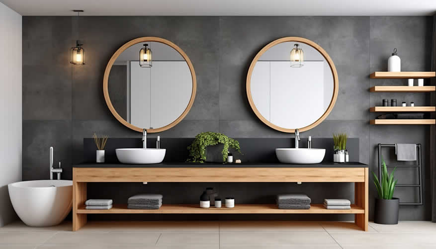
Long-Term Appeal
When determining the color for your space, it’s essential to consider the long-term appeal of your chosen hue. Trends in color come and go, and what may be the height of fashion today can appear dated in just a few years.
Therefore, selecting a color that not only suits your immediate aesthetic preference but also has the versatility to adapt to future changes in decor can provide enduring satisfaction.
Opting for classic or neutral colors can offer a timeless backdrop that allows for easy updates to room accents and furnishings. In addition, understanding how your color choice might affect the resale value of your property could also influence your decision, making this consideration an important aspect of the selection process.
- Timeless Choices:
Consider whether you’ll still love the color in a few years. Neutral shades often have more staying power. - Personal Preference:
While trends are fun, make sure the color you choose aligns with your personal taste and style.
- Timeless Choices:
copyright image by 123rf.com
[ youtube: pick colors like a designer ]
[ youtube: pairing colors together ]
-
-
-
ideas to view and compare from the information discussed above
Scroll up to directory … or scroll to next section about decorating interior walls with paint color …

addressing decorating interior walls with paint color and other home improvement needs …
… grab this directory of ideas for future use
 File Type (PDF)

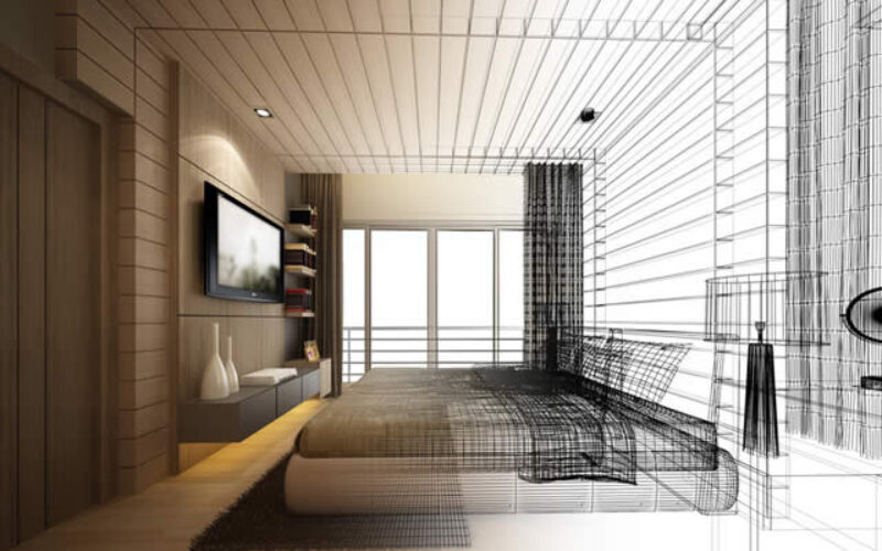

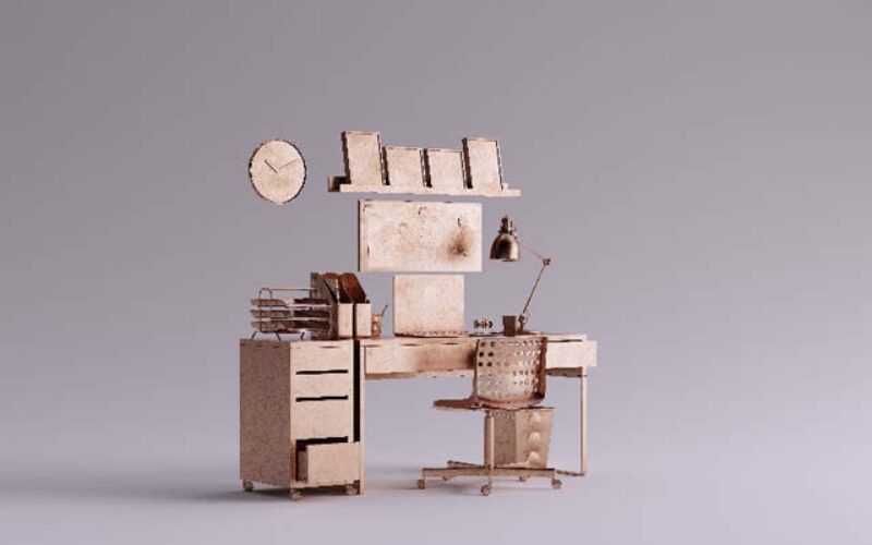


key paint finishes and styling ideas
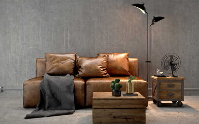
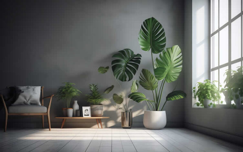
remodeling decisions
May We Suggest Other Photo Remodeling Ideas About
“Home Improvement …” (new win)


third “photo remodeling” idea
AI generated image by 123rf.com
Painting Tip 3: Understanding Paint Finishes, Hues, and Styles
Notes:
-
Paint is one of the most versatile tools in interior design. It can transform a room, set the mood, and reflect your personality. Understanding paint finishes, hues, and styles is crucial for creating spaces that are not only beautiful but also functional.
This comprehensive guide will walk you through the essentials of selecting the perfect paint for every room in your home.
-
Quick scroll to “paint finishes-hues-styles” side notes …
-
-
1st: Paint Finishes and Their Impact on Wall Colors
Choosing the right paint finish is as critical as selecting the color itself. The finish of a paint affects how the color appears under different lighting conditions, influences the durability of the paint job, and determines the ease of maintenance.
Here’s a closer look at the most common types of paint finishes and their best use cases within your home.
-
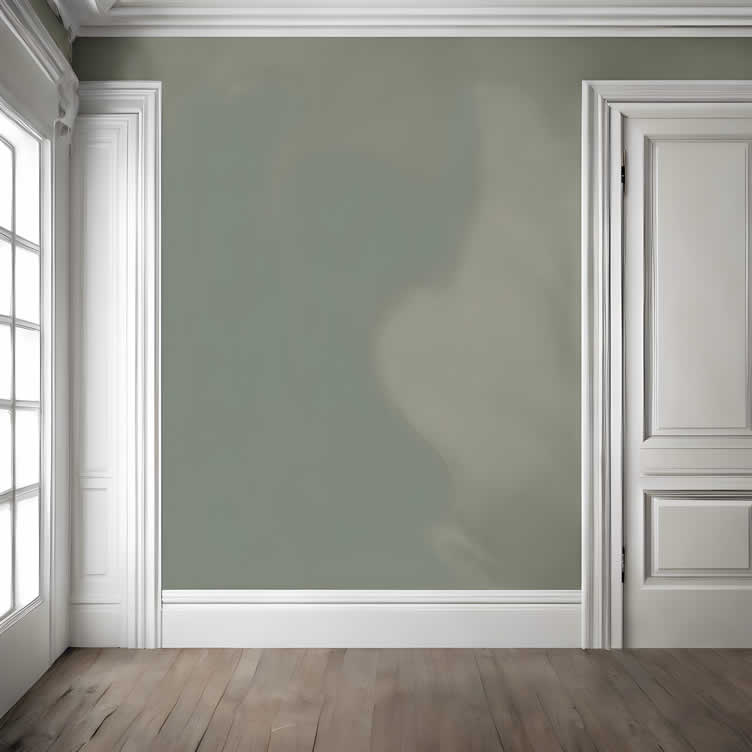
Matte Finish
A matte or flat finish provides a non-reflective surface that is ideal for hiding imperfections on walls and ceilings. This finish absorbs light, resulting in a soft and even look that minimizes glare.
While beautiful and velvety in appearance, it is best used in low-traffic areas since it can be difficult to clean. Perfect for living rooms, ceilings, and adult bedrooms where touch-ups are less frequent.
-
Eggshell
Eggshell finishes boast a slight sheen, somewhat like the surface of an eggshell. This finish strikes a balance between sheen and ease of cleaning, making it suitable for moderate-traffic areas such as living rooms and dining rooms.
It reflects light gently, which can help enhance the room’s overall brightness without highlighting wall imperfections severely.
-
Satin
Satin finishes offer a higher sheen level than eggshell and can endure cleaning better, making them ideal for high-traffic areas or rooms exposed to moisture. This finish is perfect for kitchens, bathrooms, hallways, and children’s rooms.
Satin finishes reflect light more noticeably, bringing a dynamic quality to colors and making spaces appear brighter.
-
Semi-Gloss and High-Gloss
Glossy finishes, including semi-gloss and high-gloss, are highly reflective and provide a durable surface that withstands moisture and heavy cleaning.
Semi-gloss is commonly used for trim, doors, and moldings, adding a durable and easy-to-clean surface that contrasts beautifully with matte or eggshell wall finishes.
High-gloss, the most durable and reflective option, is perfect for areas that need frequent scrubbing or are exposed to high levels of moisture. It’s also used to add a dramatic effect to cabinets, furniture, and accents.
Each paint finish offers unique benefits and aesthetic effects. Understanding these can help you select the right finish for each room, ensuring both beauty and functionality throughout your home.
AI generated image by 123rf.com
[ view diagram: paint finishes ]
[ youtube: paint sheen differences explained ]
-
-
2nd: Understanding Paint Hues
The choice of paint color is as crucial as selecting the finish, profoundly impacting a room’s ambiance and perceived size. The right hue can transform a space, making it feel warmer, cooler, larger, or more intimate.
Below, we explore various types of paint hues and offer insights on where and how to use them effectively.
-
Neutral Hues
Neutral hues, including white, beige, gray, and black, offer versatility and longevity in design. They serve as an excellent backdrop for any room, allowing for flexibility in decorating and accessorizing.
Neutrals can make small spaces appear larger and can be used throughout the house for a cohesive and timeless look.
-
Warm Hues
Warm hues like red, orange, and yellow bring energy, coziness, and a sense of intimacy to spaces.
They work well in social areas like the living room and dining room where they stimulate conversation and interaction. In bedrooms, warm hues should be used sparingly, as they can be invigorating rather than soothing.
-
Cool Hues
Cool hues encompass blues, greens, and purples, known for their calming and serene effects. They are ideal for bedrooms and bathrooms where relaxation is a priority.
Lighter cool hues can help make a small room feel more spacious, while darker shades create depth and sophistication.
-
Bright and Bold Hues
Bright and bold hues, such as neon green, electric blue, or hot pink, make dramatic statements and are best used as accent colors. They can bring life to a room when used on a feature wall, within artwork, or for accessories and furnishings.
However, it’s essential to balance these vibrant colors with neutral tones to prevent overwhelming the space.
Selecting the right paint hue involves considering the room’s size, lighting, and function, along with personal taste and the overall design theme. By thoughtfully choosing hues, you can create a harmonious home environment that reflects your style and meets your living needs.
AI generated image by 123rf.com
[ view diagram: paint hues ]
[ youtube: how to choose paint ]
-
-
3rd: Painting Styles
Painting styles go beyond simple color choices, infusing walls with texture, depth, and personality. Each technique offers a unique feel and can transform a plain space into a visual storytelling arena.
Whether you’re aiming for a subtle backdrop or a dramatic statement wall, understanding the nuances of various painting styles can significantly impact your room’s overall atmosphere.
-
Accent
An accent wall employs a color that is significantly different from the other walls in the room. This technique draws attention and creates a focal point, offering a bold statement or a splash of color to liven up a space.
Accent walls are perfect for highlighting architectural features or artwork.
[ view style: accent painting ideas ]
-
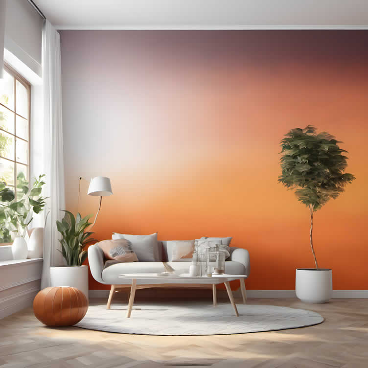
Ombre
Ombre painting creates a gradient effect, transitioning from one color to another, usually from lighter to darker shades.
This style adds a contemporary and dynamic element to walls, suitable for bedrooms and living areas where a soothing gradient can create a calming ambiance.
[ view style: ombre painting ideas ]
-
Sponging
Sponging involves dabbing a sponge into paint and then onto the wall, creating a textured, multi-dimensional look. This technique can add depth and interest to walls, ideal for achieving a rustic or eclectic appearance.
Different sponge textures can produce various effects, from subtle to dramatic.
[ view style: sponging painting ideas ]
-
Rag Rolling
Similar to sponging, rag rolling involves rolling a rag dipped in paint over the wall. This method yields a more patterned texture, with the fabric’s folds creating unique designs.
It’s great for adding vintage charm or old-world elegance to spaces.
[ view style: rag rolling painting ideas ]
-
Color Wash
Color washing is a technique that creates a soft, muted look with subtle layers of color. It involves applying a thin, transparent layer of color over a base coat, often with a large brush or cloth.
This style is perfect for achieving a warm, aged effect that’s both sophisticated and inviting.
[ view style: color wash painting ideas ]
-
Taping
Using painter’s tape to create designs or patterns on the wall before painting can produce sharp lines or geometric patterns.
Taping is an excellent way to add architectural interest or to define spaces within a room, suitable for modern and contemporary spaces.
[ view style: taping painting ideas ]
-
Metallic Fusion
Metallic fusion involves incorporating metallic paints or finishes into wall painting techniques, adding a touch of glamour and sophistication. This method can be blended with other techniques such as sponging or rag rolling to create a shimmering effect that catches the light beautifully.
Suitable for feature walls, this approach can elevate a room by introducing a luxurious texture and a reflective quality that enhances both natural and artificial lighting.
[ view style: metallic fusion painting ideas ]
-
Fresco
Fresco is a method that involves applying paint to plaster on walls while it’s still wet. This ancient technique creates enduring color that becomes part of the wall surface.
It’s ideal for achieving a historical or rustic Mediterranean look.
[ view style: fresco painting ideas ]
-
Stripling
Stripling requires a stiff-bristled brush to create fine lines of color over a base coat, often in a random or structured pattern.
This texture can add depth and visual interest, simulating the look of fabric or grasscloth.
[ view style: stripling painting ideas ]
-
Benoni
The Benoni technique uses layers of paint to achieve a rich, deep color effect with visible brush strokes that add texture and movement.
This method is perfect for creating statement walls that have a dynamic and artistic feel.
[ view style: benoni painting ideas ]
-
Texture
Texture painting involves adding materials to paint or applying techniques that leave a raised pattern on the wall.
Whether using plaster, stucco, or textured rollers, this style adds a tactile dimension to walls, excellent for covering imperfections or adding character.
[ view style: texture painting ideas ]
-
Chalkboard
Chalkboard paint transforms walls into writable surfaces, offering a functional and creative element.
Ideal for kitchens, children’s rooms, or office spaces, it provides a unique way to incorporate interactive and personalized designs into your decor.
[ view style: chalkboard painting ideas ]
Each of these painting styles brings its own charm and set of considerations to the table. By carefully choosing the method that aligns with your aesthetic goals and practical needs, you can greatly enhance the character and functionality of your living spaces.
With a bit of experimentation and creativity, paint can do much more than just add color to walls – it can also be used as a tool for self-expression and storytelling in your home. So go ahead, grab a brush, and let your imagination run wild!
Remember to always test out different techniques on sample boards before committing to painting your walls, and have fun exploring the
View Paint Styles by Wall/Rooms
google imagesAccent for walls for rooms Ombre for walls for rooms Sponging for walls for rooms Rag Rolling for walls for rooms Color Wash for walls for rooms Taping for walls for rooms Metallic Fusion for walls for rooms Fresco for walls for rooms Stripling for walls for rooms Benoni for walls for rooms Texture for walls for rooms Chalkboard for walls for rooms 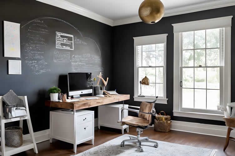
AI generated image by 123rf.com
[ view diagram: wall paint designs ]
[ youtube: how to paint an ombre wall ]
-
-
4th: Color Schemes
In the realm of interior design, the selection of paint colors plays a pivotal role in setting the tone and atmosphere of a space.
Two color schemes that offer unique possibilities are monochromatic and complementary colors. Each of these approaches can transform a room in different ways, influencing mood and eliciting visual responses from those who enter.
-
Monochromatic Colors
Monochromatic color schemes involve the use of a single color in varying shades, tones, and tints to achieve a cohesive look. This approach creates a harmonious and tranquil atmosphere, making it ideal for bedrooms, bathrooms, and spaces where a calming effect is desired.
Utilizing different shades of the same color adds depth and interest without the visual chaos that multiple colors might introduce.
For instance, a living room with walls in a light blue, combined with darker blue furniture and even lighter blue accents, can produce a sophisticated and serene space.
-
Complementary Colors
Complementary color schemes, on the other hand, are based on colors located directly opposite each other on the color wheel. This pairing offers a high degree of contrast, bringing vibrancy and energy into a room.
Perfect for areas where activity and interaction are encouraged, such as living rooms and dining areas, complementary colors create dynamic spaces that are visually stimulating.
Implementing this scheme involves choosing one color as the dominant shade for the walls, while the complementary color can be introduced through decor, furnishings, or even a feature wall.
For example, a deep violet wall paired with accents in a bright yellow can make a room pop with life and vitality.
-
Analogous Color
Analogous color schemes consist of colors that are adjacent to each other on the color wheel. This harmonious arrangement creates a visually cohesive and pleasing aesthetic, as the colors naturally blend well together without sharp contrasts.
When applied to wall painting, analogous color schemes can offer a harmonious and serene atmosphere, perfect for creating a unified look throughout a room or an entire home.
- Living Room:
In a living room, a blue-green-blue combination can create a soothing and inviting environment. Use the dominant blue on larger wall surfaces, with green and blue-green accents on trims or smaller walls. - Bedroom:
A palette ranging from soft pinks to rich reds can create a warm and romantic atmosphere. Use lighter shades on the walls and deeper tones for bedding and accessories. - Kitchen:
Energize your kitchen with a yellow-orange-red scheme. Yellow can be used for the walls, with orange backsplashes and red details to infuse energy and vibrancy.
- Living Room:
Monochromatic Colors
google imagesComplementary Colors
google imagesAnalogous Colors
google images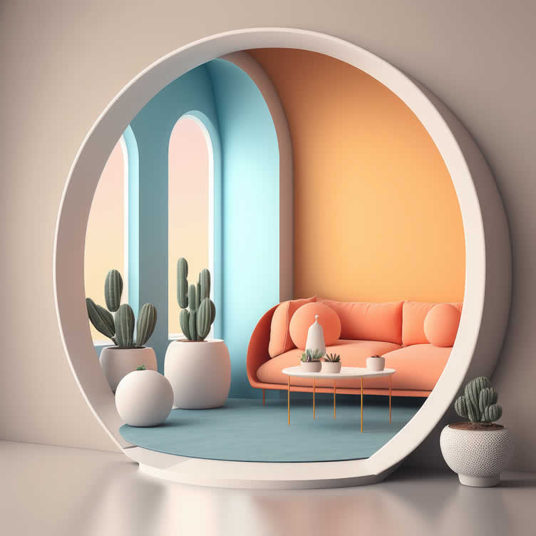
copyright image by 123rf.com
[ view diagram: wall paint color schemes ]
[ youtube: how to combine colors ]
-
-
-
ideas to view and compare from the information discussed above
Scroll up to directory … or scroll to next section about decorating interior walls with paint color …
SHARE IT ..! You might have someone in your social network who could find this informative post about decorating interior walls with paint color and styling valuable. Feel free to share it on Facebook, Twitter, LinkedIn, or Pinterest!


fourth “photo remodeling” idea
copyright image by 123rf.com
Painting Tip 4: Guide to Prepping Walls for Painting
Notes:
-
When it comes to painting walls, preparation is crucial. Whether you’re working on a new wall or repainting an existing one, proper prep work ensures a smooth, professional finish.
Skipping steps or rushing through the prep phase can lead to unsightly blemishes, uneven paint coverage, and a shorter lifespan for your paint job.
In this comprehensive section, we’ll walk you through everything you need to know about prepping walls for painting, whether it’s your first coat or a repaint project.
By the end of this review, you’ll be equipped with the knowledge and confidence to tackle your next DIY painting project with ease.
-
Quick scroll to “wall painting prep” side notes …
-
-
1st: Prepping for the First Coat
Applying the first coat of paint on a new wall is an exciting step in transforming any space. However, the key to achieving flawless results lies in meticulous preparation. For new walls, preparation involves a series of steps designed to create a pristine surface for painting.
These steps may include cleaning, smoothing out imperfections, applying primer, and ensuring the wall is completely dry and free of dust. This initial groundwork not only enhances the paint’s adherence to the wall but also contributes to a more vibrant, lasting finish.
With the right prep, your first coat of paint will lay down the foundation for a stunning, professional-quality appearance.
-
1. Cleaning
The first step in prepping a new wall is to clean it thoroughly. Dust, dirt, and grease can prevent paint from adhering properly. Here’s how to do it:
- Dust Removal:
Use a vacuum cleaner with a brush attachment to remove dust. - Grease and Grime:
For kitchen areas or other greasy spots, use a mixture of water and mild detergent. Wipe down the walls with a sponge and then rinse with clean water. - Drying:
Allow the walls to dry completely before moving on to the next step.
- Dust Removal:
-
2. Sanding
Sanding is essential for creating a smooth surface that paint can adhere to effectively.
- Materials Needed:
Fine-grit sandpaper (120-150 grit) and a sanding block. - Process:
Lightly sand the entire wall to remove any imperfections and create a slightly rough surface for the primer to grip onto. Be careful not to over-sand, as this can damage the drywall.
- Materials Needed:
-
3. Priming
Priming is a critical step, especially for new walls, as it seals the surface and provides a uniform base for the paint.
- Choose the Right Primer:
Use a high-quality primer suitable for your wall material (e.g., drywall, plaster). - Application:
Apply the primer using a roller for large areas and a brush for edges and corners. Allow the primer to dry completely as per the manufacturer’s instructions before proceeding to paint.
- Choose the Right Primer:
copyright image by 123rf.com
[ youtube: how to prep walls for painting ]
[amazon: wall sander for painting prep ]
-
-
2nd: Ensuring a Smooth Repaint
Ensuring a smooth repaint over a wall, whether it’s to refresh the existing color or to incorporate a new aesthetic, entails meticulous preparation and attention to detail.
The key to a flawless finish lies not just in the quality of the paint or the skillfulness of the application, but begins much earlier, in the preparation of the wall itself. Proper prep can transform a good painting job into an exceptional one, making the difference between a finish that lasts for years and one that disappoints.
The following steps will guide you through the essential pre-repainting processes to ensure that your walls are perfectly prepared for their transformation.
-
1. Cleaning
Just like with new walls, cleaning is the first step in repainting.
- Dust and Debris:
Use a vacuum cleaner to remove dust. - Old Paint Residue:
Wash the walls with a mixture of water and mild detergent to remove any residues from previous paint jobs. Rinse and let dry.
- Dust and Debris:
-
2. Patching
Before repainting, it’s essential to repair any holes, cracks, or imperfections in the wall.
- Materials Needed:
Spackle or joint compound, putty knife, and sandpaper. - Process:
Apply spackle or joint compound to holes and cracks using a putty knife. Smooth out the surface and let it dry. Once dry, sand the patched areas until they are flush with the rest of the wall.
- Materials Needed:
-
3. Sanding
Even if the walls were previously painted, sanding is necessary.
- Materials Needed:
Medium to fine-grit sandpaper (100-150 grit) and a sanding block. - Process:
Lightly sand the entire wall to remove any gloss from the previous paint and to smooth out patched areas.
- Materials Needed:
-
4. Priming Over Dark Paint
When covering dark paint with a lighter color, priming is essential to achieve a crisp, true color finish.
- Select a High-Hiding Primer:
Opt for a primer specifically designed to cover dark colors. These primers have better hiding abilities and will ensure the dark paint doesn’t show through the new lighter color. - Multiple Coats May Be Necessary:
In some cases, more than one coat of primer may be required to completely obscure the dark paint. Allow each coat to dry thoroughly before applying the next, as per the manufacturer’s instructions. - Tinting the Primer:
Consider tinting the primer with a bit of the new paint color. This can greatly improve coverage and reduce the number of topcoats needed for full color development.
- Select a High-Hiding Primer:
copyright image by 123rf.com
[ amazon: wall paint samples ]
[amazon: wall repair kit ]
-
-
3rd: Taping Off Before Painting
Taping off is a crucial step in the painting process, ensuring clean lines and protecting areas that should not be painted. This preparation step is vital for achieving a professional-looking finish.
It involves covering window sills, floor and ceiling moldings, light fixtures, electrical switches, and outlets to prevent them from getting painted over.
-
Window Sills
- Materials Needed:
Painter’s tape, newspaper or plastic sheeting. - Process:
Apply painter’s tape along the edges of the window sills. Cover the sill surface with newspaper or plastic sheeting for additional protection. Press firmly along the edge of the tape to ensure a tight seal to prevent paint bleed.
- Materials Needed:
-
Door Sills
- Materials Needed:
Painter’s tape, drop cloths or plastic sheeting. - Process:
Similar to window sills, start by applying painter’s tape along the edges of the door sills. Ensure the tape adheres well to avoid any paint bleeding underneath. - After securing the tape, lay drop cloths or plastic sheeting over the door sill and adjacent floor area for added protection. This step ensures that the door sills remain paint-free and clean, contributing to a neat and precise painting job.
- Materials Needed:
-
Floor and Ceiling Molding
- Materials Needed:
Painter’s tape. - Process:
Apply painter’s tape directly on the edges where the moldings meet the wall. Ensure the tape is straight and firmly pressed down to seal the edges properly. This prevents paint from seeping underneath.
- Materials Needed:
-
Light Fixtures
- Materials Needed:
Painter’s tape, plastic bags or wrap. - Process:
If possible, remove the light fixtures. If not, turn off the power, and cover the fixtures with plastic bags or wrap, securing them with painter’s tape. Make sure all parts susceptible to paint splatters are covered.
- Materials Needed:
-
Electrical Switches and Outlets
- Materials Needed:
Screwdriver, painter’s tape. - Process:
First, turn off the electricity to the room. Use a screwdriver to remove the covers of electrical switches and outlets. Tape over the switches and outlets with painter’s tape to protect them during painting.
- Materials Needed:
Taping off might seem time-consuming, but it’s a step that significantly contributes to the end result of a painting project. Not only does it protect various fixtures and finishes from unwanted paint, but it also ensures that paint lines are crisp and clean.
Proper taping off means less cleanup and corrections later, allowing for a more efficient and satisfying painting experience.
copyright image by 123rf.com
[ amazon: painting masking tape ]
[amazon: painting plastic sheeting ]
-
-
4th: Preparing Furniture and Flooring for Painting
Preparing your furniture and flooring before starting a painting project is crucial to achieve a clean and professional finish.
Properly covering or moving furniture and flooring helps protect them from drips, spills, and splatters, which are common when painting. This step not only saves time and effort in cleanup but also safeguards your belongings from potential damage.
Below are detailed instructions on how to prepare your furniture and flooring for the painting process.
-
Furniture
- Materials Needed:
Plastic sheeting or old sheets, painter’s tape. - Process:
Move furniture to the center of the room, away from walls. This creates a buffer zone preventing accidental paint contact. Cover the furniture with plastic sheeting or old sheets, ensuring complete coverage. - Use painter’s tape to secure the coverings in place, especially if using plastic sheeting, to prevent it from slipping off. If the room is small or painting a large area, consider moving furniture out of the room temporarily.
- Materials Needed:
-
Flooring
- Materials Needed:
Drop cloths or heavy-duty paper, painter’s tape. - Process:
Protect your flooring by laying down drop cloths or heavy-duty paper, especially in areas directly beneath the walls being painted. Secure the edges with painter’s tape to prevent them from moving and to provide a tight seal against paint drips. - Pay special attention to corners and edges, as these areas are more prone to collecting drops of paint. For carpeted areas, tucking the edge of the drop cloth beneath the baseboard can offer additional protection.
- Materials Needed:
-
Windows and Door Frames
- Materials Needed:
Painter’s tape, plastic sheeting or newspaper. - Process:
To protect windows and door frames, cover the glass and frame with plastic sheeting or newspaper, securing it with painter’s tape. Make sure the tape is firmly applied to avoid slipping or paint leakage. This not only protects the surfaces but also makes cleaning up much faster and easier.
- Materials Needed:
copyright image by 123rf.com
[ amazon: furniture covers ]
[amazon: drop clothes ]
-
-
5th: Prepping Tools
Preparing a room for painting and executing the painting job itself requires a specific set of tools designed to ensure efficiency, precision, and a clean working environment.
From the initial preparation phase to the final touches of paint application, each tool plays a pivotal role in achieving a professional-looking finish.
Below, we outline the essential tools needed for prepping the room for painting and the key painting tools required for the job.
-
Prepping Tools
- Masking Tape:
This product secures drop cloths and protects window panes, door frames, and baseboards during painting. Designed for clean, sharp lines, it prevents paint bleed on protected areas. Its adhesive strength holds materials without leaving residue, essential for professional painting results. - Sandpaper/Sanding Block:
Sanding smooths out imperfections on walls or furniture. Start with coarse grit sandpaper for rough areas to remove big blemishes and uneven spots. Then, switch to fine grit sandpaper for a smooth, flawless finish. This step-by-step approach prepares surfaces for painting or varnishing, ensuring a professional look. - Spackle and Putty Knife:
Spackle, a versatile material, fills small holes, dents, or cracks in walls for a smooth surface. It’s key for home repair and renovations, ensuring a smooth finish before painting. A putty knife is crucial for applying spackle into imperfections and smoothing it out, making repairs blend seamlessly with the area.
- Masking Tape:
-
Painting Tools
- Paint Brushes:
A selection of high-quality brushes in various sizes is critical for precision work around edges, corners, and trims. Angled brushes are particularly useful for cutting in at the ceiling or painting window frames. - Rollers and Roller Covers:
Rollers provide a more efficient way to cover large surface areas quickly. The choice of roller cover depends on the paint type and surface texture, with different naps suited for smooth or rough surfaces. - Extension Pole:
Using an extension pole with the paint roller can greatly minimize the necessity for ladders, thereby enhancing safety and efficiency during painting projects. Additionally, it allows for maintaining consistent pressure when applying paint to higher walls, ensuring an even and smooth finish across the surface. - This not only speeds up the painting process but also reduces the physical strain on the painter, making it an essential tool for both professionals and DIY enthusiasts.
- Paint Tray and Liners:
Utilizing a robust paint tray equipped with disposable liners is an efficient way to control the quantity of paint utilized during a project. This setup not only ensures that paint is used economically but also significantly simplifies the cleanup process afterward, making it a practical solution for both amateur and professional painters alike. - Painting Ladder:
An adjustable, sturdy ladder is indispensable for reaching higher areas safely. Ensure it is stable and suitable for the weight capacity required for the job. Ladders with shelf platforms are particularly helpful for holding paint and tools, minimizing the need to climb down frequently. - Paint Cleanup Supplies:
Having a variety of items for cleaning up after painting is essential. These can include soap, sponges, and rags for wiping up spills. Plastic sheeting and painter’s tape should be removed while the paint is still slightly wet to avoid tearing the paint off walls or trim. - Mineral Spirits:
For oil-based paints, mineral spirits are invaluable for cleaning brushes and other tools. They can also be used to thin oil-based paints and varnishes or to clean surfaces before painting. Always ensure adequate ventilation when using mineral spirits due to their strong fumes. - Paint Stirrer:
A paint stirrer is crucial for mixing paint thoroughly before application. This tool ensures that the pigment and solvents are evenly distributed, resulting in a consistent color and texture throughout your painting project. - Whether a simple wooden stick or a specialized mechanical mixer, ensuring your paint is well mixed can make the difference in achieving professional-looking results.
- Paint Brushes:
copyright image by 123rf.com
-
-
6th: Safety Tools and Tips for Painting a Room
Ensuring safety while painting a room is crucial to prevent accidents and health issues. The right safety tools can protect you from potential hazards such as falls, inhalation of fumes, and skin contact with irritants.
Here are some essential safety tools and tips to consider before starting your painting project.
-
Personal Protective Equipment (PPE)
Wearing appropriate personal protective equipment is essential to safeguard against potential risks. This includes wearing gloves to protect your skin from paint and solvents, goggles to shield your eyes from splashes, and a mask or respirator to avoid inhaling dust and chemical fumes.
It’s particularly important to use a respirator if you’re working in a poorly ventilated area or using oil-based paints.
-
Ventilation
Proper ventilation is crucial when painting indoors to reduce the inhalation of volatile organic compounds (VOCs) and other chemical fumes. Open windows and doors to ensure a flow of fresh air. Use fans to circulate air out of the room.
If working in a space without windows, consider using an air purifier to help remove contaminants from the air.
-
Ladder Safety
When using a ladder, make sure it is stable and securely positioned. Avoid overreaching; instead, move the ladder frequently to keep your work within easy reach.
Always keep three points of contact with the ladder (two feet and one hand or two hands and one foot) to maintain balance.
-
Safe Storage of Materials
Store paint cans and solvents securely, away from heat sources and out of reach of children and pets. Properly seal containers after use to prevent spills and ensure that products do not dry out or become unusable.
By following these safety tools and tips, you can minimize risks and enjoy a successful painting project with beautiful results. Safety should always come first, ensuring that your DIY project is both enjoyable and free from accidents.
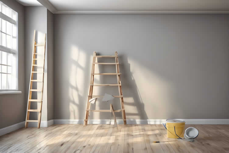
AI generated image by 123rf.com
-
-
-
ideas to view and compare from the information discussed above
Scroll up to directory … or scroll to next section about decorating interior walls with paint color …



Budgeting Worksheet For Costing Interior Painting and Home Improvement Decisions
 File Type (excel)
DIY tools in home improvement
fifth “photo remodeling” idea
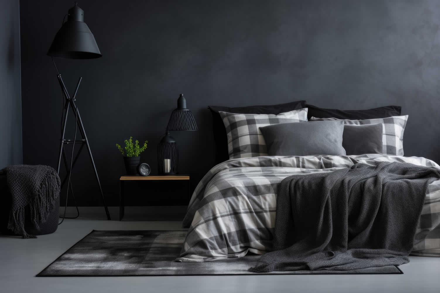
copyright image by 123rf.com
Painting Tip 5: Starting the Painting Process
Notes:
-
Before you begin painting, it’s essential to properly prepare your workspace to ensure a smooth and efficient process. Start by clearing the area of any furniture and personal items. If certain items cannot be moved, cover them with drop cloths or plastic sheeting to protect them from paint splatters.
Next, take the time to clean the walls, removing dust, dirt, and grease spots to ensure the paint adheres well. Patching any holes or cracks and sanding rough surfaces will help achieve a flawless finish.
[ see topic above: prepping the room prior to painting ]
-
Gathering Supplies
Having all your supplies on hand before you start can save you time and effort. Essential supplies include paint, brushes, rollers, painter’s tape, drop cloths, and a paint tray.
Depending on the scope of your project, you may also need a ladder, an extension pole for hard-to-reach areas, and a paint edger.
Make sure to choose the right type of paint for your specific surface and the appropriate brushes and rollers for the texture and size of the area you are painting.
-
Priming the Surface
Priming is a crucial step in the painting process that shouldn’t be overlooked. A good primer will help seal the surface, provide a uniform base for the paint, and enhance the paint’s adhesion and durability.
Apply primer evenly across your wall, allowing it to dry completely before moving on to the actual painting. For surfaces with stains or different textures, a stain-blocking primer can be particularly effective in ensuring consistent color and finish.
-
-
Quick scroll to “how-to painting” side notes …
-
-
1st: How to Paint Interior Walls and Ceiling
Transforming a room with a fresh coat of paint can be a highly rewarding DIY project. To achieve a professional finish, it’s essential to follow a systematic approach.
This guide walks you through each step of painting interior walls and ceilings, ensuring a smooth and polished result.
-
Preparation
Begin by preparing the room for painting. Remove all furniture or cover it with drop cloths to prevent paint splatters. Use painter’s tape to mask off trim, windows, and other areas you do not want to paint.
Clean the walls and ceiling to remove dust, dirt, or grease that could affect paint adhesion. Fill any holes or cracks with spackle and sand them smooth once dry.
-
Priming
Priming the surfaces is crucial, especially if you are painting over dark colors or new drywall. Apply a coat of primer to the walls and ceiling to ensure the paint adheres well and the color appears vibrant.
Allow the primer to dry completely as per the manufacturer’s instructions.
-
Cutting In
Start by "cutting in," which means painting the edges and corners of walls and around trim where rollers can’t reach. Use a high-quality angled brush to create clean lines.
Carefully paint a 2-3 inch border along the ceiling, baseboard, and interior corners.
-
Rolling the Ceiling
Once the cutting in is complete, paint the ceiling using a roller with an extension pole for easy reach. Start in one corner and work in small sections, applying the paint in a "W" or "M" pattern.
This technique ensures even coverage and prevents streaks. Allow the first coat to dry before applying a second coat if necessary.
-
Rolling the Walls
After the ceiling, move on to painting the walls. Use a thicker nap roller for textured walls or a thinner one for smooth surfaces. Apply the paint in the same "W" or "M" pattern, working from top to bottom to catch any drips.
Blend each section well by lightly rolling over it one last time in long, sweeping strokes.
-
Final Touches
Once the paint is completely dry, remove the painter’s tape carefully to avoid pulling off any fresh paint. Touch up any areas that need attention with a small brush for a flawless finish.
Replace the room’s furniture and décor, standing back to admire your handiwork.
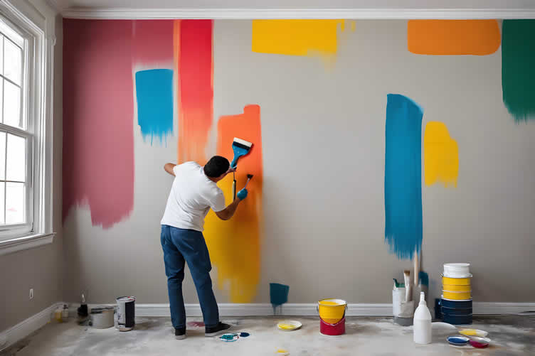
AI generated image by 123rf.com
[ diagram: painting a room how-to ]
[ youtube: how to paint a room ]
-
-
2nd: Drying Time and Second Coat
The drying time of paint is a crucial aspect to consider for achieving a flawless finish. Generally, latex or water-based paints typically dry to the touch within one hour, but they require approximately four hours before you can safely apply a second coat.
Oil-based paints take longer, often needing 6 to 8 hours to be dry to the touch and at least 24 hours before a second coat is possible. Various factors influence drying times, such as humidity, temperature, and air circulation.
Higher humidity or lower temperatures can extend drying periods, whereas proper ventilation and moderate temperatures expedite the process.
It’s essential to follow the paint manufacturer’s recommendations and be patient during this phase to ensure the paint cures properly for a durable and beautiful result.
-
Do You Need a Second Coat of Paint?
Determining whether a second coat of paint is necessary depends on several factors, including the type of paint used, the color change, and the surface being painted.
While high-quality paints often provide better coverage with a single coat, most painting projects benefit from a second coat for an even, professional look. Darker colors usually require more layers to achieve full opacity and richness, as do surfaces with significant color changes.
Additionally, a second coat can enhance durability and longevity, ensuring the paint stands up to wear and tear over time. Always evaluate the initial coat after it has dried completely to assess coverage and consistency before deciding to apply a second layer.
Taking the extra time for a second coat often results in a more polished and resilient finish.
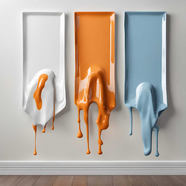
AI generated image by 123rf.com
[ youtube: drying between coats of paint ]
[ youtube: two coats of paint vs one coat ]
-
-
3rd: Mistakes to Avoid When Painting
Completing a paint job requires meticulous attention to detail to ensure the final product matches the initial vision. Therefore, conducting thorough prep work and research is crucial.
Similarly, it’s important to avoid the following common mistakes that could ruin your project.
- Skipping Surface Preparation:
Failing to clean and prime the walls before painting can lead to poor adhesion, causing the paint to peel or crack over time. Always ensure the surface is free of dust, dirt, and grease. - Using Low-Quality Tools:
Investing in high-quality brushes, rollers, and painter’s tape will make a significant difference in the final finish. Cheap tools can leave streaks or shed bristles into the paint. - Applying Too Much Paint at Once:
Overloading your brush or roller can result in drips and uneven coverage. Apply paint in thin, even layers for a smooth finish. - Neglecting to Use Primer:
Primer is essential for covering stains, creating a uniform surface, and ensuring the paint adheres well. Skipping this step can result in a sub-par finish and uneven color. - Ignoring Weather Conditions:
High humidity and extreme temperatures can affect paint drying times and the overall finish. Ensure you paint in ideal weather conditions for the best results. - Painting Over Wet Paint:
Rushing the process by applying additional coats before the previous one has dried can lead to paint lifting or smudging. Be patient and allow adequate drying time between coats. - Not Testing Paint Colors:
Colors can look different once dried and under various lighting conditions. Always test paint colors on a small area before committing to the entire room to ensure satisfaction with the final result. - Forgetting to Protect Surrounding Areas:
Failing to cover floors, furniture, and hardware can result in unwanted paint splatters. Use drop cloths and painter’s tape to safeguard these surfaces.
Avoiding these common painting mistakes will help you achieve a professional-looking finish and ensure your paint job stays beautiful and durable for years to come.

copyright image by 123rf.com
[ diagram: 10 common painting mistakes (trim) ]
[ youtube: your paint look terrible ]
- Skipping Surface Preparation:
-
4th: Hiring a Professional Painter: Pros and Cons
When it comes to achieving a flawless finish and saving time on your painting project, hiring a professional painter can be a wise decision. Professional painters bring expertise, efficiency, and quality workmanship to ensure your space looks its best.
Here are some pros and cons to consider when deciding whether to hire a professional painter.
-
Pros:
- Expertise and Experience:
Professional painters have the skills and knowledge to handle various painting techniques, surface preparations, and paint types. Their experience ensures that the job is done efficiently and to a high standard. - Quality of Work:
A professional painter pays attention to details that might be overlooked by a novice. From smooth, even coats to sharp edges and no drips or streaks, the quality of their work is often superior. - Time-Saving:
Painting can be a time-consuming task, especially for larger projects. Professional painters can complete the job more quickly, allowing you to focus on other responsibilities or enjoy your revamped space sooner. - Proper Equipment:
A professional painter comes equipped with the right tools and equipment to handle the job effectively. This includes high-quality brushes, rollers, ladders, and sometimes even scaffolding for high or hard-to-reach areas. - Stress Reduction:
Hiring a professional painter can reduce the stress and hassle associated with a DIY painting project. You can avoid the mess, frustration, and physical exertion involved in painting.
- Expertise and Experience:
-
Cons:
- Cost:
One of the main drawbacks of hiring a professional painter is the cost. Professional services can be expensive, depending on the size and complexity of the project. - Scheduling:
Depending on their availability, you might need to wait for the professional painter to fit your project into their schedule. This could delay your project if you’re on a tight timeline. - Less Control:
When hiring someone else to do the work, you may have less control over certain aspects of the project, such as the exact techniques used or the pace at which the work is completed. Clear communication is essential to ensure your expectations are met. - Insurance and Liability:
While many professional painters carry their own insurance, it’s important to verify this beforehand. Without proper insurance, you could be liable for any damages or accidents that occur during the project.
- Cost:
In conclusion, hiring a professional painter can be advantageous for ensuring a high-quality finish and saving time. However, it is crucial to weigh the costs and potential inconveniences against the benefits of achieving a polished and durable paint job.
Careful consideration and clear communication with your chosen professional can help you achieve the best results for your painting project.

copyright image by 123rf.com
Where to Find a Professional Painter
Finding a professional painter involves several steps to ensure you hire someone who is reliable, skilled, and fits within your budget. Begin by seeking recommendations from friends, family, or neighbors who have recently had painting work done.
Personal referrals are often the most trustworthy sources. Additionally, online platforms such as Yelp, Angie’s List, and Houzz offer reviews and ratings of local painters. These websites can provide insight into the experiences of past clients, helping you narrow down your options.
Another valuable resource is social media. Many professionals showcase their work on platforms like Instagram and Facebook. By browsing these sites, you can see examples of their craftsmanship and get a sense of their style and attention to detail.
Local hardware and paint stores can also be helpful; they often have connections with experienced painters and may provide recommendations.
Finally, don’t forget to check with professional organizations such as the Painting and Decorating Association or local trade groups. These institutions often have directories of certified and licensed painters who adhere to industry standards.
By covering all these avenues, you can compile a list of potential painters, compare their services, and select the best fit for your project.
LetsRenovate has partnered with HomeAdvisor™, a renowned provider of highly-rated, carefully-vetted painting contractors. Start your search here by choosing the type of contractor you need and entering your zip code to find local painting professionals.
But Wait!
Before starting the search and evaluation process for contractors, it is highly recommended to download and utilize this comprehensive worksheet. This will help ensure that you have all the necessary information and tools at your disposal to make informed decisions and streamline the entire process.
This resource will assist in impartially ranking and evaluating potential contractors, taking into consideration essential factors such as pricing,

Evaluation Sheet
File Type: -
-
-
ideas to view and compare from the information discussed above
Scroll up to directory … or scroll to next section about decorating interior walls with paint color …
below for …
professional painting services
interior wall and other home improvement decisions


Calendar For:
Home Maintenance
File Type:

Find Walls & Ceiling Services (opens new win) Drywall Installation Ceilings Painting & Texturing Tile top-rated, pre-screened local contractors Wallcoverings Ceilings – Fans Walls – Exterior Walls – Interior FREE: download contractor selection enter zip code – powered by HomeAdvisor ™
Quick Contractor Guides selecting negotiating working with inspecting

sixth and last “photo remodeling” idea

copyright image by 123rf.com
Painting Tip 6: Decorating the Wall Once the Paint Job is Completed
Notes:
-
Once the paint job is completed and has properly dried, it’s time to think about how to decorate your freshly painted wall to enhance its appeal.
Start by selecting art pieces or photographs that complement the new color. Large statement pieces can serve as focal points, while a collection of smaller items can create an engaging gallery wall.
Consider the use of shelving to add both decoration and functionality. Floating shelves can display personal treasures, plants, or books, contributing to a cozy and personalized space.
Additionally, mirrors are an excellent choice, as they can make the room appear larger and brighter by reflecting light.
Another option is to add texture through wall hangings or tapestries, which can introduce a new dimension and warmth to the area.
Whether your style is modern, rustic, or eclectic, thoughtful wall decorations can bring your freshly painted room to life.
-
Quirk scroll to topic "decorating walls" side notes …
-
-
1st: Adding and Balancing Wall Art and Other Decor Elements
Once your walls have been freshly painted, the next step is to enhance their visual appeal through the addition of wall art and other decor elements. Decorating your walls thoughtfully can transform a plain space into a personalized and stylish environment.
Here are several tips to help you add and balance decor on your finished wall paint.
-
Choose a Focal Point
Start by selecting a focal point for your wall. This could be a large piece of artwork, a decorative mirror, or a gallery of smaller items arranged in a cohesive manner.
The focal point should catch the eye and set the tone for the rest of the decor. Ensure that it is proportionate to the size of the wall and the room to avoid overwhelming or underwhelming the space.
-
Play with Scale and Proportion
Balancing the various elements on your wall requires careful consideration of scale and proportion. Mix and match different sizes and shapes of art and decor, but make sure there is a harmonious balance.
For example, you can pair a large painting with smaller, complementary pieces to create a dynamic composition.
-
Consider Color Coordination
Color coordination is crucial when adding decor to a freshly painted wall. Choose art and decorative items that either complement or contrast with your wall paint.
Complementary colors offer a more subtle and harmonious look, while contrasting colors can make the decor stand out and create a vibrant atmosphere. Keep the overall color scheme of the room in mind to ensure a cohesive design.
-
Utilize Symmetry and Asymmetry
Symmetrical arrangements can provide a sense of order and balance to your space. Hanging two identical frames on either side of a central piece can create a pleasing and structured look.
On the other hand, asymmetrical arrangements can add interest and dynamism. Experiment with different layouts to see what works best for your space.
-
Incorporate Different Textures
Incorporating a variety of textures into your wall decor can add depth and interest. Consider using textiles, such as woven wall hangings or fabric panels, alongside traditional framed art.
Metallic elements like mirrors or sconces can add a reflective quality and contrast beautifully with softer textures.
-
Use Proper Spacing
Proper spacing between decor elements is essential to avoid a cluttered look. Leave enough space between pieces to let each item stand out but ensure they are close enough to be visually connected.
A good rule of thumb is to maintain at least two to three inches of space between smaller items and more for larger items.
-
Layering and Depth
Create a sense of layering and depth by overlapping different pieces. For example, you can lean a framed picture against the wall on a shelf or mantel and place smaller items in front of it.
This technique adds dimension and makes the arrangement more engaging.
copyright image by pexels.com
-
-
2nd: Add Molding and Trim
Adding Molding and Trim to Your Paint Job
Adding molding and trim can significantly enhance the overall look of your painted walls, providing a polished and sophisticated finish. There are several types of molding and trim, each with its own unique characteristics and ideal placement.
-
Crown Molding
This type sits at the junction between the walls and the ceiling, adding a touch of elegance and drawing attention upward. Crown molding comes in various styles and sizes, making it easy to find the perfect match for your room’s decor.
-
Baseboards
Positioned at the bottom of the walls where they meet the floor, baseboards serve both a decorative and practical purpose. They help conceal any gaps between the wall and floor while protecting the lower part of the wall from damage.
-
Chair Rail
Typically installed about one-third of the way up from the floor, chair rails are both decorative and functional. They protect walls from being scuffed by chairs and can also be used to highlight different paint colors or wallpaper on the upper and lower sections of the wall.
-
Window and Door Casings
These trims frame windows and doors, giving them a defined and finished look. They can be intricate or simple, complementing the overall design of your space.
-
Picture Rail
A picture rail is installed horizontally along the wall, usually near the ceiling but below crown molding if both are used. It allows for easy hanging of artwork without damaging walls and adds a historical charm to the room.
Positioning these moldings and trims correctly can elevate the style of your interior, creating a seamless transition between different surfaces and adding architectural interest.
Whether you opt for a minimalist look or intricate designs, these elements will contribute to a harmonious and refined appearance in your home.

copyright image by 123rf.com
-
-
3rd: Incorporate an Oversize Clock
Adding an oversize clock can serve as a striking focal point that blends seamlessly with your newly painted walls. The large scale of the clock can make a statement, drawing the eye and creating a sense of grandeur in the room.
Choose a clock that complements your color scheme and overall decor style. For instance, a sleek, minimalist clock in a metallic finish can add a modern touch, while a rustic wooden clock can offer a warm, vintage feel.
The key is to ensure that the clock is proportional to the wall and the furniture around it, so it doesn’t overwhelm the space. Position it thoughtfully, perhaps above a mantelpiece or centered on a large, blank wall, to maximize its visual impact.
An oversize clock not only helps keep time but also enhances the aesthetic appeal of your room, making it a functional yet decorative addition.

copyright image by 123rf.com
-
-
FINAL REMARKS
Transforming your interior walls with color and style can be a rewarding project that breathes new life into your home. By carefully selecting which walls to paint, choosing the perfect color, experimenting with styling techniques, and adding elegant accents, you can achieve a masterful look that reflects your personal taste.
We hope this guide has inspired you to embark on your wall decoration journey. We’d love to hear about your experiences and see your stunning transformations. Share your projects and tips in the comments below, and don’t forget to subscribe for more home decor inspiration and ideas!
-
ideas to view and compare from the information discussed above
- What comments can you share about
decorating interior walls with paint color?
Scroll up to directory … or scroll to more home structural-related topics …
view illustration “becoming a bank”


home remodeling – improvement – repair
Cover image credit: decorating interior walls with paint color by 123rf.com
end of post … please share it!
 |
did you find this guide to decorating interior walls with paint color analysis helpful? If so, please share the article with your friends and family! |
Nice pic idea? Leave us a quick comment below.
And please share this pic idea within your social networks.