Summary Outline –
Warm earth-tone palettes—spanning caramel, terracotta, clay, wheat, taupe, chocolate brown, olive, burgundy, and dusty sage—have emerged as the defining color story of contemporary interior design.
These shades don’t just decorate a room; they anchor it, creating spaces that feel instinctively comfortable and authentically human.
Whether you’re refreshing a single room or re-imagining your entire home, these nine shades offer a versatile, timeless foundation to build from.
- post content … analysis/ warm earth-tone palettes

-
- —— begin first topic ——
-
1st TERM: Caramel: The Welcoming Foundation
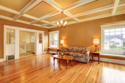
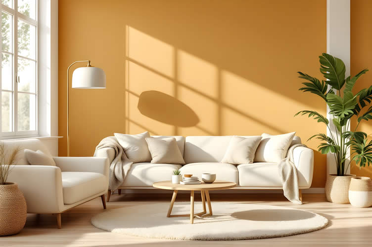
Few colors communicate warmth as effortlessly as caramel. This golden-amber hue carries the visual weight of sunlit afternoons, making it an ideal choice for creating focal points that draw people in rather than push them away.
As an accent wall color, caramel adds depth without darkening a room, and it pairs beautifully with cream linens and brushed brass hardware. Interior designers frequently recommend it for living rooms and dining areas where the goal is to encourage lingering conversation and a sense of ease.
Its approachability makes it one of the most forgiving earth tones to introduce into an existing space.

AI generated image by 123rf.com
The Power of the Perfect Palette
Choosing the right color palette for your interior painting can dramatically transform your living space, making it feel more inviting and tailored to your personal style.

Warm earth tones, such as soft browns, muted oranges, and gentle beige hues, create a sense of comfort and tranquility.
These colors not only connect your home to nature but also make each room feel cozier and more welcoming, offering a sanctuary-like atmosphere for you and your loved ones.
view ideas: Choosing the Perfect Color for Your Home(new win)

-
Scroll up to main directory … or scroll to next “warm earth-tone palettes” section …


-
-
-
2nd TERM: Terracotta: Earthy Authenticity
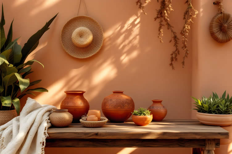
Terracotta carries centuries of human history within its burnt-orange warmth. Used in Mediterranean pottery, Southwestern adobe, and bohemian-inspired interiors alike, this shade bridges cultures and design philosophies with rare confidence.
Its natural red-clay undertones give rooms a sense of handcrafted authenticity that more synthetic colors simply cannot replicate.
Research published in the Journal of Environmental Psychology (2024) suggests that warm, reddish hues in interior spaces can elevate mood and promote social connection—making terracotta a particularly compelling choice for communal areas.
Paired with rattan furniture, linen textiles, and unglazed ceramics, terracotta creates spaces that feel lived-in and lovingly curated.
AI generated image by 123rf.com
Make Painting a Joyful Process
Any interior paint project can become an easy and rewarding DIY endeavor when you’re equipped with the right tools.
Quality brushes, rollers, painter’s tape, and drop cloths can make all the difference in achieving a smooth, professional finish.
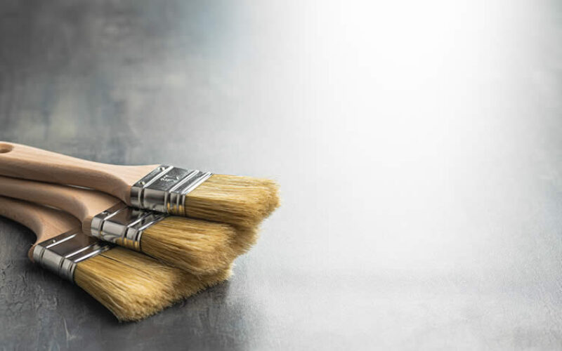
With the right preparation and the proper materials, you’ll feel confident and ready to transform your space into something truly special.
view ideas: DIY Interior Home Painting Tools(new win)
-
Scroll up to main directory … or scroll to next “warm earth-tone palettes” section …
-
-
-
-
3rd TERM: Clay: Neutral Sophistication
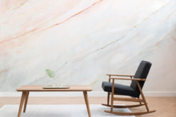
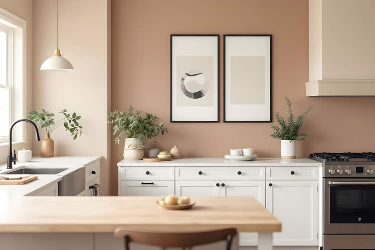
Clay occupies the quieter end of the earth-tone spectrum, offering a muted, dusty warmth that suits both minimalist and eclectic interiors with equal grace. Unlike its more saturated counterparts, clay doesn’t demand attention—it simply creates an atmosphere of understated refinement.
This makes it an especially valuable tool for layering. A clay-painted wall recedes gracefully, allowing furniture silhouettes, artwork, and natural textures to take center stage.
For designers working with open-plan spaces, clay’s neutral sophistication helps unify different functional zones without imposing a rigid visual boundary.
AI generated image by 123rf.com
Enhancing Your Home’s Ambiance
When it comes to enhancing your living space, exploring interior home designs is an essential first step.
By reviewing different styles, layouts, and color schemes, you can uncover elements that align with your personal taste and practical needs.

Thoughtful choices, like warm earth tones or natural light, can instantly elevate your home’s ambiance and turn it into a true sanctuary.
view ideas: Deciding Home Interior Design(new win)
-
Scroll up to main directory … or scroll to next “warm earth-tone palettes” section …
-
-

Tackling home upgrades and fulfilling all your home improvement needs …

… save this curated directory of ideas for future reference.

-
-
4th TERM: Wheat: Light and Airy Warmth
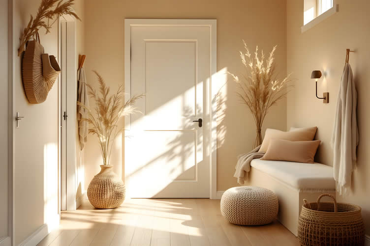
Wheat is the earth-tone palette’s most luminous member. This pale, golden-beige shade retains the warmth of its richer relatives while reflecting more light—making it an outstanding choice for smaller rooms, north-facing spaces, or any area where brightness is a priority.
Unlike stark white, wheat never feels clinical or cold. It wraps a room in a gentle, honeyed glow that feels genuinely welcoming.
Layering wheat tones across walls, soft furnishings, and flooring creates a tonal, enveloping effect that interior designers often describe as "cocoon-like"—a quality that resonates strongly with current desires for restorative home environments.
AI generated image by 123rf.com
Choosing the Right Reflective Glass
A well-placed mirror can completely transform the feeling of a room, blending elegance with practicality.
By reflecting light and creating the illusion of depth, mirrors make cramped spaces feel open and inviting, while brightening dim corners with bounced sunlight.

Whether framed in rustic wood or sleek metal, the right mirror serves as both a functional piece and a stylish statement — perfect for crafting your sanctuary.
view ideas: Mirror, Mirror on the Wall(new win)
-
Scroll up to main directory … or scroll to next “warm earth-tone palettes” section …
-
-
-
-
5th TERM: Taupe: The Versatile Bridge
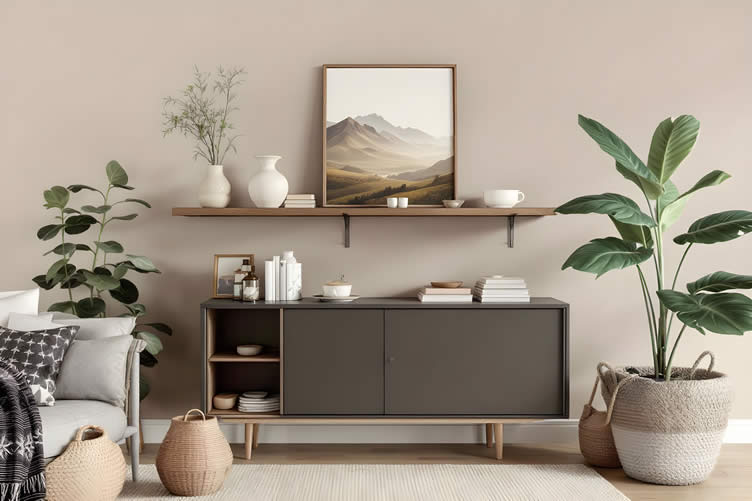
Taupe may be the most quietly indispensable color in the earth-tone family. Sitting at the intersection of warm gray and soft brown, it functions as a visual bridge—connecting bolder accent colors, grounding high-contrast palettes, and harmonizing disparate design elements into a cohesive whole.
Its neutrality is a strength, not a limitation. Taupe reads differently depending on the light and the colors surrounding it, shifting toward lavender in cool northern light and toward caramel in warm southern exposure.
This chameleonic quality makes it a reliable foundation for rooms that need to accommodate evolving décor without requiring a full repaint.
AI generated image by 123rf.com
The Art of Timekeeping
The right clock is more than a timekeeping tool—it’s an opportunity to elevate any room’s character.
A well-chosen clock can transform a bare wall into a striking focal point, tie your décor together, or add sophistication to a mantelpiece.

Whether you prefer modern minimalism, vintage charm, or bold statement pieces, the perfect clock balances functionality and style, creating a space that feels both inviting and intentional.
view ideas: Choosing the Perfect Home Timepieces(new win)
-
Scroll up to main directory … or scroll to next “warm earth-tone palettes” section …
-
-

Download this PDF for a concise summary of everything you need to know about …?

SHARE IT ..! Someone in your network might benefit from this insightful post about trending warm earth-tone palettes. Feel free to share it on Facebook, X (formally Twitter), LinkedIn, or Pinterest!


-
-
6th TERM: Chocolate Brown: Deep Richness
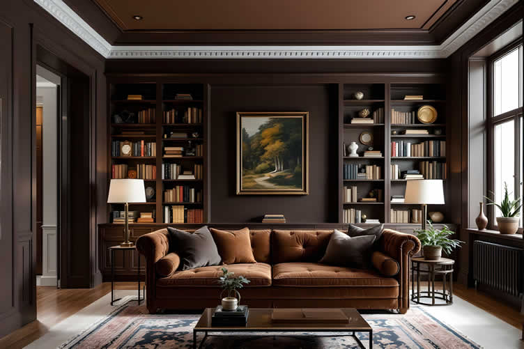
Chocolate brown brings a sense of grounding drama that few colors can match. When used intentionally—as a statement ceiling, a library wall, or an upholstered anchor piece—it creates a luxurious depth that transforms a room’s entire atmosphere.
Far from heavy or oppressive, chocolate brown used in balanced proportions feels deeply sophisticated. It pairs exceptionally well with cream, caramel, and dusty sage, and its affinity for natural wood makes it a natural fit for spaces layered with warm timber tones.
A 2023 survey by Houzz found that deep, saturated accent colors—including rich browns—were among the top requests from homeowners undertaking major renovations, reflecting a growing appetite for bold, considered color choices.
AI generated image by 123rf.com
Design Tricks for a Roomier Feel
Crafting a visually spacious room comes down to balancing color, light, and layout.
Light, neutral tones paired with strategic lighting can brighten and open up your space, making it feel larger and more inviting.

Adding mirrors and placing furniture thoughtfully can further amplify this effect, reflecting light and elongating the room’s dimensions.
Even small changes, like choosing sheer curtains or decluttering, can breathe new life into even the coziest spaces.
view ideas: Spatial Illusions(new win)
-
Scroll up to main directory … or scroll to next “warm earth-tone palettes” section …
-
-
-
-
7th TERM: Olive: Nature-Inspired Depth
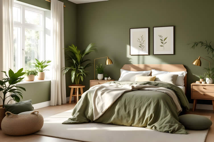
Olive green occupies a singular place in the earth-tone palette—complex, layered, and deeply connected to the natural world.
Its yellow-green base carries the quiet authority of ancient landscapes: hillside groves, marshland, and the underside of a broad leaf in afternoon light. In interiors, olive functions as both a neutral and an accent, depending on how it is used.
A matte olive wall creates a sophisticated, organic backdrop for natural materials, while olive upholstery introduces depth without the visual weight of darker shades.
It pairs especially well with terracotta, chocolate brown, and warm brass accents, building palettes of considerable sophistication.
AI generated image by 123rf.com
The Joy of Welcoming Greenery
Bringing a new plant home is always a moment of joy.
You carefully select the perfect pot, imagining how it complements your décor, and picture the vibrant energy the plant will add to your space.
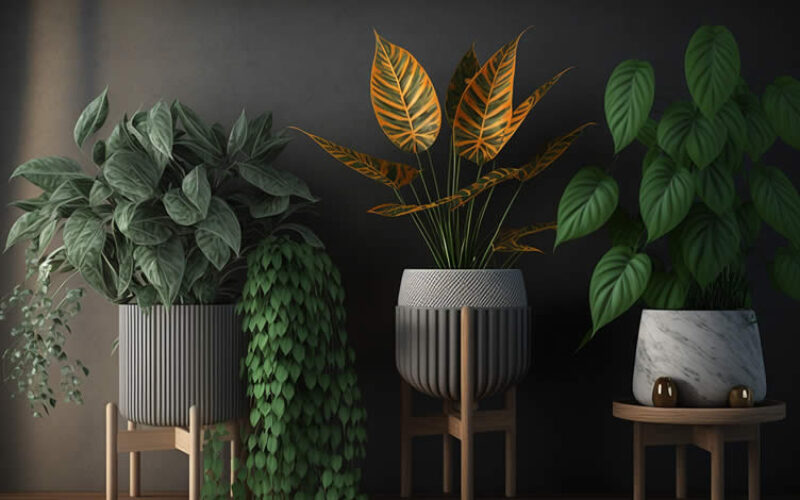
There’s a deep sense of nurturing as you anticipate watching its leaves flourish, knowing that a little care and attention will help it thrive.
This small yet meaningful addition has the power to transform your home into a calming, lively sanctuary.
view ideas: Guide to Indoor Plant Stands(new win)
Houseplant Display
google imagesclassical display view samples modern display view samples pedestal display view samples shelf display view samples ladder display view samples hanging display view samples mounted display view samples terrarium display view samples -
Scroll up to main directory … or scroll to next “warm earth-tone palettes” section …
-
-
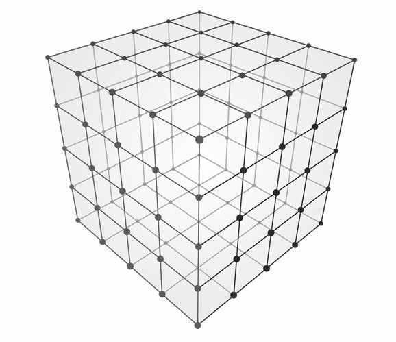
Easily determine the dimensions you need for any home remodeling project …
… ensuring functionality, visual appeal, and compliance with building codes.
… home remodeling and improvement

-
-
8th TERM: Burgundy: Sophisticated Warmth
Burgundy earns its place in the earth-tone family through its underlying warmth—a deep, wine-red hue that carries none of the coolness of true crimson.
In interior applications, it functions as an anchor of refinement, elevating surrounding neutrals and lending spaces a sense of considered luxury.
Used as a velvet accent chair, a painted alcove, or a richly patterned rug, burgundy introduces visual drama that feels intentional rather than overpowering.
Its pairing potential is broad: alongside taupe and wheat, it reads as stately and understated; alongside olive and chocolate brown, it creates a palette of layered, jewel-toned earthiness that is both bold and cohesive.
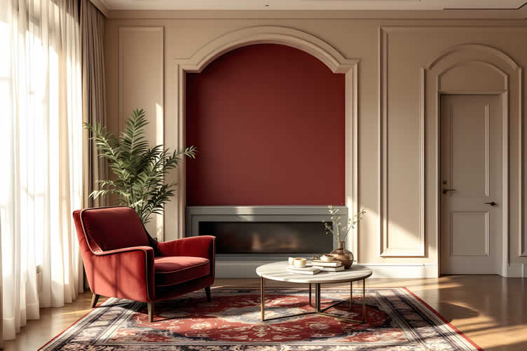
AI generated image by 123rf.com
Crafting Your Personal Haven
Building a personal library is one of the most rewarding home projects you can take on—and you don’t need a grand mansion or a wood-paneled study to do it.
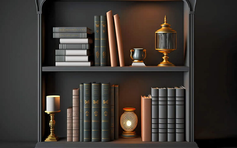
Whether it’s a single shelf of cherished books or an entire wall of literary treasures, your library is a reflection of your personality and passions.
With thoughtful arrangement, soft lighting, and comfortable seating, even the smallest space can become a sanctuary for relaxation and learning.
view ideas: Guide to Home Library Design(new win)
-
Scroll up to main directory … or scroll to next “warm earth-tone palettes” section …
-
-
-
-
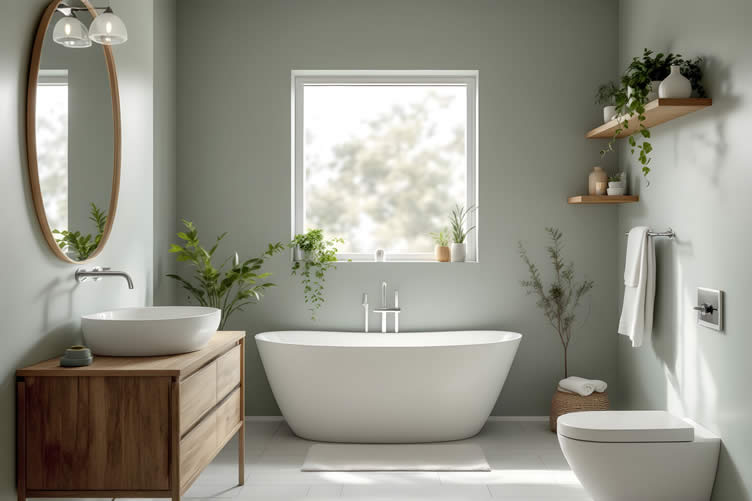
9th TERM: Dusty Sage: Calming Balance
Dusty sage is perhaps the most versatile of the cooler earth tones—a soft, gray-green shade that bridges the warmth of the broader palette with the calming quality of muted greens.
Its appeal lies in its balance: warm enough to feel connected to natural earth tones, cool enough to prevent a palette from feeling heavy or overly saturated.
Environmental psychology research consistently highlights the restorative effect of muted green hues in interior spaces, with a 2024 study in Building and Environment noting measurable reductions in perceived stress among occupants of green-toned rooms.
Dusty sage pairs beautifully with linen, whitewashed wood, and warm stone—bringing a sense of quiet vitality to bedrooms, bathrooms, and reading corners alike.
AI generated image by 123rf.com
Decorate Your Space
Abstract wall art comes in many styles, each with its own character.
Geometric designs bring structure, minimalist pieces offer calming simplicity, and color field art delivers bold expanses of color.
Expressionist and action painting styles convey energy through dynamic brushstrokes, while textured or organic designs add natural depth.

When selecting abstract art, consider the mood you want to create and your existing wall color — energetic pieces pair well with neutral walls, while softer designs complement bolder tones.
view ideas: Abstract Wall Art(new win)
Textile Wall Art
viewing amazonGraphics, Lettering, and Decals
viewing amazon-
Scroll up to main directory … or scroll to next “warm earth-tone palettes” section …
-
-
Download this PDF for a concise summary of everything you need to know about …?
-
-
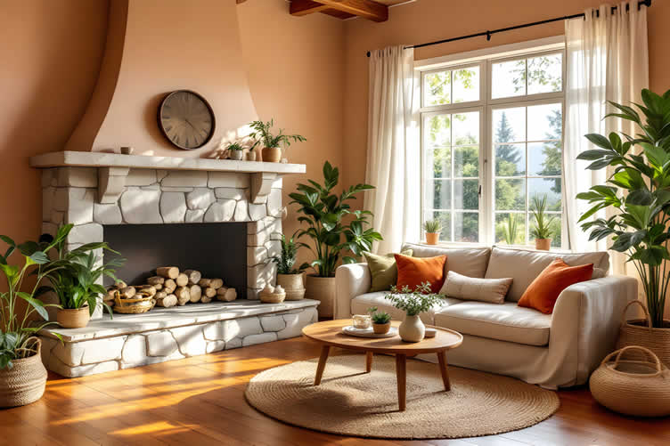
10th TERM: Pairing With Natural Materials
The true power of warm earth tones is fully realized when they are paired with natural materials. Wood, stone, and woven textiles don’t merely complement these colors—they amplify their inherent qualities, creating environments that feel genuinely connected to the physical world.
- Raw oak and walnut introduce grain and warmth that mirrors the tonal depth of caramel and chocolate brown.
- Limestone and travertine echo the dusty subtlety of clay and taupe.
- Rattan, jute, and linen add textural contrast that prevents earth-tone palettes from reading as flat or monochromatic.
The interplay between color and material is where these palettes come alive—and where thoughtful design transforms a room from merely attractive to genuinely immersive.
AI generated image by 123rf.com
Choosing the Perfect Floor
Flooring plays a pivotal role in shaping the ambiance of your home, as it sets the groundwork for all other design elements.
Pairing your flooring with warm earth-toned interior paint colors can create a harmonious and inviting space, especially when natural materials like wood or stone are involved.

By carefully considering this pairing, you can turn your living space into a serene retreat that feels cohesive and nurturing.
view ideas: Comprehensive Guide Wood-type flooring (new win)
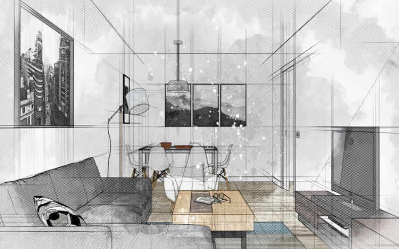
Transforming Your Home with an Interior Designer
Collaborating with an interior designer can make the process of incorporating warm earth-tone palettes into your home both seamless and inspiring. These professionals bring creativity, expertise, and personalized attention to your design vision.
Here’s what an interior designer can provide:
- Expert Color Guidance:
They can select the perfect blend of earthy tones—like terracotta, ochre, taupe, and olive green—that complement your home’s natural light and architecture. - Customized Design Plans:
Designers create tailored layouts and concepts that seamlessly integrate furniture, textures, and accessories to highlight warm, inviting palettes. - Access to Quality Resources:
They often have access to exclusive products, fabrics, and finishes that align with your desired aesthetic. - Professional Coordination:
Designers handle the details, from sourcing materials to managing contractors, ensuring a smooth execution of your vision. - Practical Budgeting:
They provide guidance to make the most of your budget while achieving an elegant and cohesive look.
You can find the ideal interior designer by browsing local design firms, exploring online design directories, or seeking recommendations from friends and family.
Additionally, many designers showcase portfolios on platforms such as Instagram or Pinterest, allowing you to preview their style and capabilities before reaching out.
LetsRenovate has partnered with HomeAdvisor (Angi)™, a renowned provider of highly-rated, carefully-vetted local interior designers, decorators, and/or painting contractors. Start your search here by choosing the type of service you need and entering your zip code to find local professionals.
AI generated image by 123rf.com
But Wait!
Before searching for interior design and/or painting contractors, we recommend downloading our evaluation worksheet.
This resource will help you objectively assess potential contractors based on key factors such as pricing, licensing, and referrals.

Evaluation Sheet
File Type:-
Scroll up to main directory … or scroll to next “warm earth-tone palettes” section …
-
Find Walls & Ceiling Services (opens new win) Drywall Installation Ceilings Painting & Texturing Tile top-rated, pre-screened local contractors Wallcoverings Ceilings – Fans Walls – Exterior Walls – Interior Find Interior Design Decorators Interior Designers FREE: download contractor selection enter zip code – powered by HomeAdvisor ™
Quick Contractor Guides selecting negotiating working with inspecting

-
-
Summary Tables
Color Description Key Characteristics Pairing Suggestions Caramel A golden-amber hue that conveys warmth, ideal for creating inviting and grounded spaces. Visually weighty yet approachable, adds depth without darkening a room. Cream linens and brushed brass hardware, suitable for living rooms and dining areas. Terracotta A burnt-orange shade with red undertones, inspired by Mediterranean pottery and adobe. Evokes earthy authenticity and social connection. Rattan furniture, linen textiles, and unglazed ceramics for a curated, warm aesthetic. Clay A muted, dusty shade of warmth that works with minimalist or eclectic interior styles. Understated refinement that recedes gracefully, ideal for layering elements. Open-plan spaces, allowing furniture, artwork, and textures to take prominence. Wheat A pale, golden-beige tone that offers light and airy warmth. Reflects more light while maintaining welcoming warmth. Soft furnishings, flooring, honeyed tones for a cocoon-like ambiance. Taupe A neutral shade bridging warm gray and soft brown, highly versatile. Chameleonic quality adapts to lighting, harmonizing distinctive design elements. Bolder accents, caramel tones, or evolving décor for cohesive palettes. Chocolate Brown A deep and rich shade bringing grounded luxury and dramatic depth. Transforms atmosphere with balanced use, sophisticated and bold. Cream, caramel, dusty sage, and natural wood for layered elegance. Olive A yellow-green earth tone closely tied to natural landscapes. Functions well as a neutral or accent, offering depth with organic sophistication. Warm brass accents, terracotta, chocolate brown for rich combinations. Burgundy A wine-red hue with underlying warmth that anchors sophistication. Elevates surrounding neutrals, offering refined visual drama. Taupe, wheat, olive, and chocolate brown for layered jewel-toned elegance. Dusty Sage A cool earth tone of soft gray-green, balancing warmth and calm. Restorative and versatile, connects interiors to nature. Linen, whitewashed wood, and warm stone for calming spaces. 
Service Description Where to Find Expert Color Guidance Interior designers can select the ideal combination of warm earth tones, such as terracotta, ochre, taupe, and olive green, taking into account the natural light and architectural features of your home. Look for designers through local design firms, online directories, or recommendations from friends and family. Customized Design Plans They create personalized layouts and concepts that integrate furniture, textures, and accessories to enhance and highlight inviting, earthy palettes. Explore designer portfolios on social platforms like Instagram or Pinterest to review their style and expertise. Access to Quality Resources Designers bring access to exclusive products, fabrics, and finishes that align with your preferred aesthetics, elevating your home design. Visit industry events, consult designer directories, or research websites showcasing exclusive design services. Professional Coordination They manage the details, including sourcing materials and coordinating with contractors, ensuring your vision is executed seamlessly. Search for experienced and well-reviewed professionals via online platforms or local design associations. Practical Budgeting Interior designers provide expert budgeting advice, helping to maximize your resources while achieving a cohesive and elegant look. Discuss your goals with potential designers, referencing their past projects to ensure alignment with your budget and design ambitions. -
Scroll up to main directory … or scroll to conclusion and references …
-
-
-
Conclusion
… your earth-tone space starts here
Warm earth tones endure because they speak to something fundamental in how we experience comfort and belonging. They connect interior spaces to the natural world, layer beautifully across a wide range of design styles, and offer a depth of character that trend-driven palettes rarely sustain.
Whether you begin with a single caramel accent wall or commit to a full palette built across terracotta, olive, and dusty sage, these shades will reward the investment with spaces that feel as good as they look.
If you’re ready to bring these palettes to life in your own home, explore our curated collection of earth-tone paint swatches, material samples, and room planning guides—and share your progress with our community of like-minded design enthusiasts. We’d love to see what you create.
References
- Color Marketing Group. (2024). 2024 Color Forecast: Nature-Inspired Palettes in Residential and Commercial Design. Color Marketing Group.
- Houzz. (2023). 2023 U.S. Houzz & Home Study: Renovation Trends. Houzz Inc.
- Largo-Wight, E., et al. (2024). Nature in the built environment: A review of restorative design principles and color psychology. Building and Environment, 248, 110-119.
- Valdez, P., & Mehrabian, A. (2024). Effects of color on emotions and engagement: Updated perspectives on warm-spectrum hues. Journal of Environmental Psychology, 91, 102-114.
-
Quick scroll to more home structural ideas …
-
ideas to view and compare from the photo above
- What comments can you share about
warm earth-tone palettes that you have installed?

Calendar For:
Home Maintenance
File Type:
… view our sharing links below for a quick "share the knowledge"
Cover image credit: warm earth-tone palettes by 123rf.com
end of post … please share it!
 |
did you find this warm earth-tone palettes analysis helpful? If so, please share the article with your friends and family! |
Nice pic idea? Leave us a quick comment below.
And please share this pic idea within your social networks.