Quick Answer:
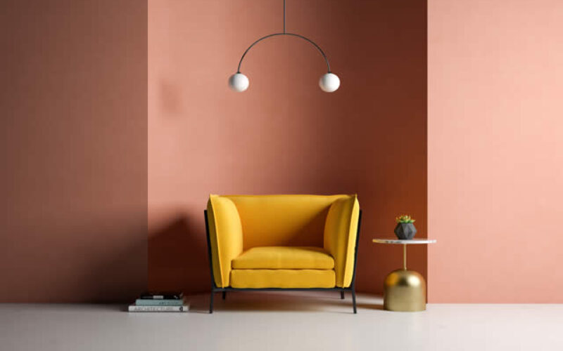
Color drenching is an interior design technique that coats walls, trim, doors, and ceilings in the same color or closely related shades from one color family. The result is an enveloping, architecturally rich space that feels intentional, cocooning, and—counterintuitively—more spacious. It works especially well in dens, libraries, powder rooms, and bedrooms.
More often than not, the culprit is contrast: white ceilings cutting against colored walls, bright trim interrupting surfaces, visual edges everywhere your eye wants to rest.
Color drenching solves exactly that problem. By applying a single color—or closely related shades within the same color family—across walls, trim, doors, and ceilings, this technique dissolves the boundaries that fragment a room and replaces them with a seamless, architectural envelope of color.
The result is a space that feels larger, warmer, and more deliberately designed than almost any other paint approach can achieve.
According to a 2026 MeltFlex industry survey, 55 percent of design professionals named color drenching the top color trend of the year—and the reasons why become clear the moment you understand what it actually does to a space.
- post content
- Understanding the Core Concept
- The Ideal Rooms for Color Drenching
- Selecting Your Color Palette
- Implementation Techniques and Best Practices
- Color Drenching in Practice
- Make the Commitment Count
- FAQs
- view table:content summary
- view notes:collective tips
- view analysis:interior Wall with Paint Color and Style
- view ideas:latest remodeling analysis
Understanding the Core Concept
Color drenching goes further than painting your walls a rich shade and calling it done. The technique requires wrapping every visible surface—walls, ceiling, trim, baseboards, doors, and even radiators—in the same color.
Traditional room painting creates a patchwork: colored walls framed by white trim, a white ceiling acting as a visual cap. Each color change signals a boundary, and those boundaries are what make rooms feel smaller and more segmented.
When every surface shares a hue, the brain can no longer lock onto edges. As interior designer Stephanie Cole of Habitar Design explains, “Color drenching blurs the lines that separate vertical and horizontal planes, creating an aesthetic that is cohesive and feels more embracing.”
That perceptual shift is the heart of the technique. The room stops being a box of painted surfaces and becomes an atmosphere—something you inhabit rather than observe.
The psychological effect is just as significant. Monochromatic environments reduce visual noise, which creates a sense of calm and containment that multi-color rooms rarely achieve.
Whitney Romanoff of Meet West Design describes it plainly: “Color drenching is like a great big hug of color in a room. It sets a clear vibe and draws you into a space.”

The Ideal Rooms for Color Drenching
Certain rooms respond to color drenching better than others, and understanding why helps you decide where to begin. Dens, libraries, powder rooms, and bedrooms are the strongest candidates—each for distinct reasons.
Powder rooms are the ideal starting point for first-time practitioners. They are small, self-contained, and require minimal paint coverage, which means low cost and fast results.
A bold jewel tone or deep green in a powder room creates immediate, dramatic impact without the commitment of a larger space. Guests walk in and the color registers instantly as a confident design statement.
Bedrooms benefit from the cocooning quality that color drenching produces. A room built for rest responds well to an enveloping atmosphere—deep navy promotes calm, warm clay feels nurturing, soft blush makes boundaries dissolve without adding visual weight.
Even bedrooms with sloped ceilings or awkward proportions are transformed by drenching, which converts architectural irregularities into intimate charm.
Dens and libraries are natural fits for darker, richer drenching colors. Deep chocolate brown, forest green, or midnight navy in a home office or reading room reduces visual distraction and creates the psychological conditions for focus.
As Swatchbox noted in their 2025 interior design analysis, color drenching “in small, contained environments feels intentional and dramatic rather than oppressive”—a quality that serves these purpose-driven rooms particularly well.
something of interest below

Revolutionize Your Interior Wall with Paint Color and Style
Deciding, selecting, and painting your interior room can be both an exciting and daunting task. With countless options and techniques available, it’s essential to have a comprehensive guide to walk you through the process.
Selecting Your Color Palette
The most consequential decision in color drenching is color selection itself. Not every shade works when spread across all surfaces simultaneously. What reads beautifully on a single wall can become suffocating at full room scale.
The colors that perform best are muted, complex, and earthy—tones with depth that shifts with light throughout the day.
Deep sage and olive greens remain the most popular choice among designers in 2025 and 2026. They connect a space to nature without feeling literal and work across bedrooms, living rooms, and home offices.
Farrow & Ball’s Calke Green, Benjamin Moore’s Salamander, and Sherwin-Williams’ Dried Thyme are consistently cited by professionals for their warmth and complexity at full coverage. Midnight navy—particularly Farrow & Ball’s Stiffkey Blue—creates drama without heaviness, reading as rich rather than dark.
Warm terracotta and clay produce Mediterranean warmth in dining rooms and living spaces. Benjamin Moore selected Silhouette, a deep espresso brown, as their 2026 Color of the Year, reflecting the broader shift toward chocolate and earthy tones in monochromatic interiors.
Dusty rose and blush, most famously represented by Farrow & Ball’s Setting Plaster, make small rooms feel unexpectedly generous by dissolving boundaries with zero visual weight.
Colors that struggle at room scale include cool greiges—popular neutrals like Agreeable Gray lose their sophistication when applied to ceilings and trim. Fully saturated brights become overwhelming, and pure black emphasizes every imperfection in the paint surface.
Undertone consistency is non-negotiable. Warm-toned colors must stay within warm families; mixing warm terracotta with a cool-leaning green reads as a mistake rather than a creative choice.
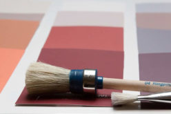
Before committing, test large paint samples—at minimum A3 size—on both walls and ceiling surfaces, and observe them at morning, afternoon, and evening light. The same color can look entirely different between a south-facing room at midday and a north-facing room after dark.
Implementation Techniques and Best Practices
Executing color drenching well requires one critical piece of knowledge that most first-time practitioners miss: the color stays the same across surfaces, but the paint sheen should vary.
As Luke Hass of Pearl Painters states directly: “The color is the only thing that is the same. Your trim should be a sheen higher than the walls.”
The standard approach is flat or matte on the ceiling, eggshell on the walls, and satin on trim and doors. Flat finish conceals ceiling imperfections and prevents light reflection from highlighting surface irregularities when viewed from below.
Eggshell on walls provides a slight reflective quality and enough durability for everyday contact. Satin on doors and trim offers the cleanability those surfaces require while adding a subtle luminosity that creates depth within the monochromatic scheme.
Without this sheen graduation, the room reads flat—technically correct but visually lifeless.
Preparation demands more attention with color drenching than with standard painting. When every surface shares one color, imperfections that were invisible against contrasting trim become conspicuous.
Fill every hole, sand every rough patch, and apply a proper primer before the color coats. Plan on three coats for even, full coverage—this is not a project to rush.
Lighting becomes more critical in drenched rooms, particularly when working with dark colors. A navy or chocolate room requires multiple warm light sources—at minimum three to four—at a color temperature of 2,700K to 3,000K.
Table lamps, floor lamps, wall sconces, and candles collectively create the atmospheric warmth that makes dark color drenching feel luxurious rather than oppressive. A single overhead fixture in a dark drenched room will make the space feel like a cave regardless of how well the painting was executed.
One practical note on materials: purchase all paints for a color drenching project from the same manufacturer. Cross-brand color matching in the same hue can produce subtle but noticeable variations across surfaces, undermining the seamless effect the technique depends on.
something of interest below
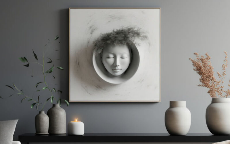
From Blank Canvas to Masterpiece: A Guide to Wall Decor Elements
Wall decorating is one of the most effective ways to transform a house into a home. It is where you get to tell your story, display what you love, and create an atmosphere that welcomes you back after a long day.
Color Drenching in Practice
Color drenching adapts across aesthetic sensibilities and color families in ways that make it genuinely versatile. A dining room drenched in deep burgundy—walls, ceiling, trim, and all—creates the kind of intimate, lingering atmosphere that the best restaurant rooms have perfected.
An emerald green library with brass accents and warm lighting reads as considered and sophisticated. A blush pink bedroom with natural linen textiles and warm wood furniture feels both serene and modern.
Materiality plays a supporting role throughout. When color unifies every surface, texture becomes the primary tool for creating visual interest. Velvet upholstery softens a high-sheen painted room.
Natural wood introduces warmth and grain. Woven textiles add tactility. Stone and ceramics provide a different surface quality. As Liz Keizerwaard noted in Swatchbox’s 2025 analysis, “When color is no longer the primary tool for contrast, designers have to rely on other sensory elements to create interest and depth.”
This means furniture selection becomes especially consequential in a drenched room—pieces that would blend into a white-walled space become the focal point against a monochromatic backdrop.
Furniture and furnishings don’t need to match the wall color exactly, but they should sit comfortably within the same tonal family. Slightly lighter or darker versions of the drench color in upholstery, rugs, or curtains add dimension without fracturing the unified atmosphere.
Make the Commitment Count
Color drenching is one of the most affordable ways to fundamentally change how a room feels. A powder room might require two to three tins of quality paint. A bedroom, four to five.
The investment in paint and preparation time delivers a result that new furniture or surface renovations rarely match—a room that feels architecturally resolved, deliberately designed, and genuinely inhabitable.
The technique works because it addresses something most decorating approaches overlook: the difference between a room that has been furnished and a room that has been designed. Furnishing fills space.
Drenching defines it. Start with a powder room or bedroom, commit to the ceiling, vary the sheen, and let the color do the work it was always capable of doing.
Painting Like a Pro
From the initial prep work to the final clean-up, having the right equipment transforms painting from a tedious task into a rewarding creative process.
A high-quality brush or roller, painter’s tape for clean edges, and drop cloths to protect your floors are essential for a professional finish.
Additionally, proper surface preparation, such as cleaning and priming, ensures the paint adheres smoothly and evenly.
With the right tools in hand and a clear plan, you can revitalize your space with confidence and style.
view ideas: DIY Interior Painting Tools (new win)

Frequently Asked Questions
-
What exactly is color drenching in interior design?
Color drenching is an interior painting technique that applies one color—or closely related shades from the same color family—to all surfaces in a room, including walls, ceiling, trim, and doors. The result is a seamless, enveloping space that feels cohesive, architectural, and intentional.
-
Does color drenching work in small rooms?
Yes—and it can actually make small rooms feel larger. When walls, ceilings, and trim share the same color, the visual boundaries of the room dissolve, creating an illusion of more space. Contrary to common intuition, darker colors applied consistently across all surfaces can be especially effective in compact spaces.
-
What rooms benefit most from color drenching?
Dens, libraries, studies, powder rooms, and bedrooms are ideal. These are spaces where intimacy, focus, and atmosphere matter most. Dining rooms and butler’s pantries also respond well to color drenching’s dramatic, enveloping quality.
-
What paint finish should I use for color drenching?
Use matte or flat finishes on ceilings and bedroom walls, eggshell for living and dining rooms, satin for kitchens and bathrooms, and semi-gloss on trim and doors. Varying the finish across surfaces adds subtle depth while maintaining color continuity.
-
What colors are trending for color drenching in 2025 and 2026?
Deep greens, earthy reds (burgundy, terracotta, rust), warm browns, rich navy, and moody charcoal are the most prominent colors for color drenching right now. Pantone’s 2025 Color of the Year, Mocha Mousse, reflects a broader move toward warm, grounded earth tones.
-
Is color drenching a lasting design choice or just a trend?
Color drenching draws on a long tradition of using architectural color to define spaces—think Victorian libraries and Georgian drawing rooms. The specific palette may shift with the times, but the underlying principle of creating a cohesive, enveloping environment is enduringly effective.
-
How is color drenching different from simply painting a room one color?
Traditional single-color rooms typically leave trim, ceilings, or doors in contrasting shades. Color drenching extends the chosen hue—or related tones from the same family—to every surface, eliminating visual breaks and creating a fully unified, architectural effect that a standard paint job does not achieve.
home improvement ideas to consider (complete directory – new win):


| Section | Description | Key Points |
|---|---|---|
| Introduction | Color drenching is a design technique that transforms a room by applying a single color or closely related shades across all surfaces, creating a seamless and cohesive look. | Creates larger, warmer, and deliberately designed spaces. Resolves issues of contrast and fragmented visual edges. |
| Core Concept | Goes beyond just painting walls; it involves wrapping all visible surfaces—walls, ceilings, trim, doors, and more—in the same color to eliminate boundaries and create a unified atmosphere. | Promotes calm by reducing visual noise. Blurs physical barriers, making spaces feel more intimate and cohesive. |
| Ideal Rooms | Best suited for small, cozy spaces like powder rooms, dens, libraries, and bedrooms, where the technique enhances intimacy and focus. | Powder rooms work well for dramatic effects; bedrooms benefit from cocooning; dens and libraries feel sophisticated and purposeful. |
| Color Selection | The choice of color is critical, with muted, earthy tones working best. Popular options include deep greens, navy, terracotta, and blush tones. | Avoid overly saturated colors or cool neutrals. Ensure undertone consistency and test colors in different lighting conditions. |
| Implementation | Requires varying paint sheens across surfaces for depth and preparation to eliminate imperfections. Lighting plays a vital role in achieving the desired effect. | Use flat on ceilings, eggshell on walls, and satin on trim. Leverage layered warm lighting for a luxurious look. |
| Practical Applications | Color drenching works across styles and materials by focusing on texture and tonal harmony. Furniture and furnishings should complement the chosen palette. | Furnishing should align with the tonal family. Texture becomes crucial for visual interest in a monochromatic setting. |

Find Walls & Ceiling Services (opens new win) Drywall Installation Ceilings Painting & Texturing Tile top-rated, pre-screened local contractors Wallcoverings Ceilings – Fans Walls – Exterior Walls – Interior FREE: download contractor selection enter zip code – powered by HomeAdvisor ™


Image credit: color drenching by envato.com
end of post … please share it!
Paint Color Samples
| reds | living room | kitchen | bedroom |
| oranges | living room | kitchen | bedroom |
| yellows | living room | kitchen | bedroom |
| greens | living room | kitchen | bedroom |
| blues | living room | kitchen | bedroom |
| purples | living room | kitchen | bedroom |
| neutrals | living room | kitchen | bedroom |
| charcoal | living room | kitchen | bedroom |
| grays | living room | kitchen | bedroom |
| tan | living room | kitchen | bedroom |
| whites | living room | kitchen | bedroom |
| more photo remodeling |
Jump Over to Our Photo Analysis Center for Ideas on
"Renovating Home"
|__________________________________________________________|
home remodeling surprise
find out where it might go - new win


Helpful article? Leave us a quick comment below.
And please share this article within your social networks.