Major design brands and interior experts are highlighting smoky greens, nurturing neutrals, deep reds, plum, caramel, and warm earth-inspired hues, alongside icy pastels that create serene spaces.
These colors reflect a broader cultural shift toward wellness and environmental connection. As more people seek homes that feel like personal sanctuaries, the 2026 color trends offer a thoughtful blend of restoration and richness.
Whether you’re planning a full renovation or simply refreshing a single room, these hues provide endless opportunities to craft spaces that feel both grounding and uplifting.
- post content
- Nature-Inspired Hues: Bringing the Outdoors In
- Rich and Warm Earth Tones: Adding Depth and Drama
- Icy Pastels: Soft and Airy Serenity
- How to Incorporate Trending Colors Into Your Home
- Transform Your Living Spaces With 2026’s Color Trends
- view table:content summary
- view notes:collective tips
- view ideas:latest remodeling analysis
Nature-Inspired Hues: Bringing the Outdoors In
Nature has always been a powerful influence in interior design, but the 2026 paint trends take this connection to a deeper level. These colors aren’t just reminiscent of the outdoors—they actively bring the restorative qualities of nature into your living spaces.
-
Smoky Greens: Calm and Restorative
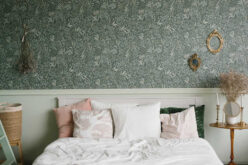
Smoky greens sit at the intersection of gray and green, offering a muted yet sophisticated alternative to brighter shades. These tones evoke misty forests and weathered sage leaves, creating an atmosphere that feels both grounded and ethereal.
Unlike vibrant greens that can dominate a space, smoky greens provide a calming backdrop that works beautifully in bedrooms, bathrooms, and living areas.
The beauty of smoky green lies in its versatility. Pair it with natural wood furniture for a cohesive, organic look, or contrast it with white trim and black accents for a more modern aesthetic. This shade also plays well with textured fabrics like linen and wool, enhancing the cozy, restorative quality of any room.
[ view ideas: smoky green paint ]
-
Nurturing Neutrals: The Foundation of Balanced Spaces
Neutrals remain essential in creating balanced interiors, but 2026’s versions lean warmer and more complex than the stark whites and cool grays of previous years. Think creamy beiges, soft taupes, and warm grays with subtle undertones of brown or pink.
These nurturing neutrals provide a gentle foundation that allows other elements in your home to shine without competing for attention.
What makes these neutrals particularly appealing is their ability to adapt to different lighting conditions throughout the day. Morning light may reveal their warmer undertones, while evening illumination brings out their softer, more intimate qualities.
Use these shades in entryways, hallways, and open-concept spaces where you want to create flow and continuity.
[ view ideas: neutral paint colors ]

Rich and Warm Earth Tones: Adding Depth and Drama
While nature-inspired hues offer tranquility, the rich and warm earth tones trending in 2026 bring depth, drama, and a sense of grounded luxury to interior spaces. These colors draw from the earth’s most vivid elements—clay, autumn leaves, and mineral-rich soil.
-
Deep Reds: Bold Impact and Emotional Warmth
Deep reds make a striking statement in any room. Unlike bright, primary reds, these sophisticated shades carry brown or burgundy undertones that feel mature and inviting.
They work exceptionally well in dining rooms, where they stimulate conversation and appetite, or in home libraries and studies where they create an atmosphere of focused warmth.
When incorporating deep red, consider using it as an accent wall rather than throughout an entire room. This approach allows you to enjoy the color’s bold impact without overwhelming the space. Pair deep red walls with brass fixtures, dark wood furniture, and rich textiles to complete the look.
[ view ideas: deep red paint colors ]
-
Plum: Sophisticated and Layered
Plum occupies a unique space in the 2026 color palette, offering the richness of purple with the warmth of red. This sophisticated hue ranges from dusty mauve to deep aubergine, providing options for various design preferences and room sizes.
Lighter plum shades work beautifully in bedrooms, creating a romantic and restful environment, while deeper versions add drama to powder rooms or accent walls.
The key to working with plum is balancing its intensity with lighter complementary colors. Cream, soft gray, and even blush pink help temper plum’s boldness while allowing its sophisticated character to shine through.
[ view ideas: plum paint colors ]
-
Caramel: Inviting and Cozy
Caramel tones bring an immediate sense of warmth and comfort to any space. These rich, golden-brown hues evoke the sweetness of their namesake while maintaining enough depth to feel substantial rather than sugary.
Caramel works particularly well in spaces where you want to encourage relaxation and conversation—living rooms, family rooms, and cozy reading nooks.
This shade pairs beautifully with natural materials like leather, rattan, and unfinished wood. Consider using caramel on walls with white or cream ceilings to maintain brightness while enjoying the color’s enveloping warmth.
[ view ideas: caramel paint colors ]
-
Warm Earth-Inspired Hues: Grounding and Organic
Beyond specific colors like caramel and deep red, the 2026 palette includes a range of warm earth-inspired hues—terracotta, rust, ochre, and clay. These colors ground interiors with their organic warmth, creating spaces that feel connected to the natural world.
They’re particularly effective in homes with abundant natural light, where they can shift and change throughout the day.
Use these tones in kitchens and dining areas to create welcoming gathering spaces, or in sunrooms and enclosed porches to strengthen the connection between indoor and outdoor environments.
[ view ideas: warm earth paint colors ]

How to Choose the Perfect Color Palette for Your Home
Choosing the right color palette for your interior painting can dramatically transform your living space, making it feel more inviting and tailored to your personal style. In the following guide, we’ll explore practical tips and strategies to help you navigate the overwhelming choices and confidently select the perfect hues that will enhance your home’s atmosphere and reflect your unique taste.
Icy Pastels: Soft and Airy Serenity
While earth tones dominate much of the 2026 palette, icy pastels provide a refreshing counterpoint. These soft, airy colors—pale blue, mint, lavender, and blush—create serene and uplifting environments that feel spacious and light.
Icy pastels work exceptionally well in smaller rooms or spaces with limited natural light, as they reflect available light and make areas feel larger.
[ view ideas: icy pastels ]
Consider them for nurseries, guest bedrooms, and bathrooms where you want to evoke a spa-like atmosphere. Unlike their more saturated counterparts, icy pastels provide color interest without overwhelming the senses.
The beauty of these shades lies in their ability to create calm without feeling cold. Pair them with warm wood tones, natural fiber rugs, and soft textiles to add warmth and prevent spaces from feeling sterile.
How to Incorporate Trending Colors Into Your Home
Understanding the trending colors is one thing; knowing how to use them effectively is another. Here are practical tips for bringing these 2026 paint trends into your living spaces.
Start by identifying which rooms would benefit most from these colors. Bedrooms and bathrooms are ideal for calming smoky greens and icy pastels, while social spaces like living rooms and dining areas can handle the drama of deep reds and plum.
Kitchens and family rooms often shine with warm earth tones that create inviting, comfortable atmospheres.
Consider the amount of natural light each room receives. Darker, richer colors like deep red and plum work best in rooms with ample natural light, while lighter shades like nurturing neutrals and icy pastels can brighten spaces with limited windows.
Test paint samples on your walls and observe how they look at different times of day before committing to a full room.
When pairing these trending colors with furniture and decor, think about creating balance. If you’re using a bold wall color like deep red or plum, opt for neutral furniture and let the walls take center stage.
Conversely, if your walls are painted in nurturing neutrals or icy pastels, you can introduce color through furniture, artwork, and accessories.
Don’t forget about finish. Matte and eggshell finishes work well for most wall applications, providing a soft, sophisticated look. Save satin and semi-gloss finishes for trim, doors, and high-moisture areas like bathrooms and kitchens.
Transform Your Living Spaces With 2026’s Color Trends
The 2026 paint color trends offer something for every design preference—from the restorative calm of smoky greens to the grounded luxury of deep reds and the airy serenity of icy pastels. These colors reflect our collective desire for homes that feel like personal sanctuaries, spaces that nurture well-being while expressing individual style.
Whether you’re planning a complete home makeover or simply refreshing a single room, these trending colors provide the perfect opportunity to transform your living spaces.
Start with one room, experiment with samples, and trust your instincts. The right color has the power to completely change how a space feels and functions, creating an environment that truly supports the life you want to live.
Ready to explore these trends in your own home? Grab some paint samples and see which 2026 colors speak to you.
Your dream space is just a few brushstrokes away.
| Color Name | Characteristics | Ideal Room Application | Design Tips |
|---|---|---|---|
| Smoky Green | Misty, muted green with gray undertones. Offers calm and restorative ambiance. | Bedrooms, bathrooms, living areas | Pair with natural wood furniture or contrast with white trim and black accents for a modern look. |
| Nurturing Neutrals | Warm beiges, taupes, and grays with soft undertones like pink or brown. | Entryways, hallways, open-concept spaces | Create flow and continuity. Adapts beautifully to different lighting conditions. |
| Deep Red | Bold and rich with burgundy or brown undertones. Invites warmth and sophistication. | Dining rooms, home libraries, accent walls | Use sparingly as an accent wall. Pair with brass, dark wood, and rich textiles. |
| Plum | Luxurious and layered hues ranging from dusty mauves to deep aubergines. | Bedrooms, powder rooms, accent walls | Balance intensity with lighter tones like cream, blush pink, or soft gray. |
| Caramel | Warm golden-brown tones that feel inviting yet substantial. | Living rooms, family rooms, cozy nooks | Combine with leather, rattan, and unfinished wood for a relaxed look. |
| Warm Earth-Inspired Hues | Grounded tones like terracotta, rust, ochre, and clay. Organic and natural. | Kitchens, dining areas, sunrooms | Best in spaces with natural light to highlight their depth and warmth. |
| Icy Pastels | Soft and airy shades like pale blue, mint, lavender, and blush. | Nurseries, guest bedrooms, bathrooms | Mix with warm wood tones and natural textiles to prevent a sterile feel. |

Find Painting Services Painting Staining Texturing Wallcoverings top-rated, pre-screened local contractors FREE: download contractor selection enter zip code – powered by HomeAdvisor ™


Image credit: trending paint colors by envato.com
end of post … please share it!
| more photo remodeling |
Jump Over to Our Photo Analysis Center for Ideas on
"Renovating Home"
|__________________________________________________________|
home remodeling surprise
find out where it might go - new win


Helpful article? Leave us a quick comment below.
And please share this article within your social networks.