Summary Outline – Choosing the right color palette for your home can seem like a daunting task. With endless shades and combinations to choose from, it’s easy to feel overwhelmed.
Whether you’re aiming for a calm and serene bedroom, a vibrant and lively kitchen, or a cozy and warm living area, the right color palette can make all the difference!
In this guide, we’ll walk you through the process of selecting the ideal colors to create a harmonious and inviting space.
- post content … analysis / how to choose the perfect color palette
- 1st: Understand the Basics of Color Theory
- 2nd: Consider the Mood You Want to Create
- 3rd: Take Inspiration from Your Existing Decor
- 4th: Explore Different Color Schemes
- 5th: Test Samples in Different Lighting
- 6th: Balance Bold and Neutral Tones
- 7th: Consider the Function of Each Room
- 8th: Types of Paint Styling for a Room
- 9th: Factor in the Pros
- conclusion
- other home structural topics

-
- —— begin first topic ——
-
1st Color Tip: Understand the Basics of Color Theory
Before diving into color swatches, it’s essential to understand the basics of color theory. Colors are divided into primary (red, blue, yellow), secondary (orange, green, purple), and tertiary categories.
The color wheel helps visualize relationships between these colors, including complementary (opposite on the wheel) and analogous (next to each other) hues. This understanding is crucial when selecting shades that work well together.
-
Colors That Make Up the Color Wheel
The color wheel is a circular diagram of colors arranged sequentially. The primary, secondary, and tertiary colors included in the color wheel are:
- Primary Colors:
- Red
- Blue
- Yellow
- Secondary Colors (created by mixing two primary colors):
- Orange (Red + Yellow)
- Green (Blue + Yellow)
- Purple (Red + Blue)
- Tertiary Colors (created by mixing a primary and a secondary color):
- Red-Orange
- Yellow-Orange
- Yellow-Green
- Blue-Green
- Blue-Purple
- Red-Purple
- Primary Colors:

copyright image by 123rf.com
[ view diagram: color theory chart ]
[ youtube: color theory basics ]

-
-
2nd Color Tip: Consider the Mood You Want to Create
Different colors evoke different emotions. Warm tones like reds and yellows can make a room feel cozy and energetic, while cool tones like blues and greens can create a calming and serene atmosphere.
Think about the mood you want each room to convey. For example, a bedroom might benefit from soothing colors, whereas a kitchen could be more vibrant and lively.
-
Warm Colors
Warm colors are typically associated with energy, passion, and warmth. These colors are often used to create a cozy and inviting atmosphere. Some common warm colors include:
- Red
- Orange
- Yellow
- Gold
- Maroon
- Peach
-
Cool Colors
Cool colors are known for their calming and relaxing effects. They are often used to create a serene and tranquil environment. Common cool colors include:
- Blue
- Green
- Purple
- Turquoise
- Teal
- Lavender

copyright image by 123rf.com
[ view samples: warm paint colors ]
[ view samples: cool paint colors ]
Choosing Warm or Cool Colors for Different Rooms
Choosing the right color palette for your home can significantly influence the ambiance and functionality of each space. ‘
The decision between warm and cool colors often depends on the purpose of the room and the type of atmosphere you wish to create.
Below are some recommendations for selecting the best warm or cool colors for various rooms in your home.
-
Living Room
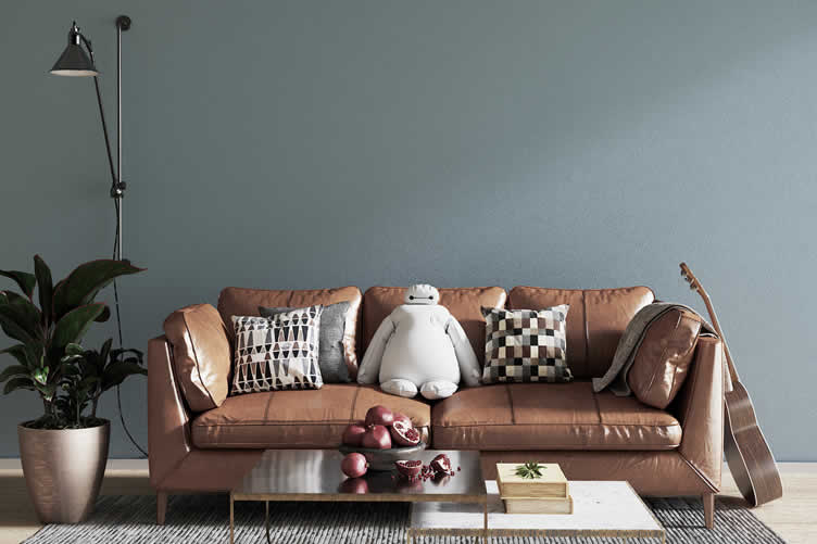
The living room is a space where family and friends gather to relax and socialize. Warm colors like beige, soft reds, or golden yellows can create an inviting and comfortable atmosphere that encourages conversation and togetherness.
Alternatively, cool colors like light blues or soft grays can make the room feel serene and spacious.
[ view samples: living room "warm" palette ]
[ view samples: living room "cool" palette ]
-
Kitchen
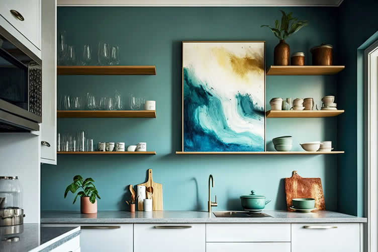
Kitchens are often the heart of the home, bustling with activity and energy. Warm colors like vibrant yellows, energetic oranges, or rich terracottas can invigorate the space, promoting a cheerful and lively environment.
If you prefer a more subdued kitchen, cool colors such as mint green or light blue can offer a clean and refreshing look.
[ view samples: kitchen "warm" palette ]
[ view samples: kitchen "cool" palette ]
-
Bedroom
The bedroom is a personal sanctuary where relaxation is key. Cool colors such as gentle blues, greens, or lavenders are ideal for creating a calming and restful retreat.
These shades are conducive to rest and relaxation, helping to ensure a good night’s sleep. If you prefer a warmer feel, consider using soft peach or muted pink which can also add a touch of coziness without being too stimulating.
[ view samples: bedroom "warm" palette ]
[ view samples: bedroom "cool" palette ]
-
Bathroom
Bathrooms benefit greatly from a clean and fresh aesthetic. Cool colors like aqua, teal, or light gray can enhance the sense of cleanliness and tranquility.
These colors can make the bathroom feel like a spa-like retreat. On the other hand, warm colors such as sunny yellow or creamy beige can give the space a more inviting and warm feel, making it comfortable and homey.
[ view samples: bathroom "warm" palette ]
[ view samples: bathroom "cool" palette ]
-
Entryway
The entryway is the first impression of your home, so it should feel welcoming. Warm colors like rich reds, burnt oranges, or warm taupes can provide a sense of warmth and hospitality as guests enter your home.
If you prefer a more sophisticated and airy entryway, cool colors such as sleek grays or deep blues can add elegance and a sense of calm.
[ view samples: entryway "warm" palette ]
[ view samples: entryway "cool" palette ]
-
Hallway
Hallways are often overlooked but play a crucial role in the flow of your home. Warm colors like soft gold or warm beige can make these transitional spaces feel cozy and connected to the rest of the home.
Alternatively, light cool colors can make a hallway appear more spacious and open, ensuring a smooth and serene transition between rooms.
[ view samples: hallway "warm" palette ]
[ view samples: hallway "cool" palette ]
-
Other Areas
For other areas, such as home offices or dining rooms, consider the activities taking place there. A home office might benefit from cool colors like pastel green or blue to enhance concentration and focus.
Conversely, a dining room painted in warmer tones like rich reds or oranges can stimulate appetite and encourage lively conversation.
By thoughtfully choosing between warm and cool colors, you can create the desired mood and functionality for each space in your home.
copyright image by 123rf.com
Living Room Paint Colors
google imagesReds view ideas Oranges view ideas Yellows view ideas Greens view ideas Blues view ideas Purples view ideas Browns view ideas Grays view ideas Tans view ideas Whites view ideas -
-
3rd Color Tip: Take Inspiration from Your Existing Decor
Look at the furniture, artwork, and other decor pieces already in your home. These items can provide clues as to which colors will complement your space.
A beloved painting or a unique piece of furniture can serve as a focal point, helping you build your color scheme around it.
Certain furniture pieces like your couch, dining table, and lamps, can help you decide which colors can best complement them.
copyright image by 123rf.com
[ pinterest: paint colors that make a room bigger ]
[ youtube: best paint colors to pair with wood trim ]
Examples Of Using Existing Decor
Choosing the perfect paint color for a room can seem daunting, but one of the best places to start is by looking at your existing decor.
By drawing inspiration from the furniture, artwork, and other decorative elements you already have, you can create a harmonious and aesthetically pleasing space that feels cohesive and intentional.
Below are some specific ways your existing decor can guide your paint selection.
-
Wall Painting
A stunning wall painting can be a natural focal point and a perfect starting point for your color scheme. For instance, if your painting features shades of blue and green, these colors can be incorporated into your walls to create a cohesive look.
Opt for a lighter shade for the walls and a deeper hue for accent areas to bring out the painting’s vibrancy.
-
Wall Art
Similarly, wall art such as framed prints or photographs can lead to inspired color choices. Consider the dominant tones in your wall art and use those colors to find complementary or contrasting shades for your walls.
For example, a photograph with warm earthy tones might pair well with a rich terracotta or a soft beige on the walls.
-
Furniture
Your furniture is a significant part of your room’s visual landscape, and its colors and materials should inform your paint selections.
A bold-colored couch can serve as an anchor for selecting a neutral wall color that highlights the furniture piece. Alternatively, if your furniture is more subdued, you might choose a bolder wall color to add character and depth to the room.
-
Flooring
Don’t overlook the role of your flooring when choosing paint colors. Whether you have wooden floors, carpets, or tiles, the color and material can influence the overall aesthetic.
For example, dark wooden floors might pair beautifully with lighter wall colors to create a balanced and inviting space.
-
General Decor
General decor items like area rugs, curtains, and cushions also play a crucial role in your color selection. These items often introduce accent colors that can inspire your wall hue.
Matching your wall color with the secondary tones found in these elements can tie the entire room together seamlessly.
-
Other Elements
Other decorative elements such as lamps, vases, or decorative bowls can also be considered when choosing paint colors. These smaller accents can either match or contrast with the wall color to create a vibrant and dynamic space.
For instance, a metallic lamp might shine even brighter against a matte dark wall, adding layers of interest to your decor.
By evaluating and drawing inspiration from your existing decor, you can make more informed decisions about paint colors, ensuring that they enhance and complement the overall aesthetic of your room.
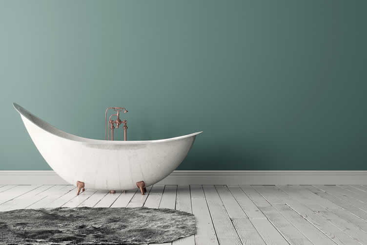
copyright image by 123rf.com
Kitchen Paint Colors
google imagesReds view ideas Oranges view ideas Yellows view ideas Greens view ideas Blues view ideas Purples view ideas Browns view ideas Grays view ideas Tans view ideas Whites view ideas -
-
4th Color Tip: Explore Different Color Schemes
There are several types of color schemes to consider:
- Monochromatic:
Uses variations in lightness and saturation of a single color. - Analogous:
Combines colors that are next to each other on the color wheel. - Complementary:
Pairs colors that are opposite each other on the color wheel. - Triadic:
Uses three colors that are evenly spaced around the color wheel.
Different color schemes have the power to evoke various moods and complement your personal style. Understanding how to effectively utilize these schemes can help you create a space that feels cohesive and inviting.
Below, we review in detail the four popular color schemes and provide practical examples of how they can transform a room.
-
Monochromatic
A monochromatic color scheme revolves around variations of a single color, offering simplicity and elegance. For example, consider using shades of blue in a living room.
You might paint the walls a soft sky blue, incorporate deep navy blue furniture, and add accents in lighter tints like baby blue or turquoise. This approach creates a harmonious and tranquil environment, ideal for relaxation.
[ view diagram: monochromatic color scheme ]
[ images: view room examples ]
-
Analogous
Analogous color schemes combine colors that are adjacent on the color wheel, delivering a soothing and cohesive look. For instance, a bedroom utilizing green, blue, and turquoise can feel serene and refreshing.
You could paint the walls a pale green, add a deep blue bedspread, and accessorize with touches of turquoise in pillows and artwork. This scheme enhances a balanced and restful atmosphere.
[ view diagram: analogous color scheme ]
[ images: view room examples ]
-
Complementary
Complementary color schemes pair colors that are opposite each other on the color wheel, leading to a vibrant and energetic look. In a dining room, using orange and blue can create a striking contrast.
You might paint the walls a warm orange and opt for blue dining chairs or a blue area rug. This scheme can make the room more lively and stimulating, perfect for gatherings and social events.
[ view diagram: complementary color scheme ]
[ images: view room examples ]
-
Triadic
Triadic color schemes use three colors that are evenly spaced around the color wheel, offering a dynamic and balanced aesthetic.
For a home office, consider a triadic scheme with violet, green, and orange. Paint the walls a soft violet, choose a green desk chair, and add orange accessories like lamps or artwork. This palette can foster creativity and productivity while maintaining visual harmony.
[ view diagram: triadic color scheme ]
[ images: view room examples ]
Experimenting with these color schemes can help you find the perfect combination that resonates with your vision, enhancing the beauty and functionality of your space.

copyright image by 123rf.com
Bathroom Paint Colors
google imagesReds view ideas Oranges view ideas Yellows view ideas Greens view ideas Blues view ideas Purples view ideas Browns view ideas Grays view ideas Tans view ideas Whites view ideas - Monochromatic:
-
5th Color Tip: Test Samples in Different Lighting
Colors can look drastically different under various lighting conditions. Paint a few test swatches on your walls and observe them at different times of the day.
Natural and artificial light can change the appearance of paint colors, so it’s important to see how they look in your home’s lighting.
To avoid surprises and ensure you achieve the desired aesthetics, it’s wise to test color samples in your home before making a final decision. This approach helps in evaluating the color’s versatility and its harmony with the overall décor.
-
Morning Light
In the early hours, natural light is softer and cooler due to the low angle of the sun. Light in this period has a bluish tint, which can make paint colors appear more subdued.
For example, a warm beige might take on a grayer tone, while a cool blue could become even more pronounced.
-
Afternoon Light
As the sun reaches its peak, the light becomes brighter and more neutral. This is usually the best time to assess the true color of your paint.
However, the intensity of the light can also make colors appear more vibrant. A soft yellow may seem brighter and more saturated, while a deep green could look more lively and bold.
-
Evening Light
In the late afternoon to early evening, the light turns warmer and often has an orange or golden hue. During this time, warm-toned colors like reds, oranges, and yellows can appear richer and more inviting.
Conversely, cooler colors may appear somewhat muted or washed out.
-
Artificial Light
After sunset, artificial lighting takes over. The type of artificial lighting—whether it’s incandescent, fluorescent, or LED—can significantly impact the appearance of your paint. Incandescent lighting, which emits a warm, yellow glow, can enhance warm colors and dull cool ones.
Fluorescent lighting, which is more neutral to cool, can sometimes make colors look harsher. LED lights come in a variety of color temperatures, offering flexibility but requiring careful selection to match your desired paint color.
By observing and evaluating your paint samples under these different lighting conditions, you can make a more informed decision that ensures your chosen color remains consistent and pleasing at all times of the day.
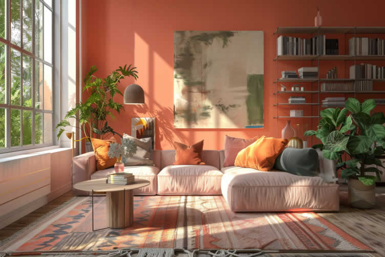
copyright image by 123rf.com
Hallway Paint Colors
google imagesReds view ideas Oranges view ideas Yellows view ideas Greens view ideas Blues view ideas Purples view ideas Browns view ideas Grays view ideas Tans view ideas Whites view ideas -
-
6th Color Tip: Balance Bold and Neutral Tones
A balanced color palette often includes a mix of bold and neutral tones.
Use bold colors as accents to add personality and interest, while neutral shades provide a versatile background that can adapt to changing decor over time.
This balance ensures that your space feels cohesive and not overwhelming.
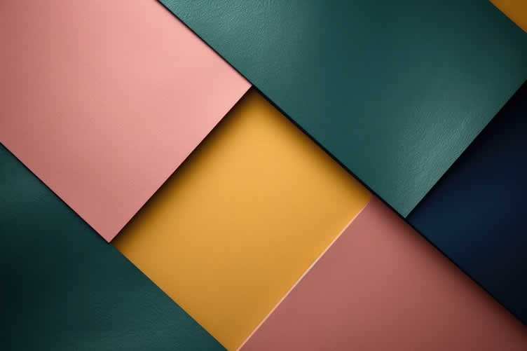
copyright image by 123rf.com
[ view samples: bold color interior design ]
[ pinterest: painting accent wall ideas ]
Using Bold Colors in a Balanced Palette
Incorporating bold colors into a room’s design can create a vibrant and dynamic environment. When balanced with neutral tones, bold colors can highlight specific features, add depth, and infuse energy without overwhelming the space.
By strategically placing bold hues, you can transform any room into a stylish and inviting area.
-
Accent Walls
Painting an accent wall in a bold color can immediately draw attention and add a striking focal point to the room.
For example, a rich emerald green wall in a living room can create a sense of luxury and sophistication. Paired with neutral furnishings and decor, this bold choice ensures the room feels balanced and cohesive.
-
Furniture Pieces
Introducing bold colors through furniture is a subtle yet effective way to enliven a space. A vibrant red sofa or a mustard yellow armchair can provide a pop of color that energizes the room.
These statement pieces work best when surrounded by neutral walls and floors, allowing the bold colors to stand out without overwhelming the design.
-
Accessories and Decor
Smaller decor items, such as cushions, rugs, or artwork, can also be perfect vehicles for bold colors. For instance, bright blue throw pillows on a gray couch or a colorful abstract painting on a beige wall can significantly enhance the visual interest of the room.
These elements are easy to update, making them ideal for those who like to refresh their decor frequently.
-
Lighting
Bold colors can also be introduced through lighting fixtures. A chandelier or pendant light in a striking hue, such as a deep cobalt or a lively orange, can serve as both a functional and decorative element.
This approach ensures the space remains balanced, with the lighting fixture acting as a subtle yet impactful accent in the room’s overall design.
By thoughtfully integrating bold colors in various aspects of room decor, you can achieve a harmonious balance that combines personality with versatility.
Whether through accent walls, furniture, accessories, or lighting, bold hues can enhance and elevate any living space.
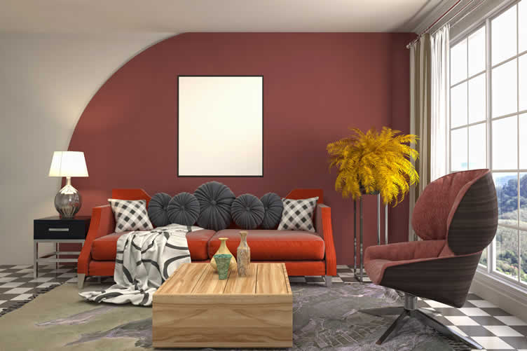
copyright image by 123rf.com
Home Library Paint Colors
google imagesReds view ideas Oranges view ideas Yellows view ideas Greens view ideas Blues view ideas Purples view ideas Browns view ideas Grays view ideas Tans view ideas Whites view ideas -
-
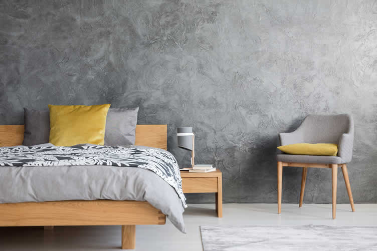
7th Color Tip: Consider the Function of Each Room
Think about how each room will be used. Practical considerations can influence your color choices.
For instance, a home office might benefit from colors that enhance focus and productivity, while a living room might prioritize comfort and relaxation.
Tailor your color palette to the function and purpose of each space.
copyright image by 123rf.com
[ pinterest: painting ideas for bathroom ]
[ pinterest: painting ideas for bedroom ]
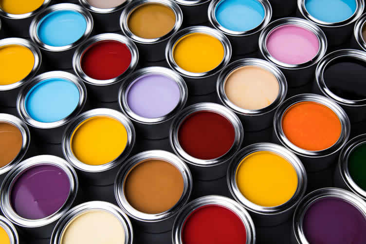
Understanding Paint Finishes
Selecting the right paint color is just one part of creating a beautiful and cohesive living space. Equally important is understanding the various paint finishes available, each offering unique qualities that can significantly impact the overall look and feel of a room.
Different finishes serve different functional and aesthetic purposes, and choosing the right one can elevate your design while also addressing practical needs.
-
Flat Paint Finish
Flat paint, also known as matte finish, has no shine and offers a smooth, velvety appearance. It is excellent for concealing imperfections on walls and ceilings due to its non-reflective surface.
Flat paint is best suited for low-traffic areas such as bedrooms and living rooms, where the need for frequent cleaning is minimal.
-
Matte Paint Finish
Matte paint finish, slightly more lustrous than flat paint, still provides a non-reflective, smooth look that hides surface imperfections well. It is ideal for walls in dining rooms or adult bedrooms where durability and a sophisticated appearance are both important.
Matte finishes are easier to clean than flat finishes, making them a versatile choice for many spaces.
-
Eggshell Paint Finish
Eggshell finish offers a subtle shine, resembling the surface of an eggshell. This finish provides a balance between matte and satin, offering durability and slight sheen.
It’s a versatile and popular choice for living rooms, hallways, and family rooms. Eggshell finishes are relatively easy to clean and are suitable for spaces that experience moderate foot traffic.
-
Satin Finish
Satin finish paint has a soft, pearl-like sheen. It is more durable and easier to clean than eggshell, making it ideal for high-traffic areas like kitchens, bathrooms, and children’s rooms.
Satin finish highlights architectural details beautifully and provides a welcoming warmth to the space.
-
Semi-Gloss Finish
Semi-gloss finish offers a noticeable shine and is highly durable and moisture-resistant. It’s perfect for areas that encounter humidity and require frequent cleaning, such as kitchens, bathrooms, doors, and trim.
The reflective quality of semi-gloss can also brighten a space by reflecting more light.
-
High-Gloss Finish
High-gloss finish is the most reflective paint finish available. It creates a smooth, glass-like surface that is exceptionally durable and easy to clean.
High-gloss paint is ideal for woodwork, trim, doors, and cabinetry where a sleek, polished look is desired. Its washability makes it a practical choice for areas that demand heavy-duty cleaning.
Understanding these paint finishes and their best-use scenarios can greatly impact the success of your decorating projects. By choosing the appropriate finish, you ensure that your paint job not only looks excellent but also meets the functional needs of each room.
copyright image by 123rf.com
Bedroom Paint Colors
google imagesReds view ideas Oranges view ideas Yellows view ideas Greens view ideas Blues view ideas Purples view ideas Browns view ideas Grays view ideas Tans view ideas Whites view ideas -
-
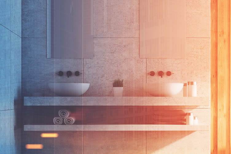
8th Color Tip: Types of Paint Styling for a Room
Choosing how to style the paint in a room can dramatically impact its look and feel, making it vital to understand different techniques and their effects according to color theory.
Color theory helps us comprehend how colors interact, the emotions they evoke, and how they alter our perception of space.
Below, we explore various paint styling techniques, providing examples of how each one can be utilized to create visually appealing and dynamic spaces.
-
Accent Walls
An accent wall, typically painted a different color or finish from the other walls in a room, serves as a focal point.
For example, using a bold, contrasting color from the rest of the room can draw attention to architectural features or a key piece of furniture, creating a balanced and harmonious space.
[ view images: accent wall paint ]
[ pinterest: paint accent wall ]
-
Ombre
The ombre technique involves blending one color softly into another, often transitioning from dark to light. This style can subtly introduce color variations and add depth to a room.
For instance, an ombre wall starting with deep blue at the base and fading into a light sky blue at the ceiling can evoke a serene, expansive feeling.
[ view images: ombre wall paint ]
[ pinterest: paint ombre wall ]
-
Sponging
Sponging creates a textured effect by applying a glaze with a sea sponge. By layering a secondary color over a base coat, sponging adds dimension and richness, ideal for creating a rustic or organic look.
A room styled with a soft, golden sponge effect can exude warmth and coziness.
[ view images: sponge wall paint ]
[ pinterest: paint sponge wall ]
-
Rag Rolling
Rag rolling involves rolling a rag over a glaze to create a mottled, irregular pattern. This technique offers a soft and elegant finish, perfect for injecting subtle sophistication.
For example, a neutral-toned rag-rolled wall can bring a touch of classic elegance to any living space.
[ view images: rag-rolled wall paint ]
[ pinterest: paint rag-rolled wall ]
-
Color Wash
A color wash, achieved by applying a translucent glaze over a solid base coat with a brush, results in a delicate, aged appearance.
This technique can make a room feel more historic or cozy. Using earth tones over a light background can evoke a Mediterranean or farmhouse style.
[ view images: color wash wall paint ]
[ pinterest: paint color wash wall ]
-
Taping
Taping involves using painter’s tape to create geometric patterns and designs before painting. This method allows for precision and creativity, offering endless possibilities for unique decor.
For example, a modern living room can be enhanced with a bold, taped-chevron pattern using contrasting colors.
[ view images: taped wall paint ]
[ pinterest: paint taped wall ]
-
Metallic Fusion
Metallic fusion paint incorporates metallic pigments, providing a room with sparkle and dimension. Using this technique can introduce a luxe and contemporary feel.
A feature wall with a gold or silver metallic finish can immediately elevate the room’s ambiance and sense of sophistication.
[ view images: metallic fusion wall paint ]
[ pinterest: paint metallic fusion wall ]
-
Fresco
Fresco painting involves applying pigment onto freshly plastered walls, resulting in a durable and slightly textured finish. This timeless technique can give the room an old-world charm and sophistication.
Frescoes often remind one of historic European architecture, and incorporating them can add a sense of heritage and elegance to a space.
[ view images: fresco wall paint ]
[ pinterest: paint fresco wall ]
-
Benoni
Benoni styling uses multiple layers of different colors applied with a brush to create soft, feathery patterns. This technique is perfect for adding a whimsical, airy touch to any room.
For example, using pastel colors in a Benoni style can infuse a child’s bedroom with playful yet calming energy.
[ view images: benoni wall paint ]
[ pinterest: paint benoni wall ]
-
Stenciled
Stenciling is a precise technique where patterns or images are painted onto a surface using a stencil. It offers the flexibility to introduce intricate designs without freehand painting.
A stenciled floral border around a room can add a touch of personalized artistry and elegance.
Understanding and applying these different paint styling techniques allows you to create a room that reflects your personal taste while adhering to the principles of color theory.
Each method offers unique aesthetic possibilities, enabling you to design spaces that are visually compelling and harmoniously balanced.
[ view images: stenciled wall paint ]
[ pinterest: paint stenciled wall ]
copyright image by 123rf.com
Paint Finishes
google images -
-
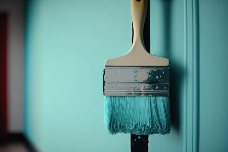
9th Color Tip: Factor in the Pros
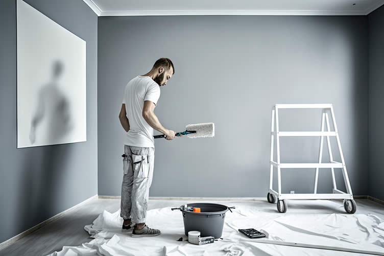
When finalizing your color palette, consider enlisting the help of professionals, like Blue Jay Painting. Experts can provide valuable advice on color selection, ensure high-quality application, and save you time and effort.
Their expertise can make a significant difference in achieving a seamless and durable finish for your home’s interior that will last years to come.
copyright image by 123rf.com
What to Look for in a Professional Painter
When considering a professional painter to transform your interior space, it’s important to pay attention to several key attributes and qualifications to ensure a high-quality finish and a pleasant experience.
Here are some essential factors to consider:
- Experience and Expertise:
Look for a painter with a solid portfolio showcasing a range of styles and techniques. Years of experience often translate to a refined skill set and an eye for detail, crucial for sophisticated finishes like fresco, Benoni, or stenciled designs. - References and Reviews:
Checking reviews and asking for references can offer insight into the painter’s reliability, professionalism, and the quality of their work. Satisfied clients and glowing testimonials are good indicators of a trustworthy professional. - Versatility in Techniques:
A talented painter should be adept at various painting styles and willing to provide samples of their work. Their ability to switch between techniques like metallic finishes or fresco painting demonstrates a robust skill set and creativity. - Attention to Preparation:
Quality painting goes beyond the final coat. Inquire about the painter’s preparation process, including surface cleaning, priming, and protective measures for furniture and floors. Thorough preparation can significantly impact the durability and appearance of the paint job. - Clear Communication and Professionalism:
Effective communication before and during the project ensures that your vision is understood and executed. A professional painter should be punctual, respectful, and open to feedback. - Use of Quality Materials:
Ensure that the painter uses high-quality paints and materials. Premium products are essential for achieving the best visual results and ensuring the longevity of the finish. - Detailed Estimates and Contracts:
A professional painter should provide a comprehensive estimate that outlines the scope of work, materials to be used, cost, and time-line. Clear contracts help avoid misunderstandings and ensure that all parties are on the same page.
By carefully evaluating these aspects, you can select a professional painter who will bring your interior design vision to life, adding a touch of elegance and sophistication to your space.
LetsRenovate has partnered with HomeAdvisor™, a renowned provider of highly-rated, carefully-vetted local painting contractors. Start your search here by entering your zip code to find local professionals.
copyright image by 123rf.com
But Wait!
Before starting your search and evaluation of a painting contractor, it is highly recommended to download and utilize this evaluation worksheet. This sheep allows you to summarize all the necessary information to make informed decisions on which contractor to select for your interior painting needs.

Evaluation Sheet
File Type:
- Experience and Expertise:
-
Conclusion
Choosing the perfect color palette for your home may seem daunting, but with a little knowledge and consideration, you can create a space that reflects your style and personality.
From understanding color theory to balancing bold and neutral tones, you can confidently create a cohesive and beautiful living environment.
Don’t be afraid to seek professional help and have fun exploring different color combinations until you find the perfect one for your home!
-
Quick scroll to more home structural project ideas …

-
ideas to view and compare from the photo above
- What comments can you share about
how to choose the perfect color palette for your interior walls?

addressing how to choose the perfect color palette and other home improvement needs …

… grab this directory of ideas for future use


… how to choose the perfect color palette and other home improvement needs

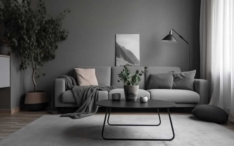
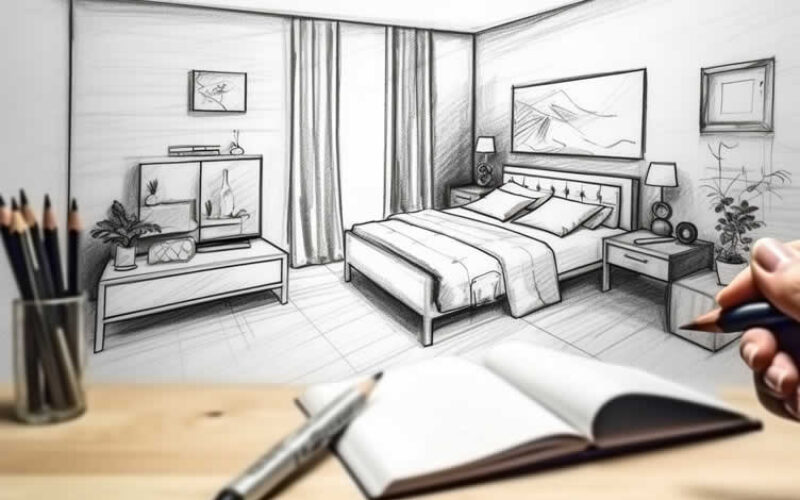
… home painting supplies


Budgeting Worksheet For Costing Home Remodeling and Home Improvement Decisions
 File Type (excel)

SHARE IT ..! You might have someone in your social network who could find this informative post on how to choose the perfect color palette valuable. Feel free to share it on Facebook, X (formally Twitter), LinkedIn, or Pinterest!


… home remodeling – improvement



get the size dimensions for any home remodeling project …

… for functionality, aesthetics, and adhering to building codes


… remodeling decisions

Calendar For:
Home Maintenance
File Type:
… view illustration “becoming a bank”
Find Painting Services Painting Staining Texturing Wallcoverings top-rated, pre-screened local contractors FREE: download contractor selection enter zip code – powered by HomeAdvisor ™
Quick Contractor Guides selecting negotiating working with inspecting

Cover image credit: how to choose the perfect color palette by 123rf.com
end of post … please share it!
 |
did you find how to choose the perfect color palette analysis helpful? If so, please share the article with your friends and family! |
Nice pic idea? Leave us a quick comment below.
And please share this pic idea within your social networks.