Whether you’re redesigning your house or shifting to a new location, knowing how to build a color scheme that speaks to your lifestyle and taste is crucial. From the furnishings and walls to minute décor details, every shade contributes.
Using five key techniques for designing amazing color schemes, you may make your house seem wonderfully coordinated.
Understand the Psychology of Color
Understanding how various colors affect emotions and perceptions helps one understand paint samples or fabric swatches. Your feelings in a given space are much influenced by color psychology.
For baths or bedrooms, for instance, light blues and greens are perfect as they are usually connected with calmness and serenity. Warm colors like red, orange, and yellow are stimulating and great for communal areas like kitchens or dining rooms.

Neutrals provide a classic basis and let accent colors shine without overwhelming the senses; beige, gray, and taupe are examples.
You are laying yourself up for a good scheme by selecting colors that complement the atmosphere you wish each room to project.

Find Inspiration and Build Around a Focal Point
Take cues from something you enjoy if you’re not sure where to start. This may be your best piece of clothing, a patterned rug, or even a work of art. Based on the colors of the item, create your whole scheme.
To round out the palette, first choose one or two dominating colors, then pull in complementary tones. For the whole room, a picture with rich terracotta, deep blue, and soft cream can act as a route map.
From there, you may select coordinating wall colors, upholstery fabrics, and accessories. This approach guarantees your space feels intentionally designed and helps to produce visual harmony.
Choose the Right Paint and Finish
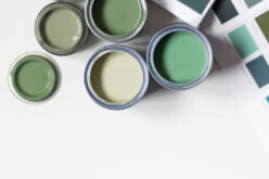
One of the most affordable and transforming methods to establish a color scheme is paint. When selecting paint, take finish into account in addition to color.
While satin and semi-gloss are suitable for high-traffic areas or locations that demand regular cleaning, matte and eggshell finishes are fantastic for covering flaws on walls. Regarding unique and modern finishes, limewash is becoming more and more popular.
Limewash paint gives walls depth and character, unlike traditional paint, thanks to its soft, textured appearance. If you would like to establish a more natural, lived-in look or add a little Old-World appeal, this is a fantastic alternative.
Experiment with color on your walls; it can dramatically alter the mood and appearance of your room.
Use the 60-30-10 Rule
Using the 60-30-10 Rule will help a room stay in equilibrium rather well. According to this idea, your main color should occupy 60% of the space, your secondary color should occupy 30%, and the remaining 10% should be a bold accent.
If your main color is a soft ivory, for instance, your secondary can be a muted sage green utilized in furniture or drapes; the 10% is a pop of gold in light fixtures or throw cushions.
Without making a room seem mismatched or disorganized, this formula helps you distribute colors evenly throughout it. This method grounds everything and looks great, even using bold or trendy colors.

How to Choose the Perfect Color Palette for Your Home
Choosing the right color palette for your interior painting can dramatically transform your living space, making it feel more inviting and tailored to your personal style. In the following guide, we’ll explore practical tips and strategies to help you navigate the overwhelming choices and confidently select the perfect hues that will enhance your home’s atmosphere.
Consider Lighting and Natural Light
Your color scheme may be made or broken by lighting. Natural light varies with the day; artificial lighting may either enhance or distort the color appearance.
Test paint samples on your walls always and note them several times a day. Under nighttime lighting, a color that seems warm and inviting in the morning might feel excessively strong. In dimly lit spaces, some tones might seem dull as well.
Consider the direction your windows face and the light the room gets while choosing your color palette. While south-facing rooms welcome warm, brilliant sunlight, north-facing rooms often provide cooler, more muted light.
Early in the process, thinking about lighting can help you prevent surprises and guarantee that your selected colors always appear their best.
Conclusion
Designing a beautiful color scheme for your house need not be difficult. Your room will seem both beautiful and personal if you approach it with consideration for color psychology, strategic planning, and knowledge of how light interacts with color.
The opportunities are unlimited, from trying out timeless design ideas like the 60-30-10 Rule to experimenting with paint colors like limewash.
Remember—your house should represent your own style and the way you wish to live. Trust your instincts, test your decisions.
other related analysis of interest: (new win)
Enhancing Outdoor Spaces with Ornamental Grasses in Landscape Design
Find Walls & Ceiling Services (opens new win) Drywall Installation Ceilings Painting & Texturing Tile top-rated, pre-screened local contractors Wallcoverings Ceilings – Fans Walls – Exterior Walls – Interior FREE: download contractor selection enter zip code – powered by HomeAdvisor ™


Image credit: color schemes for your home by envato.com
end of post … please share it!
| more photo remodeling |
Jump Over to Our Photo Analysis Center for Ideas on
"Renovating Home"
|__________________________________________________________|
home remodeling surprise
find out where it might go - new win


Helpful article? Leave us a quick comment below.
And please share this article within your social networks.