Summary Outline:
Some of the bigger pieces of the plan might entail things like stripping the home down to the bones and starting from the basics. It could also mean a lot of tasks that add up to big changes such as replacing flooring and appliances and adding a fresh coat of paint to all of the rooms.
All of these renovations will ultimately add up to something amazing that anyone would be thrilled to have the opportunity to live in. Of course, the biggest test of the entire project is how it is all pulled together at the end.
Seemingly small things like how the rooms are painted can make all the difference. The goal of a renovator looking to sell afterward is not to indulge in bright, bold colors that make a statement. Rather it is to invest in color palettes throughout the home that are pleasing to the majority of buyers.
Some examples include:

-
Quik scroll to first topic about choosing color palettes that are pleasing …

first “color palettes that are pleasing” idea


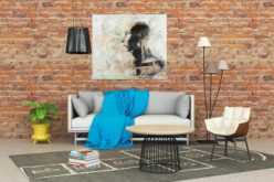
copyright image by 123rf.com
Keep It Calm and Simple
Notes:
- The psychology of color in interior design is fascinating and can really have a significant impact on the way potential buyers perceive a room. Certain colors can make rooms appear larger and airier, while others can make rooms feel small and dark.
- Likewise, the application of the appropriate colors in a certain space can create a calming effect, provide a warm and comforting space, or evoke feelings of energy and emotion.
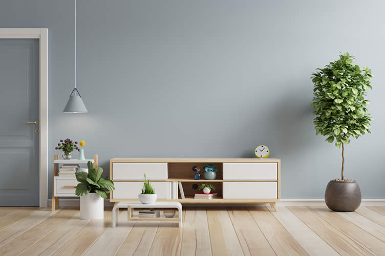
- For the majority of people looking to renovate and sell homes, the color palette throughout the house should be calming and simple with occasional accent colors that are bolder. These are typically color schemes in the blue, green, or neutral families.
-
Quik scroll to topic side notes …
-
-
What Research of Colors Suggest:
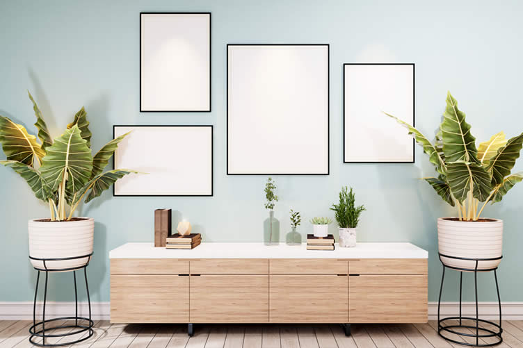
Some research suggests that the short wavelengths of light sages and blues are easier for the cones in our eyes to perceive and, therefore, are more relaxing and less straining to our eyes.
Another reason that these color palettes are popular is that they often remind us of nature, which is subconsciously tied to our history as a species as a positive thing. Neutral browns, creams, and whites can also elicit similar feelings.


copyright image by envato.com | envato.com | envato.com | envato.com
Ultimately, all of these palettes create a sense of calm and serenity that can make potential buyers feel more relaxed and positive about the home.
images: Sample Paint Colors by RoomReds for living room for kitchen for bedroom Oranges for living room for kitchen for bedroom Yellows for living room for kitchen for bedroom Greens for living room for kitchen for bedroom Blues for living room for kitchen for bedroom Purples for living room for kitchen for bedroom Neutrals for living room for kitchen for bedroom Grays for living room for kitchen for bedroom Tan for living room for kitchen for bedroom Whites for living room for kitchen for bedroom
-
-
Quik scroll to next topic about choosing color palettes that are pleasing …
-
ideas to view and compare from the information discussed above
interior paint colorschoosing interior colorshow to paint interior rooms
second “photo remodeling” idea

copyright image by 123rf.com
Considerations for Aging Demographics
Notes:
- Neutral colors can seem like a pretty easy thing to pick out but, actually, it can be quite challenging. Surprisingly, there are hundreds of neutral colors and color combinations that can make even something so seemingly simple complex. After all, how does one choose between headspace blue and smoke blue?
- The answer could actually be related to the end purchaser of the home. If the renovation is likely to be bought by a young couple, the tones within the color scheme may not matter quite as much as if it will be purchased by an aging couple. All of this has to do with how the eye perceives certain tones of colors as it ages.
-
Quik scroll to topic side notes …
-
-
Aging Up:
As people age, their ability to distinguish hues of neutral colors can diminish. Although many older people strive to maintain healthy eyes, this is a natural process.
Tones of blues and greens that are obviously different to younger people with healthy eyes may look the same or even more yellowish to older generations. In these instances, in order to really capture some of the intended color and psychological impacts, it might be worth choosing a slightly more saturated hue.


copyright image by 123rd.com | 123rd.com | 123rd.com | 123rd.com
Some summary definitions about color hues and shades:
-
Hue:
the pure color with no tint or shade
-
Tint:
mixture of the color with white
-
Tone:
mixture of the color with gray
-
Shade:
mixture or the color with black
images: Viewing Neutral Color TonesShades of Neutral Paint Colors view ideas – for Living Room view ideas – for Kitchen view ideas – for Bedroom view ideas – for Bathroom view ideas Gray Color Tones
Shades of Gray Paint Colors view ideas – for Living Room view ideas – for Kitchen view ideas – for Bedroom view ideas – for Bathroom view ideas Blue Color Tones
Shades of Blue Paint Colors view ideas – for Living Room view ideas – for Kitchen view ideas – for Bedroom view ideas – for Bathroom view ideas Green Color Tones
Shades of Green Paint Colors view ideas – for Living Room view ideas – for Kitchen view ideas – for Bedroom view ideas – for Bathroom view ideas Yellow Color Tones
Shades of Yellow Paint Colors view ideas – for Living Room view ideas – for Kitchen view ideas – for Bedroom view ideas – for Bathroom view ideas Red Color Tones
Shades of Red Paint Colors view ideas – for Living Room view ideas – for Kitchen view ideas – for Bedroom view ideas – for Bathroom view ideas -
-
Understanding the Color Wheel:
Color wheels can be divided into two types: warm and cool tones. The warm colors – red, orange, yellow – give a sense of “warm feelings”, such as sunshine and heat. It gives a sense of heightened emotions such as energy and playfulness.
Cool colors – blue, green, light purple – conveys the cool feelings of water and sky. These color help make you feel calm, relaxed and refreshed.

copyright image by envato.com
-
Monochromatic Color Scheme:
when you use all varieties of single color – the tints, shades, and tones.
-
Complementary Color Scheme:
using two colors that are opposite of each other on the color wheel. You will have one color as dominant, with the secondary color serving as an accent color.
-
Analogous Color Scheme:
is using three colors that are adjacent to each other on the color wheel, such as violet, red-violet, and red. One color will be dominant, while the other two serve as accent.
Paint Color Wheel Samples
Reds view ideas Oranges view ideas Yellows view ideas Greens view ideas Blues view ideas Purples view ideas Browns view ideas Grays view ideas Tans view ideas Whites view ideas -
-
-
Quik scroll to next topic about choosing color palettes that are pleasing …
-
ideas to view and compare from the information discussed above
 … grab this directory of ideas
walls n’ ceiling

May We Suggest Other Photo Remodeling Ideas About
“Other Interior Painting Ideas …”



third “photo remodeling” idea

copyright image by 123rf.com
Palettes To Avoid
Notes:
- As a renovator, it can be hard to ultimately walk away from some of the best visions for the home. You might be thinking of a bold kitchen or living room space that captures some of the energy and excitement you’re feeling about the home. However, it is valuable to remember that not all potential buyers are likely to share or agree with those color choices.
- Often, bright and bold colors can have unintended effects psychologically. For instance, a bold red in the kitchen might bring people together, but it can also bring in stronger, louder emotions. Bright colors can also eliminate the relaxing vibes that most people want in a home.
-
Quik scroll to topic side notes …
-
-
Adding Personalization:
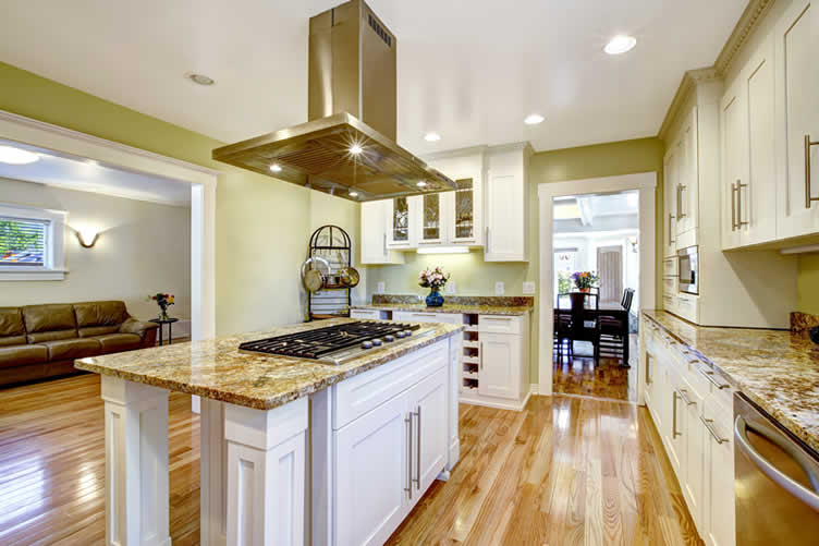
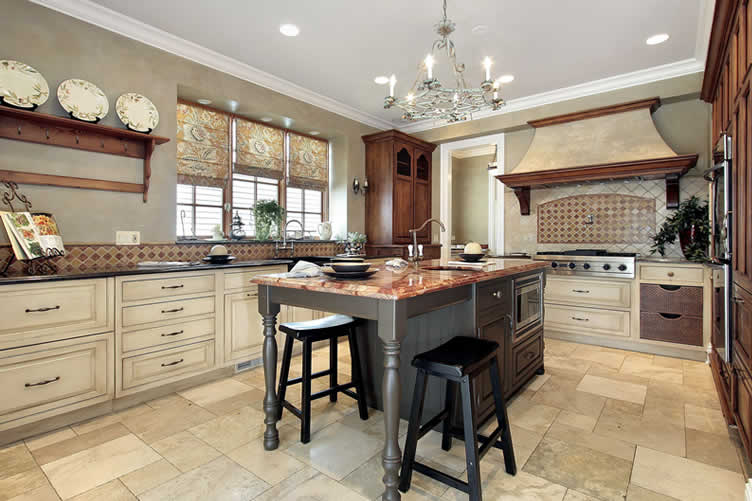
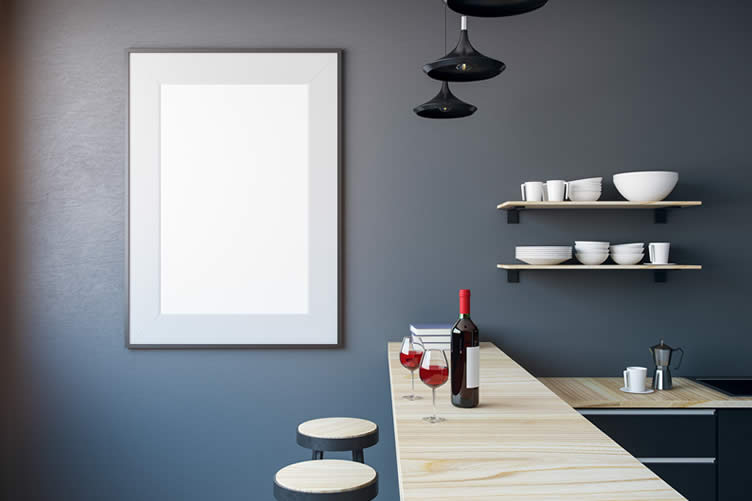
Personalization is also important when transforming any room. This certainly doesn’t mean that there can’t be any reds, oranges, or yellows in the home. These colors can actually make fantastic accents that offer a pop of color and excitement to a room.

copyright image by 123rd.com | 123rd.com | 123rd.com | 123rd.com
For instance, many people like to have some of these warmer tones in their kitchens to bring people together and create a space for conversations. However, if these colors are going to make up a larger portion of the color scheme, they should be more muted tones.
Paint Patterns (Using Tape)
3D view ideas Abstract view ideas Chevron view ideas Circle Ombre view ideas Color Blocks view ideas Confetti view ideas Criss Cross view ideas Geometrics view ideas Hexagon view ideas Honeycomb view ideas Pastel view ideas Stripes view ideas Tiles view ideas Triangle view ideas
-
-
FINAL REMARKS
Choosing the paint and color palette of a home is one of the most exciting aspects of renovating a place to sell. It sets the tone and the ultimate vibe of the home. For the larger population, more neutral and natural colors are the most pleasing and can have the greatest positive effect on home sales.
-
Quik scroll more walls n’ ceiling ideas …
-
ideas to view and compare from the information discussed above
interior painting kitpaint mixer for drillpaint covers for floors
- What comments can you share about
selecting color palettes that are pleasing?
painting needs and supplies

Find Walls & Ceiling Services (opens new win) Drywall Installation Ceilings Painting & Texturing Tile top-rated, pre-screened local contractors Wallcoverings Ceilings – Fans Walls – Exterior Walls – Interior FREE: download contractor selection enter zip code – powered by HomeAdvisor ™
Quick Contractor Guides selecting negotiating working with inspecting

Cover image credit: color palettes that are pleasing by envato.com
end of post … please share it!
 links open new win
or simply search by entering paint item or other remodeling need

Nice pic idea? Leave us a quick comment below.
And please share this pic idea within your social networks.