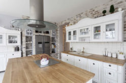
If you’re hesitant to try vivid colors in your home but want to give it a try, here are a few tips on doing it successfully.
Match the Colors to the Purpose
Different colors evoke different moods in the observer. Orange is energizing, inviting and can even make you hungry. It’s an excellent choice for the kitchen. Yellow is a cheerful color that exudes happiness.

It’s a great color for any room; it can bring you joy wherever it is. Green is harmonious and fresh. Consider it for the bedroom, kitchen or bathroom. Purple, a romantic color that speaks of luxury, is a nice choice for the bedroom.
Of course, you can use vibrant colors in any room you choose. See how different vivid shades affect you and what emotions they stir up, and decide from there what colors suit your tastes for each room.
Contrast Your Colors
For an extra pop of vibrancy, contrast your bright colors by using combinations from opposite sides of the color wheel. You can put yellow and purple throw pillows on your bed, for example, or a living room rug that includes shades of blue and orange.
If you want to scale back a bit on the vibrancy, choose bright colors close together on the color wheel, such as royal blue and kelly green or fire-engine red and bright orange.
Balance With Black
Bright colors against a black backdrop really pop. You can put brightly patterned pillows on a black leather sofa to make them stand out. A black accent wall with art by Ashley Longshore will create a statement in your room. Black will balance out your palette and let your vivid colors shine.
Use the 60-30-10 Rule
Designers like to use the rule of 60-30-10. Translated, this means that one color is used for 60% of the room — walls and flooring, perhaps — while 30% of the room uses another color and the final 10% is devoted to a third color.

some color ideas to consider
If you’re having difficulty deciding how to start adding color to your room, the 60-30-10 rule can help you. Try choosing a neutral color for your 60%, a brighter color for your 30% and something vivid for your 10%. Your 60% color, for example, can be light gray, with bright yellow for the 30% color and tangerine for the 10% color.
Turn to Nature for Inspiration
If you need help combining colors and shades, look no further than nature. You can find plenty of inspiration in the outdoors. Consider the bright colors of autumn, for example, like orange, red and dark green.
advertisement
Colors from the desert can include terra cotta, bright green and sunny yellow. A beach-inspired room can have a taupe or blue background with fiery sunset accents like purple, orange and red.
Use Accessories
If you’re hesitant to buy an orange couch, that’s perfectly understandable. Large, colorful pieces can quickly become eyesores if you decide you are tired of them.
other related articles of interest:
Using bright colors in your accessories, such as wall art, throw pillows and vases, makes more sense financially and keeps you from becoming visually overstimulated. If you want a change of scenery, accessories are easier to replace than large pieces.
Incorporating vivid colors into your living space can be fun and make your room feel fresh. Enjoy decorating with bright colors and reaping the benefits of their energy.
Find Painting Services Painting Staining Texturing Wallcoverings top-rated, pre-screened local contractors FREE: download contractor selection enter zip code – powered by HomeAdvisor ™

Image credit: adding bright colors to your home by Pixabay
end of post … please share it!
 links open new win
or simply search by entering paint item or other remodeling need
|__________________________________________________________|
home remodeling surprise
find out where it might go - new win


Helpful article? Leave us a quick comment below.
And please share this article within your social networks.